Scoring genre clarity...

Paper Animal Adventure capsule

Paper Animal Adventure

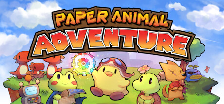
Paper Animal Adventure is a cute roguelike game where you can explore a colorful world, fight scary enemies, and relax with your friends at the campfire! Will you be the one to seal the timelines and find the missing king?

$14.99Very Positive(138)
Early AccessMetroidvaniaPixel Graphics
Cuddling Raccoons StudioAug 7, 2025

Paper Animal Adventure scores 75/100 — better than 68% of Early Access capsules (n=3,067).

Very Positive (138 reviews) · $14.99 · Released Aug 7, 2025 · By Cuddling Raccoons Studio

Quick text summary

Paper Animal Adventure scored 75/100 on Steam Analyzer — Good for a Early Access capsule. Top priority fix: [title_readability] Test the two-line title stack at 120x45 resolution and consider consolidating to single-line or increasing letter spacing if compression occurs.

Capsule scores by dimension

  • Genre Clarity: 8/10 — Clear adventure, cute aesthetic cues. The paper-craft art style, cheerful yellow animal characters, and pastoral green landscape immediately signal a lighthearted adventure game. At tiny size, the bright yellow protagonists and colorful enemy variety (red creatures, gear-adorned robots) still read as adventure/RPG despite the cute theme. The composition suggests exploration and combat through character arrangement and environmental hints like the campfire mention.
  • Title Readability: 7/10 — Bold title reads at small, slight size variance. The all-caps yellow and orange title text with heavy black outline stands out well against the blue sky background at full and small sizes. At tiny size, the title remains readable though letter separation tightens slightly. The two-line stacked layout (PAPER ANIMAL / ADVENTURE) is sensible but the smaller secondary line could risk compression at extreme scales.
  • Contrast & Color: 8/10 — Vibrant palette pops against dark backgrounds. The bright blue sky, yellow characters, red enemies, and lime-green grass create strong value separation and saturation that will cut through the Steam dark background (#1b2838) during quick scroll. At tiny size, the yellow-to-blue contrast remains the dominant read and silhouettes stay clear. Warm-to-cool color harmony adds visual appeal without muddy mid-tones.
  • Uniqueness & Polish: 7/10 — Distinctive paper-craft style, competent execution. The paper-animal aesthetic is cohesive and feels intentionally crafted rather than generic asset-slapped together; the 3D paper-folded look on flat characters is a recognizable hook. Character poses and environmental props (gear, campfire setup, varied creature types) suggest story and gameplay depth rather than a static scene. While not groundbreaking, the presentation avoids the common template fatigue of indie adventure capsules in this space.
  • Brand Consistency: 7/10 — Consistent paper-craft identity, friendly tone. The paper-animal rendering style, warm color palette (reds, yellows, greens), and whimsical character designs create a recognizable internal brand voice. The bold, playful title treatment matches the cheerful subject matter and suggests consistent visual direction across marketing. No jarring tonal conflicts or stylistic inconsistencies within the frame suggest solid art direction alignment.
  • Composition: 8/10 — Strong focal hierarchy, balanced scene depth. The title anchors the top with clear primary focus, while the character cluster in the center creates a natural focal point with foreground (small characters front-left), midground (main yellow characters), and background (landscape and sky) layering. At small and tiny sizes, the clustered character arrangement reads as a unified group without scattered attention; the composition is resilient to Steam cropping with no critical elements hugging dangerous edges. Safe margins are maintained and the scene feels intentionally composed rather than haphazardly placed.

What works

  • Instant genre recognition. The bright yellow characters, pastoral setting, and whimsical paper-craft style immediately communicate a cute adventure experience even at tiny thumbnail size.
  • Bold, legible title treatment. The high-contrast yellow-and-orange text with heavy black outline remains readable at small sizes and stands out clearly against the blue sky background.
  • Rich color harmony and vibrancy. The saturated blues, yellows, reds, and greens create strong visual pop against the Steam dark background and maintain clarity during quick scroll.
  • Coherent visual storytelling. Character poses, varied enemy types, and environmental props suggest gameplay variety and narrative depth without feeling static or generic.

What hurts the capsule

  • Secondary text may compress at extreme scales. The two-line title split (PAPER ANIMAL on top, ADVENTURE below) risks letterform tightness and potential legibility loss at the smallest thumbnail dimensions.
  • Slightly crowded character cluster. While compositionally sound, the dense grouping of multiple characters center-frame could risk individual character silhouette clarity if further reduced in size or displayed at low resolution.
  • Limited distinctiveness versus peers. The paper-craft style is charming but similar indie adventure capsules (e.g., Chants of Sennaar, Harold Halibut) use comparable whimsical-craft aesthetics, so the hook feels incremental rather than singular.

Priority fixes

  1. [title_readability] Test the two-line title stack at 120x45 resolution and consider consolidating to single-line or increasing letter spacing if compression occurs.
  2. [uniqueness_polish] Add a more distinctive visual hook or signature motif (e.g., iconic character pose, unique UI element, or landmark) that differentiates from other paper-craft indie adventures.
  3. [composition] Ensure the smallest character silhouettes remain distinguishable at tiny size; consider mild character spacing or silhouette outline emphasis if readability tests show clustering collapse.

Store copy priority fixes

  1. [audience_targeting] Clarify in the short description whether the 'campfire with friends' element is co-op, single-player narrative, or seasonal/event-based, or remove it if it is not a core feature.
  2. [hook_strength] Rewrite the closing question to emphasize a unique mechanical or narrative hook rather than vague timeline/king lore—e.g., 'Master 10 unique character builds and face boss rematches with each unlock.'
  3. [uniqueness] Add 1–2 sentences after the inspirations stating what is mechanically or tonally distinct—e.g., 'Unlike its inspirations, every run generates a new world, and sticker passives let you create broken combos that no two runs feel the same.'
  4. [feature_communication] Move or condense the final narrative section to a separate 'Story' subsection so that the core mechanic summary remains the dominant reading focus.

Related guides

Steam app ID: 1982120 · Tags: Early Access, Metroidvania, Pixel Graphics, 2D, Combat