Scoring genre clarity...

Everhood 2 capsule

Everhood 2

AN UNCONVENTIONAL ARPG where you battle enemies through musical encounters while being accompanied by a raven who promises to retrieve your voice if you slay the mighty Mind Dragon!🎵

$19.99Mostly Positive(13)
PsychedelicMusicIndie
Chris Nordgren, Jordi RocaMar 4, 2025

Everhood 2 scores 72/100 — better than 46% of Psychedelic capsules (n=434).

Mostly Positive (13 reviews) · $19.99 · Released Mar 4, 2025 · By Chris Nordgren

Quick text summary

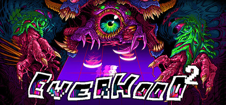
Everhood 2 scored 72/100 on Steam Analyzer — Good for a Psychedelic capsule. Top priority fix: [title_readability] Remove or reduce chromatic aberration on title letterforms and use solid white or light outline only to ensure legibility at small capsule and tiny thumbnail sizes.

Capsule scores by dimension

  • Genre Clarity: 8/10 — Psychedelic action-RPG with clear identity. The grotesque, eye-centered creature design with neon magenta and green color scheme immediately signals surreal, unconventional gameplay—distinctly pointing toward a stylized action or indie RPG experience. The pixelated UI elements at the bottom reinforce retro-action game semantics. At tiny size, the central luminous eye and alien creature silhouette read as 'otherworldly combat' rather than generic action, supporting the musical/psychedelic ARPG positioning.
  • Title Readability: 5/10 — Title struggles at small size clarity. The title 'EVERHOOD 2' uses an outlined, angular font with magenta/cyan chromatic aberration effect positioned directly over the glowing creature. While readable at full header size, the compressed letterforms and heavy outline create visual noise at small capsule size, and at tiny thumbnail the text collapses into illegible artifact-like marks due to the alternating color fringing. The design prioritizes visual spectacle over legibility hierarchy.
  • Contrast & Color: 8/10 — Vibrant neon palette pops effectively. The bright magenta, lime green, and cyan colors create strong value separation against the dark blue background, with the glowing eye providing a clear luminous focal point that reads well even at reduced sizes. The neon aesthetic maintains silhouette clarity in grayscale due to high saturation and brightness values. At tiny size, the color differentiation helps distinguish creature anatomy despite resolution loss.
  • Uniqueness & Polish: 8/10 — Distinctive psychedelic monster design. The ornate, grotesque creature with multiple organic layers, glowing green eye, and detailed tooth/claw texturing feels premium and intentional rather than asset-flipped. The neon chromatic aberration on the title and pixelated UI bottom-bar create a cohesive retro-futuristic aesthetic that signals a singular creative vision. This visual language distinctly communicates 'not a typical action game' and aligns with the game's unconventional musical-ARPG hook.
  • Brand Consistency: 7/10 — Recognizable psychedelic signature style. The magenta-green creature palette, glowing eye motif, and chromatic aberration effects form a memorable visual signature consistent with a surreal indie title identity. The pixelated UI strips and organic monster rendering suggest a coherent art direction, though without access to all 9 reference screenshots, internal consistency is inferred from the bold stylistic choices. The neon-goth creature aesthetic is distinctive enough to become iconic upon repeat exposure.
  • Composition: 7/10 — Strong focal point with minor crowding. The giant eye provides a clear primary focal point centered on the capsule, with the creature's mouth and tentacles creating layered depth that guides secondary attention. Title placement below the main subject follows convention, though the chromatic aberration effect creates visual competition. At small size the composition reads well, but the ornate detail density in the creature leaves minimal negative space, which could feel slightly claustrophobic on tiny thumbnails.

What works

  • Neon color contrast. Bright magenta and lime green values create instant visual pop against Steam's dark background and maintain silhouette clarity at all sizes.
  • Clear focal point. The glowing central eye immediately anchors attention and communicates 'surreal creature' at a glance, even at tiny thumbnail resolution.
  • Distinctive visual identity. The ornate psychedelic creature design with chromatic aberration and retro pixel UI strips feels premium and uniquely positioned versus generic action games.

What hurts the capsule

  • Title chromatic aberration reduces legibility. The magenta-cyan fringing on 'EVERHOOD 2' creates visual noise and collapses into illegible artifacts at small and tiny sizes.
  • Dense ornamental detail. The creature's layered teeth, tentacles, and texture-rich design creates visual clutter that may feel overwhelming at tiny thumbnail scale and obscures simple recognition.
  • High-contrast text may clip on Steam UI. The outlined title positioned over the brightest creature region risks being cut or obscured depending on Steam's dynamic capsule cropping across different store views.

Priority fixes

  1. [title_readability] Remove or reduce chromatic aberration on title letterforms and use solid white or light outline only to ensure legibility at small capsule and tiny thumbnail sizes.
  2. [composition] Add subtle dark background panel or vignette behind the title to guarantee text remains readable regardless of Steam UI cropping and capsule position context.
  3. [contrast_color] Consider slightly darkening or desaturating one creature layer to reduce visual density and improve tiny-size silhouette clarity without losing neon impact.

Store copy priority fixes

  1. [feature_communication] Add 1-2 sentences explaining core music-battle mechanics: e.g., 'Time your actions to the beat, dodge incoming attacks in rhythm, or chain combos through musical sequences.' This clarifies the moment-to-moment gameplay loop.
  2. [uniqueness] Expand the custom editor description to emphasize player agency: e.g., 'Design your own battles and stories with the included World & Battle Editor, or share creations via Steam Workshop.' This raises awareness of a key differentiator.
  3. [audience_targeting] Add a single sentence signaling difficulty or player type: e.g., 'Perfect for rhythm fans and narrative-driven players who value style over relentless challenge.' This helps self-selection.
  4. [feature_communication] Replace 'Make funny friends!' with a concrete example: e.g., 'Recruit eccentric allies who reveal the mystery of your stolen voice.' This clarifies narrative and gameplay relevance.

Related guides

Steam app ID: 1984020 · Tags: Psychedelic, Music, Indie, Story Rich, 2D