Scoring genre clarity...
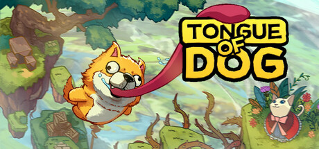
A 'Getting Over It' style game. Play as a cute dog. Lick, grip, and swing with your tongue. Overcome 8 distinct levels: Big Swings, Ice Sliding, Space Drifting, Volcano Escaping, etc. No checkpoints. Has collectables, leaderboards, and dog customisation.
$2.99Positive(23)
DogsPsychological HorrorComedy
LauNewBeeJun 1, 2025