Scoring genre clarity...

Another Day with You capsule

Another Day with You

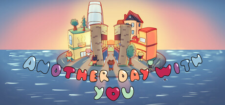
Another Day with You is an adventure game featuring mini-games galore. Explore this quiet corner of the city - time passes as you play, whether you are talking to locals, playing hide and seek, or at the arcade. Will you leave your date waiting? Did you bring flowers? It's Another Day with You.

Free to PlayPositive(39)
MinigamesTime ManagementAdventure
baugipFeb 14, 2026

Another Day with You scores 67/100 — better than 20% of Minigames capsules (n=121).

Positive (39 reviews) · Free to Play · Released Feb 14, 2026 · By baugip

Quick text summary

Another Day with You scored 67/100 on Steam Analyzer — Solid for a Minigames capsule. Top priority fix: [title_readability] Replace decorative bubble lettering with a bold, clean sans-serif title positioned in a single line with a dark outline for legibility at tiny size.

Capsule scores by dimension

  • Genre Clarity: 7/10 — Casual adventure with clear mini-game focus. The capsule communicates a lighthearted, slice-of-life adventure through the whimsical cityscape with arcade machines, ferris wheel, and cozy buildings. At tiny size, the colorful toy-like aesthetic and playful composition still convey a casual, relaxed game rather than action or combat. However, the specific 'dating sim' or relationship mechanic implied by the title 'Another Day with You' is not visually obvious from the scene alone.
  • Title Readability: 6/10 — Readable at full, struggles at tiny. The title 'ANOTHER DAY WITH YOU' is split across three lines with decorative bubble lettering in red, white, and yellow. At full size it reads clearly with good color separation against the sky gradient background. At tiny size (120×45), the text collapses into an unreadable jumble of colored shapes, losing letterform clarity and hierarchy.
  • Contrast & Color: 7/10 — Strong warm palette, good value separation. The warm sunset gradient (peachy pink to golden yellow) provides excellent contrast against Steam's dark background #1b2838. The colorful buildings, blue water, and bright sky maintain clear silhouettes and strong separation. At tiny size, the overall warm-cool contrast between the pink sky and blue water preserves readability, though some mid-tone detail softens.
  • Uniqueness & Polish: 7/10 — Charming art style, competent execution. The watercolor-illustration aesthetic with rounded, toy-like proportions feels intentional and cohesive, distinct from generic low-poly or photorealistic indie games. The scene composition with stacked whimsical buildings and arcade elements communicates the core theme of exploring a quiet city and playing mini-games. However, the visual hook feels more 'cute and pleasant' than 'instantly memorable'—it lacks a signature motif or character that would elevate it into the top tier of indie polish.
  • Brand Consistency: 6/10 — Consistent art style, limited iconic identity. The illustration style is clean and internally consistent across the buildings, water, sky, and typography, with a cohesive pastel-warm palette and rounded proportions throughout. However, there are no immediately recognizable character signatures, recurring symbols, or motifs that would make this capsule instantly identifiable as 'Another Day with You' at future encounters. The style is more 'soft indie aesthetic' than 'branded identity.'
  • Composition: 7/10 — Strong focal point, good layering hierarchy. The cityscape is centered with clear depth: foreground title and decorative bubbles, midground buildings and ferris wheel, background sky gradient. The eye naturally settles on the colorful architecture cluster as the primary subject. At small size, the composition reads cleanly with the city as focal anchor. However, the title placement at the bottom leaves significant dead space above at small sizes, and at tiny size the composition loses structure as elements blur.

What works

  • Warm, cohesive color palette. The peachy-pink to golden-yellow gradient sky combined with colorful buildings and blue water creates strong value separation against Steam's dark background, ensuring visibility in scrolling.
  • Clear artistic direction and charm. The watercolor-illustration style with rounded toy-like proportions is distinctive, intentional, and clearly communicates a casual, cozy adventure tone rather than generic indie aesthetic.
  • Strong depth and layering composition. The three-plane composition (title/foreground, buildings/midground, sky/background) creates visual hierarchy and guides the eye naturally at full and small sizes.

What hurts the capsule

  • Title illegible at tiny size. The three-line bubble lettering collapses into unreadable colored shapes when viewed at 120×45 pixels, severely harming discoverability in store thumbnails.
  • No iconic character or signature motif. While the art style is charming, the capsule lacks a memorable mascot, symbol, or visual hook that would create instant brand recognition on repeat viewing.
  • Generic scene without mechanical clarity. The idle city exploration scene doesn't clearly communicate the mini-game core mechanic or dating-sim relationship focus mentioned in the store description.

Priority fixes

  1. [title_readability] Replace decorative bubble lettering with a bold, clean sans-serif title positioned in a single line with a dark outline for legibility at tiny size.
  2. [genre_clarity] Add a subtle character silhouette (protagonist with date, or iconic mini-game element like arcade cabinet in foreground) to clarify the dating/relationship focus.
  3. [composition] Redistribute vertical space to reduce dead area above the cityscape; consider moving title inline with the scene or using a darker safe zone background behind text.

Store copy priority fixes

  1. [hook_strength] Rewrite the short description opening to lead with the date and time pressure: 'You're early for a date and time is slipping away—explore a cozy corner of the city, play minigames, and make memories before your date arrives. One wrong move and you'll be left on read.' This moves the hook from generic to consequence-driven.
  2. [uniqueness] Add 1–2 sentences explaining what makes the romance or minigame blend distinctive—e.g., 'Every activity unlocks new conversation topics with your date' or 'Your choices ripple across multiple dates, creating branching paths to love or rejection.' This differentiates from standard dating sims.
  3. [feature_communication] Clarify the progression system: mention whether players can replay days, whether there are multiple date outcomes, or if romance has meaningful branches. This answers 'what happens after the first date?' which is implied but not stated.

Related guides

Steam app ID: 1991110 · Tags: Minigames, Time Management, Adventure, Casual, Relaxing