Scoring genre clarity...
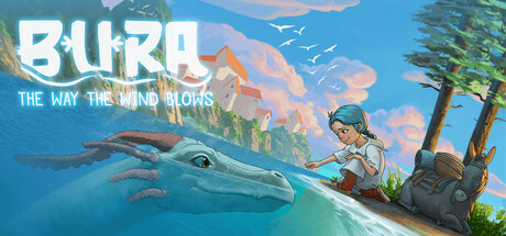
Explore the beautiful Adriatic coast, roam among the spirits of Mediterranean old-folk tales and live in the moment throughout your adventure. Strengthen the bond with your spirit companion and unlock unusual abilities to help you explore.
$14.99Positive(10)
ExplorationAdventureFantasy
Tiny Meow studio, Raven InsightsOct 27, 2025