Parallel Experiment scores 77/100 — better than 81% of Puzzle capsules (n=4,408).

Quick text summary

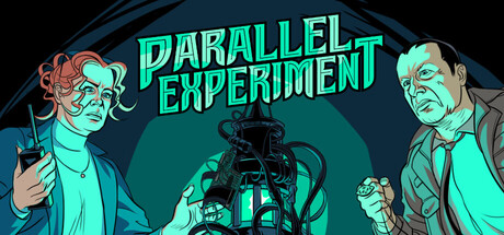
Parallel Experiment scored 77/100 on Steam Analyzer — Good for a Puzzle capsule. Top priority fix: [genre_clarity] Add subtle visual indicators of the split-information mechanic—such as different colored overlays on each character or asymmetrical UI elements—to communicate the unique co-op puzzle concept at thumbnail sizes.

Capsule scores by dimension

  • Genre Clarity: 7/10 — Mystery thriller with character focus. The capsule clearly communicates a detective or investigative narrative through two distinct characters in formal attire positioned on either side, with a mechanical/technological element at center suggesting sci-fi or experimental themes. At TINY size, the character silhouettes and central machine remain readable, though the specific 'co-op puzzle' mechanic is not visually implied by the composition alone.
  • Title Readability: 9/10 — Bright cyan text excellent contrast. The title 'PARALLEL EXPERIMENT' uses a strong neon cyan color with clean, bold sans-serif letterforms positioned clearly in the upper half against a dark teal gradient background. At SMALL and TINY sizes, the text maintains excellent legibility with strong value separation and crisp edges, making it one of the strongest elements of the design.
  • Contrast & Color: 8/10 — Strong neon cyan against dark teal. The vibrant cyan text and character accents create excellent silhouette separation against the dark teal-to-black gradient background. The color palette uses warm orange-reddish tones on the left character and cool cyan on the mechanical elements, creating visual interest and clear foreground-background layering that reads well even when squinting.
  • Uniqueness & Polish: 7/10 — Stylized characters, distinctive palette. The art direction features a cohesive comic book or graphic novel style with exaggerated character expressions and detailed line work that feels intentional and premium. However, the composition follows a fairly conventional symmetrical layout with characters flanking a central object, which is competent but not particularly distinctive within indie adventure game capsule trends.
  • Brand Consistency: 7/10 — Consistent art style, recognizable look. The capsule establishes a clear visual identity through its distinctive hand-drawn character style, neon cyan color signature, and dark teal atmosphere that would likely remain recognizable across multiple marketing materials. The exaggerated expressions and comic-book rendering style create an identifiable brand hook, though without access to the 11 screenshots, the full consistency across the game cannot be verified.
  • Composition: 8/10 — Clear hierarchy, balanced, focal depth. The layout uses strong compositional hierarchy with title at top, two character framing elements on sides, and a mechanical focal point centered between them creating natural eye flow. The depth layering (characters in foreground, machine and gradient in midground/background) reads clearly at SMALL and TINY sizes, and safe margins protect the key elements from edge cropping.

What works

  • Neon cyan title legibility. The bold, bright title maintains excellent readability at all sizes from full header down to tiny thumbnail, with strong contrast and clean letterforms.
  • Character silhouette clarity. The two distinct characters remain recognizable at small sizes, with clear outlines and expressive poses that guide viewer attention and communicate personality.
  • Atmospheric color palette. The teal-to-black gradient with neon cyan accents creates a cohesive, premium mood that feels appropriate for a mysterious sci-fi thriller adventure.
  • Balanced compositional framing. The symmetrical placement of characters flanking the central mechanical element creates visual stability and natural eye flow without cluttering the design.

What hurts the capsule

  • Generic symmetrical layout. The left-character, center-object, right-character composition is a common template in game marketing that lacks distinctive spatial innovation.
  • Mechanical element lacks visual clarity. The central machine/apparatus at medium-close inspection shows detail but its purpose and connection to the 'parallel experiment' theme is not immediately obvious at TINY size.
  • Co-op gameplay not visually implied. While the two characters suggest multiplayer, there are no clear visual cues communicating the 'puzzle' or 'information asymmetry' core mechanic that defines the game.

Priority fixes

  1. [genre_clarity] Add subtle visual indicators of the split-information mechanic—such as different colored overlays on each character or asymmetrical UI elements—to communicate the unique co-op puzzle concept at thumbnail sizes.
  2. [uniqueness_polish] Introduce a more distinctive compositional twist, such as angled character poses, overlapping layering, or off-center focal points, to differentiate from conventional indie game symmetrical layouts.
  3. [composition] Increase visual emphasis on the mechanical device with enhanced lighting, glow effects, or clearer silhouette definition so its role in the narrative becomes immediately apparent even at tiny sizes.

Store copy priority fixes

  1. [hook_strength] Emphasize the asymmetric information design in the short description more directly—e.g., 'You see half the solution, your partner sees the other half' creates immediate clarity of the unique co-op mechanic.
  2. [audience_targeting] Add a sentence early in the detailed description targeting the intended difficulty level and player type, e.g., 'Perfect for puzzle enthusiasts seeking a collaborative challenge' or 'A fun night-in experience for friends who love mystery games.'
  3. [feature_communication] Move or expand the cross-platform device requirement into the opening paragraph of the detailed description with a clearer visual or bolded note to prevent purchase friction.
  4. [uniqueness] Replace the assertion 'situations never seen before' with one or two specific puzzle examples that illustrate why the asymmetric co-op design is mechanically novel compared to standard escape rooms.

Related guides

Steam app ID: 2012320 · Tags: Puzzle, Co-op, Point & Click, Adventure, Comic Book