Scoring genre clarity...
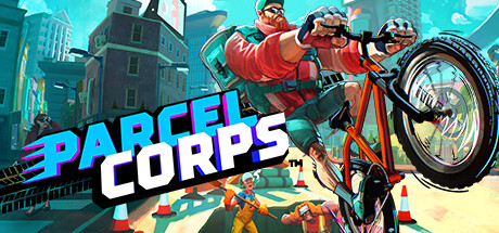
Parcel Corps capsule

Parcel Corps

Ditch the 9-5 and embrace the high-octane life of a freelance bicycle messenger! Skid, grind, and wallride across eight huge levels, delivering parcels for a cast of eccentric business owners. Find shortcuts, dodge traffic, and maybe even save the world!

$4.99Mixed(107)
ControllerRacingAction
Billy Goat Entertainment LtdOct 3, 2024

Parcel Corps scores 77/100 — better than 73% of Controller capsules (n=3,152).

Mixed (107 reviews) · $4.99 · Released Oct 3, 2024 · By Billy Goat Entertainment Ltd

Quick text summary

Parcel Corps scored 77/100 on Steam Analyzer — Good for a Controller capsule. Top priority fix: [uniqueness_polish] Add a visual signature element specific to 'messenger delivery' (e.g., glowing parcel silhouette on the bike, iconic cargo item) to differentiate from generic stunt games and reinforce core mechanic at a glance.

Capsule scores by dimension

  • Genre Clarity: 8/10 — Action racing sport gameplay clear. The bicyclist performing a stunt on a large wheel, urban environment with traffic cones, and dynamic action pose immediately signal action-sports and racing gameplay. At tiny size, the red bike and rider silhouette remain recognizable, though the 'freelance messenger' niche is harder to infer without reading description text. The visual strongly communicates extreme stunt cycling rather than confusion with other genres.
  • Title Readability: 8/10 — Bold cyan lettering reads well. PARCEL CORPS uses large, high-contrast cyan and white letterforms positioned on the left-center, ensuring legibility at full, small, and tiny sizes. The outline and spacing prevent letterform collapse when scaled down. At tiny size the title remains recognizable, though 'CORPS' sits slightly lower and could risk minor edge cropping on certain Steam layouts.
  • Contrast & Color: 8/10 — Bright cyan pops against sky. The cyan title and red-orange rider create strong value separation against the turquoise sky and dark urban buildings in the background. At tiny size, the red jacket and cyan text maintain clear silhouettes and don't muddy into the background. Grayscale evaluation confirms the rider and title have distinct light and dark regions that separate cleanly.
  • Uniqueness & Polish: 7/10 — Polished indie aesthetic, approachable tone. The art style is clean, vibrant, and professionally rendered with intentional lighting and particle effects (lens flare, clouds). The stunt pose and urban setting communicate the core 'high-octane delivery' loop effectively. However, the visual doesn't feel as distinctive or genre-breaking compared to top-tier action indie titles; it reads as a well-executed but familiar action-sports composition.
  • Brand Consistency: 7/10 — Consistent colorful vector-style branding. The palette (cyan, red-orange, turquoise, dark teal buildings) is coherent and likely consistent across promotional material and in-game UI based on the description of 9 store screenshots. The friendly, bold sans-serif typography and upbeat tone align with an approachable indie brand. The character design and urban setting create recognizable identity cues, though without access to other materials, internal cohesion appears solid.
  • Composition: 8/10 — Strong focal point, layered depth. The bicyclist mid-stunt dominates the upper-right quadrant as the clear primary focal point, with supporting elements (buildings, sky, cones, second character) creating a logical background-to-foreground hierarchy. Title placement on the left balances the composition without crowding. At small and tiny sizes, the rider remains the obvious hero and the layout does not feel scattered or cluttered.

What works

  • Cyan title contrast excellence. High-contrast cyan letters with white outline ensure PARCEL CORPS remains fully legible and eye-catching at tiny thumbnail size against the turquoise sky background.
  • Genre communicated through stunt pose. The rider performing a wheelie on a large tire immediately signals action-sports gameplay without requiring text, making the game type clear to quick scrollers.
  • Clean depth layering. Urban buildings and sky form a structured background that frames the rider and traffic cones, creating visual depth that prevents the composition from feeling flat or cluttered.
  • Vibrant, cohesive color palette. Cyan, red-orange, turquoise, and teal work harmoniously to create an appealing, recognizable visual identity that stands out on a dark Steam background.

What hurts the capsule

  • Secondary character potential distraction. The character in the background wearing orange jacket competes slightly with the primary rider, though at tiny size this is mitigated by the dominant red foreground cyclist.
  • Niche premise not visually obvious. While the stunt cycling genre is clear, the 'bicycle messenger delivery' and 'freelance gig economy' angle require reading the game description; the capsule alone suggests generic stunt racing rather than a unique delivery-focused hook.
  • Generic action-sports aesthetic. The visual style, while polished, follows familiar indie action-game conventions and does not stand out as distinctly memorable or unique compared to genre benchmarks like Forza or HOT WHEELS.

Priority fixes

  1. [uniqueness_polish] Add a visual signature element specific to 'messenger delivery' (e.g., glowing parcel silhouette on the bike, iconic cargo item) to differentiate from generic stunt games and reinforce core mechanic at a glance.
  2. [composition] Reduce secondary character prominence or reposition to avoid focal point competition; ensure the primary red-jacketed rider remains the unambiguous hero even at tiny size.
  3. [genre_clarity] Consider adding subtle UI hint (delivery GPS, package icon, or route overlay) to reinforce the 'delivery mission' angle and make the unique selling point visible without reading description.

Related guides

Steam app ID: 2015960 · Tags: Controller, Racing, Action, 3D Platformer, Action-Adventure