Scoring genre clarity...

The Cecil: The Journey Begins capsule

The Cecil: The Journey Begins

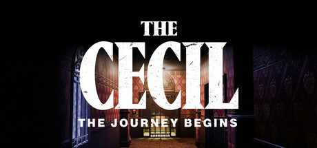
A romantic getaway takes a turn for the worst for John and Sarah as their dream vacation at The Cecil Hotel turns into a nightmare. John wakes up in a dark cell, realizing Sarah is missing. Now, he must find and save her from the horrors that haunt the hotel before it’s too late.

$19.99Mixed(31)
ActionViolentGore
Genie Interactive GamesApr 3, 2025

The Cecil: The Journey Begins scores 77/100 — better than 79% of Action capsules (n=8,534).

Mixed (31 reviews) · $19.99 · Released Apr 3, 2025 · By Genie Interactive Games

Quick text summary

The Cecil: The Journey Begins scored 77/100 on Steam Analyzer — Good for a Action capsule. Top priority fix: [title_readability] Simplify or remove the tagline, or increase its size and weight to maintain legibility at tiny size, focusing on the primary title alone.

Capsule scores by dimension

  • Genre Clarity: 8/10 — Horror-thriller with psychological dread. The extreme close-up of a bloodshot, distressed eye with visible gore and tears immediately signals psychological horror and survival-thriller mechanics. The visceral, unsettling imagery communicates danger and emotional distress rather than action-adventure, positioning this as a horror-focused narrative game. At tiny size, the eye remains the dominant focal point and successfully conveys unease and threat, though the specific hotel setting context becomes abstract.
  • Title Readability: 7/10 — Readable primary title, weak tagline. THE CECIL reads clearly in bold distressed white lettering at full size and remains legible at small size due to strong contrast and clean letterforms. The tagline THE JOURNEY BEGINS becomes significantly harder to parse at tiny size due to smaller scale and placement over the noisy eye texture. The distressed font effect adds thematic weight but maintains sufficient clarity across viewing conditions.
  • Contrast & Color: 8/10 — Strong dark-light separation, visceral depth. The bloodshot eye with deep reds, blacks, and whites creates excellent value separation against the #1b2838 background, with the bright title text cutting through cleanly. Warm red tones in the iris and surrounding blood create saturation contrast that draws immediate attention at scroll speed. In grayscale, the eye structure maintains clear silhouette and the white title remains distinct, though some mid-tone detail in the eyelashes becomes softer.
  • Uniqueness & Polish: 8/10 — Distinctive horror aesthetic, intentional craft. The extreme close-up eye approach is less common than establishing shots or character portraits, creating memorable visual distinctiveness. The rendering quality of the eye—bloodshot capillaries, tear droplets, and raw texture—signals premium production values and deliberate horror storytelling rather than generic thriller imagery. The distressed typography reinforces the unsettling mood and suggests narrative instability, elevating the design beyond template horror.
  • Brand Consistency: 7/10 — Cohesive horror tone, limited identity markers. The bloodshot eye, distressed text, and dark palette create a consistent psychological-horror mood that would likely align with game's visual identity across screenshots. The specific Cecil Hotel setting context is lost at this level of abstraction—the eye could evoke multiple horror narratives rather than establishing a unique brand signature for this specific game. Internal cohesion is strong, but visual distinctiveness from other horror titles remains moderate.
  • Composition: 8/10 — Clear focal hierarchy, intentional framing. The eye dominates the frame as the undeniable primary focal point, with title text layered strategically in the upper portion providing clear information hierarchy. The composition uses center-weighted focus with strong depth—eyelashes in foreground, iris in midground, darkness in background—creating visual layers that read well at all sizes. Safe margins are respected for the main title; the tagline placement is slightly vulnerable to edge cropping but remains functional.

What works

  • Distinctive horror visual hook. The extreme close-up bloodshot eye is memorable and immediately communicates psychological horror, standing apart from typical action-adventure capsule approaches.
  • Title legibility and placement. THE CECIL text maintains strong readability across all sizes through high contrast white lettering and bold weight, positioned on a controlled region.
  • Strong value contrast. Dark background paired with bright title and vivid red eye tones create excellent separation that persists through tiny-size viewing and grayscale conversion.
  • Clear thematic alignment. The distressed aesthetic, gore detail, and eye imagery cohesively reinforce the psychological-horror tone without confusion or mixed messaging.

What hurts the capsule

  • Tagline readability collapse. THE JOURNEY BEGINS becomes significantly harder to parse at tiny thumbnail size, reducing secondary information hierarchy effectiveness.
  • Limited brand specificity. The eye and horror atmosphere could apply to multiple horror games; there is no clear visual marker that specifically establishes The Cecil Hotel's identity or setting.
  • Abstraction loses narrative context. At small and tiny sizes, the Cecil Hotel setting and romantic-getaway-gone-wrong premise become completely obscured, leaving only generic horror without story differentiation.

Priority fixes

  1. [title_readability] Simplify or remove the tagline, or increase its size and weight to maintain legibility at tiny size, focusing on the primary title alone.
  2. [brand_consistency] Introduce a subtle but distinctive visual element—such as hotel architecture, a signature motif, or a secondary character—that establishes The Cecil's unique identity and setting.
  3. [genre_clarity] Consider adding a secondary contextual element at 20-30% opacity (architectural detail, shadow figure, or environmental cue) that reinforces the hotel setting without overwhelming the eye focal point.

Store copy priority fixes

  1. [uniqueness] Add a sentence that clarifies what is distinctly The Cecil—e.g., 'Inspired by true events at the historic Cecil Hotel' or 'Face enemies with unique AI behavior unlike other first-person horror games.'
  2. [feature_communication] Replace 'immersive gameplay' and 'mind-bending' with concrete mechanic descriptions: e.g., 'Craft weapons from found objects, use stealth to avoid detection, and solve environmental puzzles to unlock new areas.'
  3. [audience_targeting] Add a sentence specifying the intended player: e.g., 'For narrative-driven horror fans who value story and tension over jump scares' or 'Designed for action-horror players who want fast-paced combat and exploration.'
  4. [hook_strength] Strengthen the short description with a gameplay verb: e.g., 'A romantic getaway turns into a nightmare—fight terrifying creatures, solve deadly puzzles, and escape The Cecil Hotel before Sarah is lost forever.'

Related guides

Steam app ID: 2019340 · Tags: Action, Violent, Gore, Adventure, Horror