Scoring genre clarity...

Call of Duty®: Black Ops II capsule

Call of Duty®: Black Ops II

Pushing the boundaries of what fans have come to expect from the record-setting entertainment franchise, Call of Duty®: Black Ops II propels players into a near future Cold War

$39.99Very Positive(301)
MultiplayerActionFPS
TreyarchNov 12, 2012

Call of Duty®: Black Ops II scores 88/100 — better than 99% of Multiplayer capsules (n=3,150).

Very Positive (301 reviews) · $39.99 · Released Nov 12, 2012 · By Treyarch

Quick text summary

Call of Duty®: Black Ops II scored 88/100 on Steam Analyzer — Excellent for a Multiplayer capsule. Top priority fix: [uniqueness_polish] Consider introducing a subtle signature color accent (neon green or cold blue) to the tactical gear or lighting to increase visual distinctiveness while maintaining the noir aesthetic.

Capsule scores by dimension

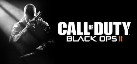
  • Genre Clarity: 9/10 — Tactical shooter immediately obvious. The armed, tactical-geared soldier centered in dramatic lighting instantly communicates military first-person shooter. Visible weapons, tactical gear, and the aggressive pose with crossed arms holding rifles make the genre unmistakable even at tiny size. The monochromatic noir lighting reinforces the gritty, high-stakes shooter aesthetic perfectly.
  • Title Readability: 9/10 — Bold, crisp, highly legible title. The white sans-serif 'CALL OF DUTY' text is large, bold, and contrasts sharply against the black background, remaining crystal clear at all sizes including tiny thumbnails. The subtitle 'BLACK OPS II' maintains excellent readability with clean kerning and strategic placement to the right of the soldier. No decorative elements compromise legibility, and the logo does not collapse at any viewing scale.
  • Contrast & Color: 9/10 — Excellent value separation and silhouette. The grayscale soldier figure with bright rim lighting creates a strong light-dark contrast that pops against the dark Steam background. The white title text has maximum contrast value separation, and the soldier's silhouette remains sharp and distinct even when squinting. The dramatic directional light on the character creates clear depth and separation from the black background.
  • Uniqueness & Polish: 8/10 — Premium execution with tactical branding. The cinematic lighting treatment and professional character rendering elevate this beyond generic action imagery, conveying high production values. The composition feels intentional and branded, with the soldier positioned as an iconic figure rather than a random screenshot. While the genre tropes are familiar, the execution is polished and clearly communicates this as a AAA military franchise entry.
  • Brand Consistency: 9/10 — Iconic Black Ops visual identity established. The monochromatic color grading, tactical soldier centering, and dramatic military lighting are signature Black Ops visual hallmarks recognizable across the franchise. The stark white title treatment and clean sans-serif typography align with the series' bold, no-nonsense branding approach. This capsule would be instantly recognizable as Black Ops in context with other franchise materials.
  • Composition: 9/10 — Perfect focal hierarchy and balance. The soldier is a strong primary focal point slightly left of center, with the title positioned to the right creating excellent visual balance and space utilization. The dramatic lighting naturally guides the eye to the character first, then to the logo, establishing clear reading order. The composition maintains excellent clarity at all sizes with no awkward cropping or edge-hugging elements, and zero wasted dead space.

What works

  • Exceptional title legibility at all sizes. Bold white sans-serif 'CALL OF DUTY' and 'BLACK OPS II' remain crisp and readable down to tiny 120x45 thumbnail size with maximum contrast against dark background.
  • Clear genre communication through silhouette. The tactical soldier's pose, weapons, and gear instantly communicate military shooter without ambiguity, even in quick scroll or squint test.
  • Strong professional lighting and rendering. Cinematic rim lighting and grayscale treatment create premium visual polish that conveys AAA production quality and tactical sophistication.
  • Iconic franchise visual identity. Monochromatic aesthetic, tactical soldier focus, and bold typography are signature Black Ops hallmarks that build brand recognition.

What hurts the capsule

  • Limited color palette reduces memorability. Purely grayscale treatment, while atmospheric, lacks the color distinctiveness that helps capsules stand out in crowded storefronts or genre browsing.
  • Generic soldier archetype lacks unique hook. While well-executed, the tactical soldier silhouette follows expected franchise conventions without a distinctive character or memorable visual hook that sets this specific entry apart.

Priority fixes

  1. [uniqueness_polish] Consider introducing a subtle signature color accent (neon green or cold blue) to the tactical gear or lighting to increase visual distinctiveness while maintaining the noir aesthetic.
  2. [brand_consistency] Ensure the soldier's specific tactical loadout or uniform details are recognizable as Black Ops II-specific to differentiate from other entries in the franchise.

Store copy priority fixes

  1. [feature_communication] Expand the detailed description to 150–200 words and explicitly list core features: campaign setting and plot hook, multiplayer modes (TDM, Domination, etc.), weapon customization, zombie co-op mode if applicable, progression systems, and key selling points unique to Black Ops II.
  2. [hook_strength] Replace "Pushing the boundaries" with a verb-driven hook that communicates core gameplay—e.g., "Command elite operatives through a near-future Cold War, where your tactical choices reshape global conflict."
  3. [uniqueness] Add a sentence explaining what differentiates Black Ops II from other COD entries and competitors—e.g., specific technological innovations, the futuristic setting's impact on mission design, or a signature gameplay mechanic exclusive to this entry.
  4. [audience_targeting] Add one sentence explicitly addressing the core audience—e.g., "For solo campaign veterans and competitive multiplayer teams seeking the next evolution of tactical FPS gameplay."

Related guides

Steam app ID: 202970 · Tags: Multiplayer, Action, FPS, Shooter, Singleplayer