Scoring genre clarity...

撕逼豆派对 capsule

撕逼豆派对

This is a multi player party game, which supports multi player local play on the same screen, and up to 4 people can play at the same time Each small game has different playing methods, from which you can experience different fun, just like Super Mario Party

CasualCartoon3D
松鼠是只猪Coming soon

撕逼豆派对 scores 62/100 — better than 3% of Casual capsules (n=10,372).

Released Coming soon · By 松鼠是只猪

Quick text summary

撕逼豆派对 scored 62/100 on Steam Analyzer — Solid for a Casual capsule. Top priority fix: [title_readability] Move Chinese title above or below character to dedicated text area with darker background bar to ensure legibility at SMALL and TINY sizes without competing with the focal character

Capsule scores by dimension

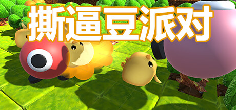
  • Genre Clarity: 7/10 — Casual party game evident. Bright, playful anthropomorphic characters with exaggerated features and colorful landscape immediately signal a family-friendly casual game. The whimsical art style and cute protagonist with large eyes clearly communicate party/mini-game genre at full size, though at TINY size the character details blur slightly, reducing genre specificity to just 'cute casual' rather than 'party game.'
  • Title Readability: 4/10 — Title unreadable at small sizes. The Chinese text (撕逼豆派对) is rendered in a clean white outline font centered over the yellow character, which reads adequately at full header size. However, at SMALL (231×87) and TINY (120×45) sizes, the characters collapse into illegible blur due to font weight, character density, and lack of sufficient contrast buffer around individual glyphs against the busy background.
  • Contrast & Color: 8/10 — Strong vibrant palette, excellent pop. Neon lime-green foliage and bright yellow-green platform create exceptional value separation against Steam's dark background, while the red character orb and warm yellow glow provide clear focal warmth. Even at TINY size, the silhouette of the red character and green environment maintain strong separation in grayscale, though mid-tone shadows in the landscape reduce overall clarity slightly.
  • Uniqueness & Polish: 6/10 — Competent but visually generic. The 3D rendered cute character and colorful garden setting feel well-executed and polished, but closely mirrors the aesthetic of established casual indie titles like Minami Lane or Moonstone Island without a distinctive visual hook. The art is clean and professional, but lacks a memorable signature style or unique mechanic visual that would distinguish it from competitors in the party game space.
  • Brand Consistency: 5/10 — Limited internal identity signals. The capsule features a single character design with bright eyes and red coloring, but provides no recurring visual motif, icon, or signature palette that would anchor brand recognition across different game assets. Without reference to other store screenshots, the capsule reads as a generic cute-character party game rather than establishing a distinctive identity; the title text offers no visual branding leverage either.
  • Composition: 7/10 — Clear focal point, adequate balance. The red character orb anchors the left-center area while the title overlays it with warm yellow, creating a natural focal hierarchy that guides the eye. The pink sphere on the right provides balance without competing for attention, and the lush green environment grounds the scene; however, the title placement directly over the character reduces legibility at small sizes and the composition feels slightly crowded in the horizontal center.

What works

  • Vibrant color contrast against dark background. Neon greens, bright yellows, and red character create immediate visual pop and strong separation from Steam's #1b2838 background.
  • Clear character-focused focal point. Red orb protagonist with exaggerated eyes is immediately recognizable and draws attention naturally without requiring text to understand cuteness appeal.
  • Polished 3D rendering quality. Clean asset modeling, soft shadow work, and cohesive lighting demonstrate professional production values appropriate for indie market.

What hurts the capsule

  • Chinese title illegible at TINY size. Dense character glyphs and small font weight cause text to blur completely at 120×45 resolution, eliminating title recognition during quick scroll.
  • Generic visual identity without distinction. Cute garden scene with colorful creatures lacks a unique selling point visual or signature art style that differentiates it from similar casual party games.
  • No recognizable brand motif or icon. Single character appearance with no recurring symbol, palette signature, or visual shorthand that could build recognition across marketing materials.
  • Title placement obscures character detail. White text directly overlaid on red orb reduces character clarity and creates compositional conflict between character and title hierarchy.

Priority fixes

  1. [title_readability] Move Chinese title above or below character to dedicated text area with darker background bar to ensure legibility at SMALL and TINY sizes without competing with the focal character
  2. [brand_consistency] Develop a visual icon or recurring motif (e.g., distinctive character mark, party-specific symbol) that can appear consistently across capsules and store assets to build brand recognition
  3. [uniqueness_polish] Add a secondary visual element that communicates the multi-player party game mechanic specifically (e.g., silhouettes of multiple characters, game controller icons, or numbered mini-game hint) to distinguish from single-player casual titles

Store copy priority fixes

  1. [hook_strength] Replace the opening line with an action-oriented hook that leads with the social fun: 'Grab up to 3 friends and compete in fast-paced mini-games on one screen—chaotic laughter guaranteed.' instead of 'This is a multi player party game...'
  2. [feature_communication] Add 1-2 sentence descriptions of each completed mini-game that explain what players do and what makes it fun: e.g., 'Eagle Catching Chicken: A tag-style game where one player hunts while others flee and protect each other.' for each of the four current games.
  3. [uniqueness] Add a paragraph that explains what makes this game distinct: e.g., 'Unlike [competitor], [feature unique to this game]' or highlight specific design choices (art style, game philosophy, planned scope) that differentiate it from other party games.
  4. [tone_match] Rewrite the detailed description in a casual, playful voice that matches the cartoon aesthetic and party game energy, e.g., 'Chaos. Betrayal. Laughter. Grab your crew and jump into 4 wild mini-games designed for maximum couch mayhem.'

Related guides

Steam app ID: 2053920 · Tags: Casual, Cartoon, 3D, 4 Player Local, Local Multiplayer