Scoring genre clarity...

Nova Antarctica capsule

Nova Antarctica

Survive Earth’s harshest conditions on a devastatingly beautiful journey shaped by the choices you make, the paths you take, and the stories you weave with the mysterious animals of Antarctica.

$24.99Positive(11)
CuteSurvivalAdventure
RexLabo, PARCO GAMESJan 28, 2026

Nova Antarctica scores 68/100 — better than 17% of Cute capsules (n=4,529).

Positive (11 reviews) · $24.99 · Released Jan 28, 2026 · By RexLabo

Quick text summary

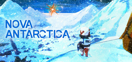
Nova Antarctica scored 68/100 on Steam Analyzer — Solid for a Cute capsule. Top priority fix: [genre_clarity] Feature the character larger and centered with one or more of the mysterious animals visible in the frame to immediately communicate the human-animal narrative core.

Capsule scores by dimension

  • Genre Clarity: 7/10 — Adventure setting clear, gameplay ambiguous. The icy Antarctic landscape, sparse vegetation, and a character figure with equipment establish an outdoor adventure tone. However, at tiny size the visual reads more as scenic exploration than action-survival, and the mysterious animal reference is not visually prominent enough to clarify the narrative-choice mechanic core to the game. The starfish icon and overall composition suggest environmental discovery rather than the survival stakes advertised.
  • Title Readability: 8/10 — Bold, readable title with solid placement. NOVA ANTARCTICA is rendered in clean, large sans-serif blue typography positioned in the left third of the composition against a relatively clear sky region. The text remains legible at small and tiny sizes due to high contrast against the lighter background. Minor weakness: no supporting tagline or subtitle is readable at tiny size, so narrative context is lost below full view.
  • Contrast & Color: 8/10 — Strong light-dark separation, cool palette cohesion. The blue title pops clearly against the light cyan and white ice layers, creating distinct value separation readable at all sizes. The warm orange starfish and brown rock provide subtle accent contrast without overwhelming. In grayscale the silhouettes remain clean and separated, though the mid-tone ice formations could be slightly richer to avoid flatness; this works well enough against the dark Steam background.
  • Uniqueness & Polish: 6/10 — Competent scenic composition, lacks distinctive hook. The artwork is technically sound with layered ice formations, atmospheric lighting, and a recognizable character pose suggesting exploration. However, the visual treatment feels like a polished nature photograph or travel poster rather than a distinctive game identity—it does not communicate the choice-driven narrative or mysterious animal mechanic that differentiates Nova Antarctica from other survival-adventure games. The starfish is interesting but underutilized as a brand signal.
  • Brand Consistency: 5/10 — Generic Antarctic aesthetic, weak identity cues. The capsule relies on typical ice-world iconography (frozen landscape, snow, aurora) without establishing a recognizable visual signature. The starfish is visually unique but appears isolated and unexplained; it does not yet function as a memorable brand motif. Without access to other materials the capsule does not broadcast a distinctive visual language that would carry recognition across marketing materials.
  • Composition: 7/10 — Balanced layers, slightly unfocused subject hierarchy. The composition uses effective depth with a starry sky backdrop, ice cliff midground, and character figure in the right-center foreground, creating visual layering. Title occupies safe left margin and remains in frame across sizes. Weakness: the character is small and lacks visual dominance compared to the landscape; at tiny size the focal point diffuses across the entire scene rather than anchoring on a single element, reducing immediate impact during quick scroll.

What works

  • Title legibility across sizes. Bold blue NOVA ANTARCTICA text remains clear and readable from full header down to tiny thumbnail due to strategic left placement and high contrast against light sky.
  • Atmospheric layering and depth. The composition effectively uses sky, ice formations, and foreground character to create visual hierarchy and a sense of vast, beautiful isolation that matches the game's premise.
  • Color palette cohesion. Cool blues and whites dominate with warm orange accent from the starfish, creating a balanced and thematically appropriate cool-world aesthetic.

What hurts the capsule

  • Weak character focal point. The character figure is too small and visually subordinate to the landscape, causing the eye to scatter across the entire scene rather than settling on a clear primary subject at small and tiny sizes.
  • Generic survival-adventure cliché. The image reads as a standard icy-world exploration scene with no distinctive visual hook that signals the choice-driven narrative or mysterious animal interaction mechanics that differentiate the game.
  • Underutilized starfish symbol. The starfish is visually intriguing but disconnected and unexplained within the composition, missing an opportunity to establish a memorable and recognizable brand identity cue.
  • No gameplay clarity at tiny size. The capsule communicates scenic beauty but fails to hint at survival mechanics, choice systems, or animal interaction that are core to the game's unique selling point.

Priority fixes

  1. [genre_clarity] Feature the character larger and centered with one or more of the mysterious animals visible in the frame to immediately communicate the human-animal narrative core.
  2. [uniqueness_polish] Integrate the starfish as a larger, more prominent and recurring visual motif that anchors the brand identity and hints at the game's supernatural or fantastical element.
  3. [composition] Rebalance the focal point hierarchy so that the character or animal becomes the primary visual anchor rather than the landscape, ensuring impact at small and tiny sizes.
  4. [brand_consistency] Establish a distinctive visual treatment (lighting, color accent, or iconic object) that differentiates Nova Antarctica from generic Antarctic travel imagery and becomes recognizable across marketing.

Store copy priority fixes

  1. [feature_communication] Add 2–3 sentences in the GAME SYSTEM section immediately explaining how animals function in gameplay: Do they provide resources? Companionship? Puzzle mechanics? This resolves the unfulfilled promise from the short description and clarifies the game's unique identity.
  2. [hook_strength] In the GAME SYSTEM intro, replace the generic 'traverse each area' with a specific mechanic or example from animal interaction or landmark discovery to reinforce the 'stories you weave' hook and maintain narrative momentum.
  3. [tone_match] Condense the STORY section to 4–5 sentences focusing on emotional stakes (humanity's survival) rather than exposition (viruses, wars, resources), then weave atmospheric danger language into the hazard descriptions to maintain immersion throughout.
  4. [feature_communication] Add a brief progression or milestone section explaining how many hours, regions, or story beats players encounter, so audience understands the game's scope and pacing expectations.

Related guides

Steam app ID: 2054310 · Tags: Cute, Survival, Adventure, Exploration, Atmospheric