Scoring genre clarity...

Dragon's Dogma 2 capsule

Dragon's Dogma 2

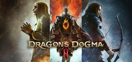
Dragon’s Dogma 2 is a single player, narrative driven action-RPG that challenges the players to choose their own experience – from the appearance of their Arisen, their vocation, their party, how to approach different situations and more - in a truly immersive fantasy world.

$39.99Mixed(582)
Open WorldRPGAction RPG
CAPCOM Co., Ltd.Mar 21, 2024

Dragon's Dogma 2 scores 83/100 — better than 95% of Open World capsules (n=1,551).

Mixed (582 reviews) · $39.99 · Released Mar 21, 2024 · By CAPCOM Co., Ltd.

Quick text summary

Dragon's Dogma 2 scored 83/100 on Steam Analyzer — Good for a Open World capsule. Top priority fix: [contrast_color] Increase the edge separation of the left robed character by darkening the immediate background behind them to improve silhouette clarity at small and tiny sizes

Capsule scores by dimension

  • Genre Clarity: 9/10 — Dark fantasy action RPG clear. Three distinct fantasy character archetypes are immediately visible: a robed spellcaster on the left, a heavily armored warrior in the center with a dramatic fire ring, and an archer on the right. The combination of medieval fantasy armor, a glowing magical emblem, and ranged weaponry clearly signals action-RPG with class variety. At tiny size the central armored figure with fire glow still communicates dark fantasy combat effectively.
  • Title Readability: 8/10 — Bold logo reads well at small. The Dragon's Dogma II logo uses a large serif-style display font in gold with a deep red drop shadow and a dragon emblem above it, placed centrally on a darker mid-ground area that provides controlled contrast. At full size it reads crisply and the dragon icon is recognizable. At tiny size the title compresses but the bold letterforms and strong value contrast against the darker lower portion keep it legible, though the roman numeral II and dragon icon become very small and harder to distinguish.
  • Contrast & Color: 8/10 — Strong value range, warm fire anchor. The central warrior's fiery ring creates a warm orange anchor point that contrasts sharply against the darker background and Steam's dark UI color, giving the image strong pop. The triptych panel structure creates natural value separation between the cooler blue-toned right panel, the warm left panel, and the fiery center. In a mental grayscale test the three figures still separate cleanly from their respective backgrounds, though the left robed character has slightly less separation due to the similarly light warm tones.
  • Uniqueness & Polish: 8/10 — Premium triptych, distinctive craft. The three-panel triptych layout is a deliberate and polished artistic choice that communicates class variety without feeling cluttered, giving it a distinctive identity compared to typical single-hero capsules in the genre. The production quality of the renders and the cohesive dark fantasy atmosphere are clearly AAA-tier. Compared to benchmark titles like God of War Ragnarök or Black Myth: Wukong, the composition feels slightly more static with less dynamic energy, but the multi-character storytelling approach is a clear and intentional brand choice.
  • Brand Consistency: 9/10 — Cohesive Capcom dark fantasy identity. The dragon emblem above the title logo, the warm ember and fire particle effects, and the dark high-fantasy aesthetic form a consistent visual identity that aligns strongly with the Dragon's Dogma franchise. The color palette of deep blacks, warm ambers, and cool steel blues is internally cohesive across all three panels. The logo treatment with the serpentine dragon icon is a recognizable motif that would be recalled on repeat viewings, and the multi-vocation showcase communicates a signature franchise hook.
  • Composition: 8/10 — Balanced triptych with clear hierarchy. The triptych panels create a clear left-center-right structure with the dominant armored warrior centered and slightly larger, establishing a primary focal point, while the flanking characters provide supporting context without competing for attention. The title logo sits naturally in the lower center third, anchored against the darker mid-ground region of the central figure. At small and tiny sizes the composition compresses well and the central fire-lit warrior remains the dominant read, though the two flanking characters become less distinct and the logo loses some detail.

What works

  • Central fire anchor. The glowing fire ring around the center warrior creates an immediate high-contrast focal point that draws the eye even at tiny thumbnail size.
  • Class variety storytelling. The three-character triptych communicates RPG class choice as a core feature without needing any text beyond the title.
  • Strong title placement. The logo is positioned on a naturally darkened region of the composition, providing controlled contrast that keeps it readable at small sizes.
  • Premium dark fantasy atmosphere. The combination of particle effects, dramatic lighting, and high-fidelity character renders clearly signals a AAA production budget.

What hurts the capsule

  • Left character contrast weakness. The robed character on the left shares similar warm light tones with the background, reducing silhouette separation in grayscale and at tiny size.
  • Dragon icon and numeral collapse at tiny. The dragon emblem above the logo and the Roman numeral II become nearly indistinguishable at 120x45 pixels, weakening the secondary brand signal.
  • Relatively static energy. Compared to top benchmark capsules like Black Myth: Wukong or God of War Ragnarök, the three figures have limited dynamic pose energy, making the image feel more like a character roster than an action moment.
  • Panel seams add visual noise. The subtle vertical seams between the three triptych panels introduce minor visual fragmentation that adds complexity at small sizes without adding clarity.

Priority fixes

  1. [contrast_color] Increase the edge separation of the left robed character by darkening the immediate background behind them to improve silhouette clarity at small and tiny sizes
  2. [title_readability] Slightly increase the size and weight of the dragon emblem above the logo so it remains readable as a brand icon at small capsule sizes
  3. [composition] Introduce a subtle motion or action element to at least one of the flanking characters to increase perceived dynamic energy compared to benchmark genre titles
  4. [uniqueness_polish] Consider adding a thin luminous border or vignette to the central panel to further reinforce the hierarchy between the primary warrior and the supporting characters at tiny size

Store copy priority fixes

  1. [feature_communication] Restructure the detailed description to lead with 'About the Game' content immediately, moving the Deluxe Edition bundle list below the fold or to a separate section.
  2. [hook_strength] Rewrite the opening 'Set forth on your grand adventure, Arisen!' to highlight a specific high-stakes scenario: 'Rise as the Arisen and face an age of dragons in a world that reacts to your choices' to add urgency and specificity.
  3. [uniqueness] Replace 'so unique you will feel as if accompanied by other players' with concrete Pawn mechanics: 'Recruit up to 3 customizable Pawns—one entirely yours, two borrowed from other players' worlds—creating a dynamic party without traditional multiplayer.'
  4. [audience_targeting] Add a sentence signaling difficulty or progression style, such as 'Master multiple vocations and tackle challenges solo or with your customized party' to clarify whether this appeals to hardcore action fans or narrative explorers.

Related guides

Steam app ID: 2054970 · Tags: Open World, RPG, Action RPG, Fantasy, Singleplayer