Scoring genre clarity...
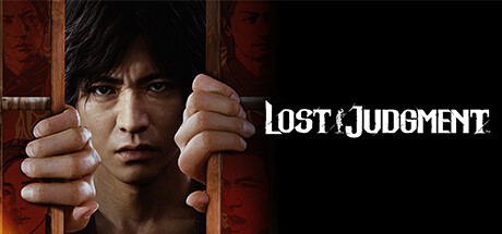
Lost Judgment capsule

Lost Judgment

In this action-adventure thriller, detective Takayuki Yagami goes undercover to unravel a string of twisted crimes at a high school in Yokohama, Japan. Crack the case and some skulls with brutal combat featuring three unique fighting styles and an arsenal of private eye tricks.

39,99€Overwhelmingly Positive(100)
ActionAdventureBeat 'em up
RGG Studio14 Sep, 2022

Lost Judgment scores 83/100 — better than 95% of Action capsules (n=9,722).

Overwhelmingly Positive (100 reviews) · 39,99€ · Released 14 Sep, 2022 · By RGG Studio

Quick text summary

Lost Judgment scored 83/100 on Steam Analyzer — Good for a Action capsule. Top priority fix: [genre_clarity] Add subtle visual element hinting at the three combat fighting styles (e.g., martial arts pose or stylized fist detail) to communicate action gameplay alongside the detective narrative.

Capsule scores by dimension

  • Genre Clarity: 8/10 — Crime thriller detective action clear. The central character's intense, determined expression combined with prison bars and the gritty red-orange palette immediately signal crime/detective noir. At tiny size, the silhouette of a face behind bars and the aggressive hand positioning on the bars remain readable enough to suggest investigation and confinement. The genre reads as action-crime-thriller without ambiguity.
  • Title Readability: 9/10 — Bold, distinctive, readable at all sizes. LOST JUDGMENT uses a strong, high-contrast white serif font with intentional distressing and a black outline that stands out sharply against the dark background. At small and tiny sizes, the title maintains excellent legibility and does not collapse, remaining recognizable even when scrolling. The strategic placement at top center over a controlled background area maximizes clarity.
  • Contrast & Color: 9/10 — Excellent silhouette, warm vibrant palette. The centered character's face and hands create a clear, high-contrast silhouette against the red-orange gradient background that pops distinctly against the Steam dark background #1b2838. Warm orange and red tones in the lighting and background create strong value separation; even in grayscale, the face and hands remain well-defined from surrounding elements. Prison bar geometry adds linear contrast that reinforces the silhouette.
  • Uniqueness & Polish: 8/10 — Distinctive character focus, premium execution. This capsule stands apart from typical action-game covers through its intimate, close-up character portrait combined with the specific prison bar framing that hints at the narrative tension and investigation themes. The high-quality photo realistic rendering of the protagonist and the deliberate color grading (warm oranges, strategic shadows) communicate a mature, story-driven experience rather than generic action spectacle. The visual storytelling clearly signals detective noir rather than pure combat focus.
  • Brand Consistency: 8/10 — Strong protagonist identity, cohesive style. The capsule centers on protagonist Takayuki Yagami's recognizable face and expression, creating an iconic anchor that aligns with the character-driven detective narrative. The red-orange color palette, gritty realism, and prison framing are consistent visual identity markers that would be recognizable across marketing materials. The grounded, photo-realistic rendering style maintains coherence with the game's mature crime-thriller positioning.
  • Composition: 8/10 — Clear focal point, balanced hierarchy. The composition uses strong central focus with the character's face and hands on the bars commanding primary attention, while the repeated faces in the background provide supporting depth without competing for focus. The title placement at top maintains safe margins and does not interfere with the main subject. At tiny size, the core silhouette of face-and-hands-on-bars remains instantly readable, and edge cropping poses minimal risk to key elements.

What works

  • Iconic protagonist framing. The close-up, emotionally intense character portrait with direct eye contact creates immediate viewer connection and clearly signals this is a character-driven narrative experience.
  • Prison bar visual metaphor. The bars effectively communicate confinement, investigation stakes, and the tension of going undercover without requiring text explanation.
  • Strong warm color palette. The red-orange gradient creates premium, cinematic mood and pops distinctly against Steam's dark interface in both full and thumbnail sizes.
  • Excellent title contrast and readability. White serif font with black outline maintains clarity at all viewing sizes and does not collapse or blur when scaled down.

What hurts the capsule

  • Genre action element underplayed. While the detective/crime aspect reads clearly, the combat and action gameplay are not visually suggested; viewers may not immediately recognize the three fighting styles as a core selling point.
  • Repetitive background faces lack narrative clarity. The red-tinted repeated faces in the background add visual depth but do not clearly communicate whether they represent suspects, victims, or school setting context.
  • High school setting not visually evident. The capsule emphasizes prison and detective elements but does not visually communicate the Yokohama high school setting that is central to the story hook.

Priority fixes

  1. [genre_clarity] Add subtle visual element hinting at the three combat fighting styles (e.g., martial arts pose or stylized fist detail) to communicate action gameplay alongside the detective narrative.
  2. [composition] Clarify background face context with environmental cues or subtle typography indicating 'suspects' or 'school' to anchor the setting and narrative frame.
  3. [brand_consistency] Ensure character expression and color palette remain consistent across all promotional materials and store screenshots for stronger brand recall.

Store copy priority fixes

  1. [uniqueness] Replace 'a story like none other' with a specific claim about what Lost Judgment does differently (e.g., 'the only detective thriller where your choice of justice or vengeance directly shapes the ending' or 'combines three martial arts styles with real-time drone surveillance for unprecedented tactical investigation options').
  2. [audience_targeting] Add one sentence clarifying the intended player: 'Perfect for action fans who crave story depth' or 'For players who want detective intrigue with satisfying hand-to-hand combat' to help self-selection.
  3. [tone_match] Recalibrate the DEEP UNDERCOVER section to reinforce the thriller tone: replace 'have some fun along the way' with language that ties leisure activities to investigation cover (e.g., 'Go undercover as a high school club advisor—each activity is cover for deeper investigation').

Related guides

Steam app ID: 2058190 · Tags: Action, Adventure, Beat 'em up, Action-Adventure, 3D Fighter