Scoring genre clarity...
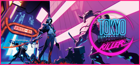
Dive into the neon-drenched deep underground of Tokyo as Kobayashi, a deadly assassin who harnesses the power of blood energy. Use your sword, mystical abilities and powerful weapons to assassinate highly dangerous maniacs and stop the invasion of the brutal Flatliners terrorizing Tokyo.
$9.99Mostly Positive(51)
ActionShooter3D
Phoenix Game ProductionsSep 4, 2025