Scoring genre clarity...

The Obsessive Shadow capsule

The Obsessive Shadow

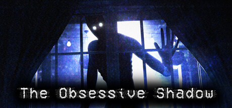
The Obsessive Shadow is a Survival Horror Game about a stalker you can't exactly Identify. With nothing but your eyes and a flashlight at your disposal, it's up to you to survive whatever horrific person or thing is out there watching you...

$4.99Mostly Positive(10)
ExplorationAction-AdventureStrategy
Pablo HeckmanMar 19, 2025

The Obsessive Shadow scores 62/100 — better than 3% of Exploration capsules (n=4,872).

Mostly Positive (10 reviews) · $4.99 · Released Mar 19, 2025 · By Pablo Heckman

Quick text summary

The Obsessive Shadow scored 62/100 on Steam Analyzer — Solid for a Exploration capsule. Top priority fix: [title_readability] Increase title letter spacing and weight or add a subtle outline/glow to maintain legibility at TINY thumbnail scale without sacrificing the monospace aesthetic.

Capsule scores by dimension

  • Genre Clarity: 7/10 — Horror stalker threat clear. The silhouetted figure pressed against a window with blue institutional lighting immediately signals survival horror and surveillance dread. At TINY size, the menacing pose and confined space still convey threat, though the specific 'stalker' mechanic becomes less obvious without gameplay UI context. The claustrophobic window framing works well to suggest the core fear premise.
  • Title Readability: 5/10 — Text legible full, struggles tiny. At full header size, 'The Obsessive Shadow' reads clearly in plain monospace font with adequate white contrast against the dark background. However, at TINY thumbnail size (120x45), the letterforms compress and thin, making the complete title difficult to parse in quick-scroll conditions; individual words may blur together. The font choice is functional but not optimized for small-scale legibility.
  • Contrast & Color: 7/10 — Strong value separation works. The bright window panes and silhouetted figure create clear light-dark contrast against the #1b2838 Steam background, with the blue institutional lighting providing saturated separation. The figure's dark outline pops well in grayscale thanks to strong value difference between shadow and bright backlight. At SMALL size this contrast holds, though fine window grid details soften.
  • Uniqueness & Polish: 6/10 — Competent horror framing, generic execution. The window peering mechanic is thematically appropriate for a stalker survival horror game and the composition is intentional. However, the image reads as a standard 'silhouette at window' trope common in horror media; there are no distinctive art flourishes, signature effects, or visual hook that signals a unique indie identity or memorable selling point. Craft is clean but not memorable.
  • Brand Consistency: 5/10 — Limited identity, consistent but forgettable. The cool blue institutional aesthetic and silhouette figure are internally coherent, suggesting a clinical or confined-space horror setting consistent with the stalker premise. However, without character design, distinctive color palette variations, or recurring visual motifs from the referenced 5 store screenshots, there is no memorable brand icon or signature element that would make this capsule recognizable on repeat viewings. The look is competent but generic to survival horror.
  • Composition: 7/10 — Strong focal point, balanced depth. The window and figure occupy clear center-to-upper-mid composition with strong foreground-to-background layering: dark frame, bright window panes, and silhouetted figure create depth hierarchy. Title placement at bottom left avoids the subject and maintains safe margins. At SMALL and TINY sizes the focal point remains unambiguous and the composition does not collapse, though title compression at TINY slightly weakens hierarchy.

What works

  • Clear horror focal point. The silhouetted figure at the window is unambiguous and threatening, reading clearly even at TINY size to signal genre intent.
  • Strong contrast separation. Blue backlit window and dark silhouette create excellent light-dark value separation that pops against the Steam dark background in both color and grayscale.
  • Intentional composition depth. Layered window frame, backlighting, and figure create a cohesive sense of threat and confinement without clutter.

What hurts the capsule

  • Title compresses at TINY scale. Monospace font thins and letterforms blur when scaled to 120x45, compromising quick-scroll readability despite adequate contrast.
  • Generic horror trope execution. Silhouette-at-window is a well-worn horror cliché with no distinctive visual hook or unique art style that differentiates this indie title.
  • No memorable brand identity. Lacks signature character, color palette, symbol, or recurring motif that would make the capsule recognizable beyond the genre archetype.

Priority fixes

  1. [title_readability] Increase title letter spacing and weight or add a subtle outline/glow to maintain legibility at TINY thumbnail scale without sacrificing the monospace aesthetic.
  2. [uniqueness_polish] Introduce a distinctive visual signature—such as a signature color accent, unique UI element, or stylized figure detail—that differentiates this from generic horror stalker tropes and signals indie identity.
  3. [brand_consistency] Develop and apply a recognizable color or design motif (e.g., a signature glow effect, recurring symbol, or palette variation) that creates a memorable brand icon for future marketing materials.

Store copy priority fixes

  1. [feature_communication] Replace 'rely on your eyes, ears, and pure instinct' with a concrete example: 'Listen for footsteps in the darkness. Watch shadows move across walls. Make split-second decisions about when to hide or run.' This transforms vague survival into actionable moments.
  2. [uniqueness] Add a sentence that differentiates the core mechanic: 'Unlike traditional horror games, the rules change every hour—what kept you safe may now expose you, forcing constant adaptation.' This articulates what is strategically unique.
  3. [audience_targeting] Specify expected playtime and accessibility: 'A focused 2-3 hour experience designed for solo players who crave psychological tension over combat.' This clarifies who this is for without jargon.
  4. [genre_clarity] Include explicit mention of VR as a mode: 'Fully playable in VR or standard first-person view, with tracked controller support for immersive horror.' This leverages a category advantage in the copy itself.

Related guides

Steam app ID: 2074360 · Tags: Exploration, Action-Adventure, Strategy, 3D, First-Person