Scoring genre clarity...
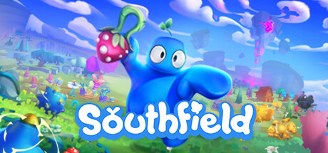
Southfield capsule

Southfield

Weird farming meets silly physics in Southfield! Combine chaotic crops with unpredictable effects, build your dream farmstead, and experiment with playful machinery. Wobble your way around an ever-changing island and unearth its secrets.

Early AccessFarming SimSandbox
Radical ForgeComing soon

Southfield scores 85/100 — better than 98% of Early Access capsules (n=3,632).

Released Coming soon · By Radical Forge

Quick text summary

Southfield scored 85/100 on Steam Analyzer — Excellent for a Early Access capsule. Top priority fix: [composition] Ensure background foliage and small elements remain visually distinct at 120×45px by increasing silhouette contrast or simplifying mid-ground detail density.

Capsule scores by dimension

  • Genre Clarity: 8/10 — Whimsical casual farming adventure clear. The bright blue character, vibrant crops, colorful landscape, and playful tone immediately signal a casual farming game with a quirky personality. At TINY size, the oversized blue creature and farm setting remain recognizable, though fine details like the magical effects blur into abstract color zones. The visual language clearly communicates 'cozy farming adventure' rather than simulation or strategy.
  • Title Readability: 9/10 — Bold white title excellent all sizes. The title 'Southfield' uses a thick, friendly white sans-serif font with a subtle outline that sits prominently in the lower-center region against a controlled blue-to-green gradient backdrop. The letterforms remain entirely readable at SMALL (231×87) and TINY (120×45) sizes due to clean spacing and strong value contrast. No supporting tagline competes, keeping the focus sharp and the brand name unmistakable.
  • Contrast & Color: 9/10 — Vibrant saturation pops on dark background. The neon blue character, hot pink flower/creature, acid green plants, and bright yellow accents create excellent separation against the steam dark background and the softer sky gradient. The color palette uses highly saturated primaries and complementary hues that maintain silhouette clarity even in grayscale squint tests. At TINY size the blue mass and pink/green details still read as distinct focal elements with no muddy blending.
  • Uniqueness & Polish: 8/10 — Distinctive art style with playful identity. The 3D art style features a bold, approachable aesthetic with soft forms, rounded proportions, and exaggerated character design that feels handcrafted rather than templated. The quirky blue protagonist holding a mushroom-like object immediately communicates a unique sense of humor and mechanical experimentation. The overall craft suggests intentional direction and a memorable visual hook beyond generic farming game tropes.
  • Brand Consistency: 8/10 — Coherent colorful world with visual identity. The warm saturated palette, soft 3D modeling, whimsical character proportions, and cheerful tone create a recognizable internal brand language that should carry across store screenshots. The blue character serves as an iconic symbol paired consistently with the vibrant, playful environment. Rendering style and art direction appear unified and intentional, establishing a memorable identity distinct from competitor casual games.
  • Composition: 9/10 — Clear focal hierarchy excellent at tiny sizes. The composition features a strong primary focal point: the large blue character slightly left of center, anchored by the title below in the lower third. The flower/creature in its hand and scattered background elements guide attention without competing, while the landscape depth creates natural layering that reads at SMALL and TINY scales. The title placement and safe margins protect key elements from Steam crop hazards, and the layout balances the character weight with breathing room on the right.

What works

  • Title remains readable at all sizes. White bold sans-serif on gradient background with clean letterforms maintains legibility even at 120×45px tiny thumbnail.
  • Vibrant color palette stands out on dark background. Neon blues, hot pinks, and acid greens create strong value and saturation separation that pops against Steam's dark UI without muddy blending.
  • Clear primary focal point with strong hierarchy. The large blue character immediately draws the eye as the dominant subject, with supporting elements like the flower and landscape reinforcing rather than competing.
  • Distinctive art direction signals unique appeal. Soft 3D rendering, exaggerated character proportions, and playful design communicate a memorable identity that differentiates from generic farming simulators.

What hurts the capsule

  • Fine details obscure at very small sizes. The intricate cloud shapes, small background structures, and delicate plant textures blur into undifferentiated color zones at TINY scale, reducing environmental storytelling impact.
  • Pink flower creature lacks immediate clarity. The pink object in the character's hand reads as vaguely organic but its specific function (crop, tool, effect) is ambiguous without larger context, reducing mechanical communication.
  • Color saturation could feel overwhelming to some players. While vibrant colors pop effectively, the sheer density of neon hues may read as chaotic rather than cohesive to players preferring subdued or pastel aesthetics.

Priority fixes

  1. [composition] Ensure background foliage and small elements remain visually distinct at 120×45px by increasing silhouette contrast or simplifying mid-ground detail density.
  2. [genre_clarity] Add a subtle UI element or iconic farm tool visible at TINY size to reinforce the farming mechanic beyond environmental cues alone.
  3. [contrast_color] Test grayscale rendering to confirm the pink flower and blue character maintain separation without relying solely on hue; adjust value if needed.

Store copy priority fixes

  1. [genre_clarity] Add a single sentence explicitly acknowledging Early Access status and what that means for content scope, e.g., 'This Early Access build focuses on farming and building systems with seasonal events and Ruffian mechanics in active development.'
  2. [feature_communication] Expand the automation paragraph with 1-2 concrete examples of automation chains or recipes, e.g., 'Link air cannons to crop sensors to launch ripe harvests directly into storage, or stack trampolines to create gravity-defying conveyor systems.'
  3. [audience_targeting] Clarify tone expectations around Ruffian defense: add a sentence like 'Defend your farm and crops from spectral chaos, but there's no pressure—pause anytime and shift focus back to building and farming at your own pace.' This reassures cozy-game seekers.
  4. [uniqueness] Close the detailed description with a single differentiator sentence: 'Only in Southfield can you harvest crops that levitate, combine them into wholly new species, and use the same physics tools to build entire contraptions—all at your own silly pace.'

Related guides

Steam app ID: 2076210 · Tags: Early Access, Farming Sim, Sandbox, Open World Survival Craft, Wholesome