Scoring genre clarity...

Stick It to the Stickman capsule

Stick It to the Stickman

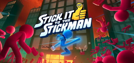
Stick it to the Stickman is a physics-based brawler where you fight heaps of red stickmen to become the boss. Choose from hundreds of unique moves to construct the perfect combat machine and fight your way to the top of the corporate ladder.

$6.99Overwhelmingly Positive(361)
Early AccessActionBeat 'em up
Free LivesAug 18, 2025

Stick It to the Stickman scores 70/100 — better than 26% of Early Access capsules (n=3,067).

Overwhelmingly Positive (361 reviews) · $6.99 · Released Aug 18, 2025 · By Free Lives

Quick text summary

Stick It to the Stickman scored 70/100 on Steam Analyzer — Good for a Early Access capsule. Top priority fix: [uniqueness_polish] Integrate a distinctive visual that communicates the physics-based move construction mechanic—such as a stickman mid-transformation or customization UI hint—rather than relying on generic action scenery.

Capsule scores by dimension

  • Genre Clarity: 7/10 — Action brawler with physics clarity. The blue and red stickman silhouettes in dynamic combat poses immediately communicate action gameplay, and the emphasis on multiple colorful stick figures suggests multiplayer or crowd-fighting mechanics. At tiny size, the stickman iconography and motion lines remain recognizable, though the specific physics-based brawler subgenre is less obvious without the title context; the visuals could suggest a generic action game rather than a physics-focused mechanic showcase.
  • Title Readability: 8/10 — Bold white title with solid contrast. The white 'STICK IT TO THE STICKMAN' text uses a clean, bold sans-serif with strong outline separation and sits against a dark background with visual breathing room. The title remains readable at small size due to letter weight and spacing, though at tiny size the full text compresses slightly but the key words remain distinguishable; the yellow 'FOREIGN MANUFACTURING' subtitle below adds context but drops to lower legibility at reduction.
  • Contrast & Color: 8/10 — Vibrant neon palette with clean separation. The electric blue center orb, bright red stickmen, and green foliage create strong value separation against the dark Steam background, with saturated neon tones that pop even under quick scroll. In grayscale the blue orb and red figures maintain distinct mid-to-light tones that silhouette cleanly; the yellow thumbs-up character adds a warm accent that further isolates the composition and prevents muddy blending.
  • Uniqueness & Polish: 6/10 — Competent execution, generic theme treatment. The stickman fighting game theme is executed with solid technical polish—clean particle effects, readable character designs, and intentional color hierarchy—but the overall concept is a recognizable indie archetype with limited visual differentiation from other stick-figure action games. The yellow mascot character with thumbs-up feels like a forced personality layer rather than an organic brand element, and the capsule communicates 'action game' more than a unique core mechanic or distinctive hook.
  • Brand Consistency: 6/10 — Limited identity signals, bright palette. The composition establishes a bright neon color palette (electric blue, red, yellow, green) and stickman character designs that should carry across marketing materials, but the yellow mascot character lacks strong iconic resonance and could be easily replaced with another generic mascot. The visual style feels more like a functional game asset set than a cohesive brand identity with memorable motifs or signature elements that would aid recognition in a crowded storefront.
  • Composition: 7/10 — Clear hierarchy, slight mascot placement issue. The blue orb and red stickmen form a dynamic layered composition with strong focal depth—the center action reads first, the title overlays clearly with breathing room, and the green foliage frames the sides. At small and tiny sizes the main action cluster holds attention well, but the yellow mascot in the top right sits too close to the edge and risks partial cropping or feeling disconnected from the primary action; the bottom subtitle creates secondary focus that competes slightly with overall hierarchy.

What works

  • Strong neon color contrast. Electric blue, bright red, and yellow elements create vibrant separation against the dark Steam background and remain visually distinct even at tiny sizes.
  • Clear title legibility and placement. Bold white sans-serif text with confident outline sits in a controlled region with dark support, maintaining readability across full and small viewing modes.
  • Action-forward visual communication. Dynamic stickman poses and motion lines immediately signal action gameplay, making genre intent clear within the first glance at any size.

What hurts the capsule

  • Weak brand identity. The yellow mascot character and overall visual treatment feel generic for the stick-figure action genre without memorable signature design elements.
  • Generic concept presentation. The capsule communicates 'action brawler' but does not visually convey the unique physics-based mechanic or move-construction system that differentiates the game from similar titles.
  • Mascot composition risk. The yellow thumbs-up character positioned in the top right corner sits dangerously close to the edge and may be cropped or feel isolated from the primary action at some viewing sizes.

Priority fixes

  1. [uniqueness_polish] Integrate a distinctive visual that communicates the physics-based move construction mechanic—such as a stickman mid-transformation or customization UI hint—rather than relying on generic action scenery.
  2. [brand_consistency] Develop or refine a signature iconographic element (character design, motion effect, or color motif) that creates stronger recall and differentiates the brand from competing stick-figure games.
  3. [composition] Relocate the yellow mascot character to a safer internal position or integrate it more organically into the central action cluster to avoid cropping risk and improve focal unity.

Store copy priority fixes

  1. [feature_communication] Add 1-2 sentences explaining how physics-based mechanics specifically affect combat or move customization, bridging the promise in the short description with concrete gameplay impact.
  2. [feature_communication] Clarify roguelike progression elements: describe runs, what players unlock between attempts, and how move construction evolves across attempts or campaigns.
  3. [genre_clarity] In the detailed description opening, add a sentence explicitly stating the progression structure (e.g., 'Climb the corporate tower in roguelike runs, unlocking new moves and weapons between attempts').

Related guides

Steam app ID: 2085540 · Tags: Early Access, Action, Beat 'em up, Roguelike, Multiplayer