Scoring genre clarity...
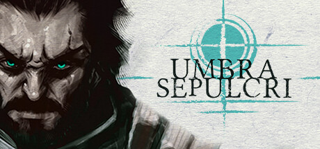
Umbra Sepulcri capsule

Umbra Sepulcri

You are a necromancer. The souls of the dead are your weapon. Push the limits of your combat skills in this story-driven, action packed Metroidvania. Enter in a dark world, where the sun's rays no longer heat up and evil creatures roam free in the night.

MetroidvaniaSouls-likeHack and Slash
Dead Pixel GamesTo be announced

Umbra Sepulcri scores 72/100 — better than 37% of Metroidvania capsules (n=378).

Released To be announced · By Dead Pixel Games

Quick text summary

Umbra Sepulcri scored 72/100 on Steam Analyzer — Good for a Metroidvania capsule. Top priority fix: [genre_clarity] Incorporate a spectral or soul-based visual element (glowing spirit, ethereal hands, ghost silhouette) to immediately communicate the necromancer mechanic and differentiate from generic dark fantasy.

Capsule scores by dimension

  • Genre Clarity: 8/10 — Dark fantasy action combat clear. The menacing hooded figure with aggressive posture, heavy armor, and glowing blue compass/rune immediately signal action-adventure or dark fantasy gameplay. At TINY size, the silhouette of the muscular antagonist wielding what appears to be a weapon reads as melee-focused combat, though the necromancer theme is not visually obvious without context. The monochromatic green and gray palette with dark tones reinforces a grim, gothic action setting typical of Metroidvania.
  • Title Readability: 8/10 — White serif title readable all sizes. The title 'UMBRA SEPULCRI' is rendered in clean white serif letterforms with a decorative compass/rune symbol integrated below, centered in the image on a semi-transparent region. At FULL size it is crisp and legible; at SMALL size it remains readable with good contrast against the darker background; at TINY size the text holds shape though individual letter detail softens slightly, but remains distinguishable. The strategic placement avoids the busy texture of the character, ensuring consistent readability across all viewing scales.
  • Contrast & Color: 7/10 — Strong value separation with dark palette. The image uses a limited but effective grayscale and green-tinted palette with high contrast between the dark character silhouette and the lighter background areas (pale whites and grays in the upper left and around the figure). The dark tones dominate, which works well against Steam's #1b2838 background. At TINY size, the primary subject separates cleanly, though the mid-tone greens in the clothing and background swirls could muddy slightly in extreme reduction—the silhouette remains readable but secondary details blur.
  • Uniqueness & Polish: 7/10 — Polished character art, generic scene setup. The character illustration itself is well-rendered with strong anatomy, expressive menacing face, and deliberate armor detailing that conveys a premium art style. However, the composition—hooded villain holding a weapon against a swirled background—echoes common action-adventure and souls-like visual tropes seen in games like Lies of P and darker action titles. The distinctive compass/rune symbol below the title adds a small branded element, but the overall scene does not communicate the unique necromancer mechanic or story hook that differentiates this from similar dark fantasy games.
  • Brand Consistency: 6/10 — Coherent but generic dark aesthetic. The monochromatic green-gray palette, gothic serif typography, and compass/rune motif are internally consistent and suggest a cohesive dark fantasy brand identity. The character rendering style is professional and uniform. However, without reference to the eight other store screenshots, the visual language feels like a safe dark fantasy template rather than a distinctive branded identity—the hooded figure and rune symbol are thematic but not immediately iconic or memorable as unique to Umbra Sepulcri specifically.
  • Composition: 7/10 — Clear focal point, well-balanced layout. The menacing character face dominates the upper-center area as the primary focal point, with the sword and armor framing the subject naturally. The title is positioned centrally below the figure, creating a vertical flow that reads well at SMALL and TINY sizes. The background swirls provide depth and frame the character without competing for attention. Safe margins around edges are respected; the composition is resilient to Steam's typical cropping and does not suffer significant loss of clarity or impact at reduced sizes.

What works

  • Strong character silhouette and menace. The aggressive pose, expressive face, and heavy armor immediately convey action-adventure tone and antagonistic presence that registers at every scale.
  • Readable white title with ornate symbol. The serif text and compass motif integrate well, maintaining legibility from FULL to TINY size while adding visual identity through the rune detail.
  • Effective value contrast and dark polish. The grayscale and green palette separates cleanly from Steam's dark background, and the character rendering quality signals a premium indie production.

What hurts the capsule

  • Fails to communicate necromancer mechanic. The capsule shows a traditional fantasy warrior with weapon, not a necromancer wielding souls or spectral powers, missing the core unique selling point.
  • Generic dark fantasy composition. Hooded villain with sword against swirled background is a common template in action-adventure genre, reducing distinctiveness compared to top-tier capsules.
  • Limited brand identity and memorability. The compass rune is the only branded element; the character and setting lack an iconic visual hook that would signal 'Umbra Sepulcri' specifically on second viewing.

Priority fixes

  1. [genre_clarity] Incorporate a spectral or soul-based visual element (glowing spirit, ethereal hands, ghost silhouette) to immediately communicate the necromancer mechanic and differentiate from generic dark fantasy.
  2. [uniqueness_polish] Add a distinctive visual storytelling element—such as spectral auras, bone motifs, or underworld environment cues—that communicates the core gameplay hook and increases memorability.
  3. [brand_consistency] Develop an iconic visual motif (character mark, recurring symbol, or palette signature) that can anchor future marketing materials and make the brand immediately recognizable.

Store copy priority fixes

  1. [feature_communication] Add a sentence explaining the soul summoning loop: how souls are collected, how many can be summoned in combat, and what tactical trade-offs they offer compared to weapons.
  2. [uniqueness] Rewrite the hand-drawn/comic book section to explain how the visual style affects storytelling or environmental design, not just appearance (e.g., 'Comic Book narration reveals NPC backstories' or 'Environmental panels unlock narrative shortcuts').
  3. [feature_communication] Specify how non-linear storytelling impacts world progression: do different story paths lead to different weapons, abilities, or boss encounters? Add a concrete example.
  4. [hook_strength] Replace 'evil creatures roam free in the night' with a specific threat or antagonist that raises immediate stakes (e.g., 'The souls corrupting the land must be freed—or destroyed').

Related guides

Steam app ID: 2087630 · Tags: Metroidvania, Souls-like, Hack and Slash, Difficult, Action-Adventure