Scoring genre clarity...
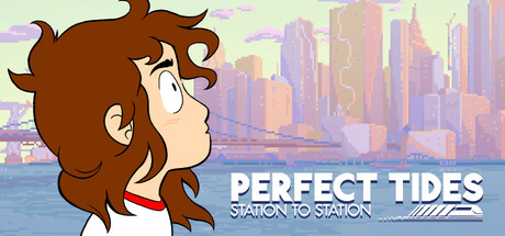
A narrative adventure about the momentum and whiplash of young adulthood. Explore the big city through 18-year-old Mara's eyes. Collect items, nurture ideas, and experience complex relationships while attempting to find your place in the world.
$19.99Very Positive(19)
Point & ClickPixel GraphicsRomance
Three BeesJan 22, 2026