Scoring genre clarity...
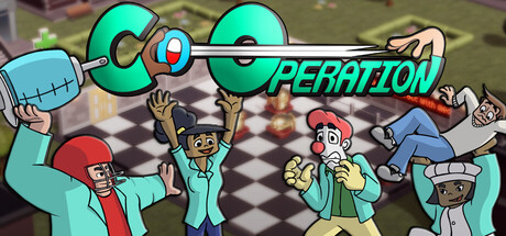
Become doctors with your friends! In this turn-based tactical game, your team plan can lead you to a masterful victory… or to a patient flying through the window. One copy is all you need and friends join using their phones. Enjoy the feeling of a couch co-op night, no matter where your friends are.
$11.994 user reviews
Turn-Based TacticsCo-opTabletop
Mind Feast GamesNov 4, 2025