Scoring genre clarity...
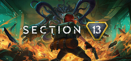
Unravel a thrilling sci-fi mystery in this action-packed twin-stick roguelite shooter. Select your load-out, stack up temporary and persistent upgrades, and delve into the depths of a subterranean base, either alone or in a group of up to 3 players.
$19.99Mostly Positive(12)
DarkTop-Down ShooterAction Roguelike
Ocean Drive Studio, Inc.May 26, 2025