Scoring genre clarity...

Lose Ctrl capsule

Lose Ctrl

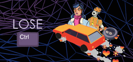
A game that literally makes you lose control by changing the way your keyboard and mouse work. Also: Dark humor in a sarcastic and philosophical story and a fun/chaotic/weird multiplayer that you can play with your friends.

$12.99Positive(13)
Dark HumorDriving3D
Play From Your Heart Ug (haftungsbeschränkt)Apr 15, 2025

Lose Ctrl scores 70/100 — better than 29% of Dark Humor capsules (n=607).

Positive (13 reviews) · $12.99 · Released Apr 15, 2025 · By Play From Your Heart Ug (haftungsbeschränkt)

Quick text summary

Lose Ctrl scored 70/100 on Steam Analyzer — Good for a Dark Humor capsule. Top priority fix: [contrast_color] Simplify or darken the background wireframe mesh to reduce visual noise and allow the title and car to command attention during quick scroll at small sizes.

Capsule scores by dimension

  • Genre Clarity: 7/10 — Casual chaos with racing element. The red car and playful character arrangement clearly signal a driving-focused game with a lighthearted tone. At tiny size, the vehicle and cartoon aesthetic remain identifiable, though the control-loss mechanic is not visually communicated. The art style reads as indie casual adventure rather than hardcore racing, which aligns with the genre mix but slightly underplays the control-manipulation hook.
  • Title Readability: 8/10 — Clear title with weak tagline. The word 'LOSE' is large, white, and legible at all sizes, though not outlined. The 'Ctrl' key icon below is clever thematically and remains readable at small size as a UI element. At tiny size, 'LOSE' holds strong contrast against the dark background, but 'Ctrl' becomes small and less prominent—the full tagline message weakens at smallest scale.
  • Contrast & Color: 7/10 — Strong title contrast, busy background. The white 'LOSE' and orange/red car pop cleanly against the dark blue geometric mesh background. Character silhouettes and orange accents maintain separation in grayscale. At tiny size, the title remains visible, but the dense triangular wireframe pattern creates visual noise that competes with the central subject, slightly reducing clarity during quick scroll.
  • Uniqueness & Polish: 7/10 — Playful art with deliberate quirk. The hand-illustrated character, anthropomorphic mascot, and scattered hearts show intentional art direction and personality that lifts it above generic racing templates. The visual storytelling of 'losing control' is communicated through chaotic arrangement and the explicit 'Ctrl' reference. However, the execution feels slightly amateurish compared to top-tier indie capsules, and the character design, while charming, lacks a fully distinctive signature.
  • Brand Consistency: 6/10 — Consistent tone, unclear visual identity. The playful, sarcastic tone and warm color palette (orange, pink, yellow accents) align across visible elements and likely extend to store screenshots. The character and mascot appear intentional, but without reference to other screenshots, it's unclear if they form a recognizable recurring brand motif. The style is coherent internally but reads as more generic indie aesthetic than a strongly iconic identity.
  • Composition: 7/10 — Balanced focal point, mid-tone clutter. The red car and character cluster form a clear primary focal point slightly right of center, with the title anchored left. Good depth layering with background mesh, midground characters, and foreground car. At small and tiny sizes, the composition holds, but the dense wireframe background and scattered hearts create visual competition that slightly diffuses focus—no dead space issues, but information density is moderate.

What works

  • Bold, readable title. The white 'LOSE' text maintains excellent legibility across all sizes with strong contrast against dark background and clean letterforms.
  • Thematic visual hook. The 'Ctrl' keyboard key and chaotic character arrangement directly reinforce the game's core mechanic of losing control in a way that differentiates it from standard racing capsules.
  • Warm, cohesive palette. Orange, pink, and yellow accents create a playful, distinctive mood that stands out in the casual indie space without feeling jarring or incoherent.
  • Clear focal point hierarchy. The red car and character silhouette immediately draw the eye, with supporting elements arranged to guide rather than distract at small sizes.

What hurts the capsule

  • Dense background texture competes for attention. The triangular wireframe mesh is visually busy and reduces contrast during quick scroll, especially at tiny size where pattern noise can overwhelm subject clarity.
  • Tagline legibility at tiny size. The 'Ctrl' text and heart scatter become difficult to parse at thumbnail scale, weakening the thematic messaging at the most critical viewing moment.
  • Generic indie character design. While charming, the illustrated woman and mascot do not feature distinctive silhouettes or signature styling that would make them immediately recognizable across marketing materials.
  • Underutilized racing genre cues. For a game with 'racing' listed in genres, the vehicle is small and de-emphasized compared to character focus, which may dilute the gameplay expectation for speedster audiences.

Priority fixes

  1. [contrast_color] Simplify or darken the background wireframe mesh to reduce visual noise and allow the title and car to command attention during quick scroll at small sizes.
  2. [title_readability] Add a subtle dark outline or semi-transparent background bar behind 'LOSE' to further strengthen title pop, especially at tiny thumbnail scale.
  3. [composition] Increase car size and positioning to create stronger racing-genre signaling while keeping character as supporting personality element.
  4. [brand_consistency] Refine character and mascot designs toward more iconic, instantly recognizable silhouettes that can carry brand identity across store screenshots and marketing.

Store copy priority fixes

  1. [hook_strength] Delete the CEO backstory sentence entirely and replace the detailed description opening with: 'Want to break out of normalcy and experience true chaos?' Move straight to the control-inversion core premise.
  2. [audience_targeting] Add one sentence clarifying the primary audience: e.g., 'Perfect for couch co-op chaos with friends, or solo for a narrative twist on game design.' This establishes whether story or multiplayer is the main draw.
  3. [genre_clarity] Early in the detailed description, explicitly state the game format: 'Lose Ctrl blends a story-driven single-player campaign (where you guide Billy through a spiraling day) with chaotic local multiplayer party modes.' This removes ambiguity.
  4. [feature_communication] Expand the Billy single-player section with one concrete detail: approximate length, core interaction loop, or how control-inversion affects the narrative progression, not just the concept.

Related guides

Steam app ID: 2111990 · Tags: Dark Humor, Driving, 3D, Story Rich, Parody