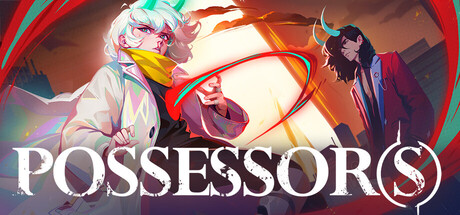
Possessor(s) scores 72/100 — better than 46% of Action capsules (n=8,534).

Quick text summary

Possessor(s) scored 72/100 on Steam Analyzer — Good for a Action capsule. Top priority fix: [genre_clarity] Integrate a clear platform or environmental detail (e.g., a recognizable level obstacle or mechanic icon) that signals side-scroller gameplay at SMALL and TINY sizes

Capsule scores by dimension

  • Genre Clarity: 7/10 — Action game clear, side-scroller ambiguous. The dynamic character poses, glowing energy effects, and combat-ready stances clearly signal action gameplay at full size. However, at TINY size the specific genre focus (side-scroller platform fighter) becomes unclear—the composition reads as generic action rather than platformer-specific. The characters and effects are recognizable as combat-focused, which helps clarity overall.
  • Title Readability: 8/10 — Strong white title, readable throughout. The white 'POSSESSOR(S)' text uses a clean serif/sans-hybrid font with high contrast against the warm orange and dark background. The title placement in the lower third avoids the busy character area and remains legible even at TINY size where individual letterforms stay distinct. The parenthetical (s) is small but does not collapse the main title's readability.
  • Contrast & Color: 8/10 — Bold warm palette with strong value separation. The orange and red gradients create warm, saturated color fields that pop clearly against the dark Steam background. Character silhouettes benefit from bright highlights and distinct edge definition, especially the right-side character in red. At TINY size the warm tones still read as a cohesive bright mass that separates from the dark background, though individual character detail softens.
  • Uniqueness & Polish: 7/10 — Stylish but genre-expected execution. The composition showcases two distinct character designs with detailed costume work and dynamic poses that suggest personality and world depth. The glowing energy loop and color grading feel intentional and premium, but the overall execution follows familiar action game tropes—vibrant characters on dark gradient is a common approach in the genre. The polish is clear, but the hook is not immediately distinctive from comparable titles like Lies of P or Senua's Saga.
  • Brand Consistency: 6/10 — Coherent visual style, weak identity signals. The character designs, costume details, and warm color palette are rendered consistently and suggest a cohesive world aesthetic. However, there are no obvious iconic symbols, motifs, or signature visual cues that would make this capsule instantly recognizable as 'Possessor(s)' if seen again without the title. The art direction is solid but generic within its action-adventure category.
  • Composition: 7/10 — Balanced pair, title placement effective. Two characters flank a bright central energy loop, creating visual balance and a clear sense of depth. The title sits safely in the lower third on a semi-transparent overlay, avoiding overlap with the busy character area. At SMALL size the composition reads clearly with the left and right figures bracketing the bright center; at TINY size the silhouette separation remains strong, though the fine detail of both characters blurs into visual rhythm rather than individual forms.

What works

  • High contrast white title. The 'POSSESSOR(S)' text maintains excellent readability from full header down to TINY thumbnail sizes with crisp letterforms and strong separation from the background.
  • Dynamic character staging. Two distinct posed figures with contrasting silhouettes create visual interest and suggest character-driven narrative without overcrowding the frame.
  • Warm color saturation. Orange and red gradients create eye-catching warmth that pops reliably against Steam's dark background across all viewing sizes.
  • Balanced spatial layout. Title placement in the lower third and character positioning on either side of a bright center point create clear hierarchy and breathing room.

What hurts the capsule

  • Generic action game aesthetic. The vibrant character + dark gradient formula is heavily used in comparable action titles, limiting distinctiveness and memorable identity.
  • Platform-fighter identity unclear. While action is evident, the specific side-scroller or platform-fighter angle is not visually communicated; the capsule could represent many action subgenres.
  • Limited iconic brand signals. No recurring symbol, motif, or signature visual element emerges that would function as an instant brand recognizer in isolation.

Priority fixes

  1. [genre_clarity] Integrate a clear platform or environmental detail (e.g., a recognizable level obstacle or mechanic icon) that signals side-scroller gameplay at SMALL and TINY sizes
  2. [uniqueness_polish] Develop a signature visual motif or character emblem unique to Possessor(s) that breaks from generic action-game tropes and strengthens brand memory
  3. [brand_consistency] Ensure recurring visual identity cues (color, symbol, or art style) are present and recognizable across all marketing materials for stronger brand consistency

Store copy priority fixes

  1. [feature_communication] Explain the possession mechanic explicitly: 'Switch between Luca and Rhem mid-combat, each with distinct abilities and fighting styles—Luca relies on speed, Rhem on power' or similar to clarify the core interaction loop.
  2. [uniqueness] Replace vague phrases like 'story told through dangerous characters' with a specific hook unique to this game: 'Uncover how an interdimensional catastrophe fractured a mega-city and reunite a fractured duo' to differentiate from other Metroidvanias.
  3. [audience_targeting] Add a single sentence signaling difficulty and intended player type: 'Built for players who love skill-based combat and interconnected worlds to explore' or 'Narrative-driven exploration with challenging precision platforming.'
  4. [hook_strength] Elevate the opening line from genre template to character intrigue: 'Play as Luca and her supernatural counterpart Rhem as they learn to survive in a catastrophe-torn city—if they can stop fighting each other' (more emotional pull than 'fast-paced action side scroller').

Related guides

Steam app ID: 2132890 · Tags: Action, Adventure, Platformer, Metroidvania, Action-Adventure