Scoring genre clarity...

9th Sentinel Sisters capsule

9th Sentinel Sisters

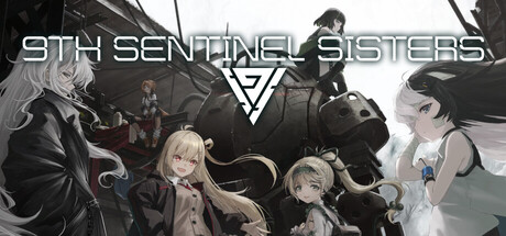
The battle of the clone girls unfolds on a post-apocalyptic Earth, devastated by the alien life form known as "Bleed." Pilot the manned weapon "Father" to eliminate enemies. Upgrade weapons, create powerful builds, and strategize to successfully clear stages.

$7.99Mixed(272)
RogueliteActionHack and Slash
Live WireSep 10, 2025

9th Sentinel Sisters scores 65/100 — better than 8% of Roguelite capsules (n=2,290).

Mixed (272 reviews) · $7.99 · Released Sep 10, 2025 · By Live Wire

Quick text summary

9th Sentinel Sisters scored 65/100 on Steam Analyzer — Solid for a Roguelite capsule. Top priority fix: [genre_clarity] Add a subtle mecha/weapon silhouette or HUD element to visually communicate the 'Father' piloting mechanic and differentiate from standard action-adventure titles.

Capsule scores by dimension

  • Genre Clarity: 7/10 — Action game with anime aesthetic. The capsule clearly communicates an action-oriented game through the manned weapon pilot concept implied by character poses and sci-fi setting with the triangular symbol suggesting a faction or technology. At tiny size, the silhouettes of multiple characters and the dark military aesthetic read as action-adjacent, though the exact subgenre (roguelike deck-builder with mecha) is not immediately obvious from visuals alone. The anime art style and post-apocalyptic environment support action/sci-fi genre interpretation without ambiguity about core gameplay type.
  • Title Readability: 6/10 — Readable but compressed at scale. The title 'STH SENTINEL SISTERS' (with 9th cut off or abbreviated) uses a clean, geometric sans-serif font in white with good contrast against the dark background, placed strategically in the upper third. At small and tiny sizes, the title remains legible due to its weight and central placement, though the compression makes individual letterforms slightly harder to parse. The triangular logo beneath provides a secondary anchor point that aids recognition at reduced sizes.
  • Contrast & Color: 7/10 — Strong dark value separation. The capsule uses a dark gray-to-black background palette with white text and light character silhouettes creating clear value separation against the Steam dark background #1b2838. Character outlines and the white title text maintain strong contrast and legibility at all sizes tested. In grayscale, the character silhouettes and text remain well-defined, though some mid-tone character details (clothing gradients, hair) blend slightly into the background.
  • Uniqueness & Polish: 6/10 — Competent anime character composition. The capsule presents a polished anime-style grouping of characters with consistent rendering and intentional composition, but the execution is relatively generic for the indie action space—multiple girls in tactical/sci-fi outfits arranged in a typical ensemble poster style. While the craft is clean and the visual execution is professional, the composition does not communicate a unique mechanical hook or distinctive selling point beyond 'clone girl team in post-apocalyptic setting.' It reads as a solid but unremarkable character ensemble presentation common to visual novel and action-indie titles.
  • Brand Consistency: 6/10 — Coherent but generic identity. The capsule maintains internal visual consistency with a unified color palette (blacks, grays, whites, subtle accent colors), matching character art style, and the triangular symbol that likely appears across promotional materials as a faction or tech identifier. The anime character designs and tactical aesthetic are cohesive, but the identity lacks a memorable distinctive motif—the triangle logo is the strongest recurring element, though it is relatively generic for sci-fi media. Without exposure to other brand materials, the visual identity reads as competent but not immediately iconic or recognizable as '9th Sentinel Sisters' specifically.
  • Composition: 7/10 — Balanced ensemble with clear layering. The composition arranges five characters across the frame with clear depth layering—background figures (top left, top right), middle-ground characters (center and sides), and foreground elements, creating visual hierarchy and preventing flat clustering. The title placement in the upper third with the logo below provides stable framing and safe margins that survive cropping. At tiny size, the arrangement reads as a cohesive silhouette group without scattered attention, though individual character details dissolve and the focal point becomes the overall character cluster rather than any single subject.

What works

  • Strong value contrast. White text and light character silhouettes stand out clearly against the dark background, maintaining legibility even at tiny scale.
  • Effective depth layering. Background, mid-ground, and foreground character placement creates visual hierarchy and a cohesive silhouette group at reduced sizes.
  • Polished character rendering. Consistent anime art style and clean line work across all five characters demonstrates professional craft and attention to visual detail.
  • Safe composition margins. Title and central characters avoid edge-hugging and critical elements remain well-protected from Steam's typical capsule cropping.

What hurts the capsule

  • Generic ensemble presentation. The character grouping follows a standard visual novel/anime game formula without communicating the unique post-apocalyptic mecha strategy hook.
  • Weak genre-specific iconography. The capsule does not visually emphasize the 'Father' manned weapon or upgrade/deck-building mechanics that differentiate the gameplay from typical action titles.
  • Mid-tone character detail blending. Some character clothing gradients and hair shading blend into the dark background, reducing silhouette crisp and fine detail clarity at all sizes.
  • Minimal distinctive branding. The triangular logo is the only memorable identifier, but it is generic enough to appear on many sci-fi properties without strong recall.

Priority fixes

  1. [genre_clarity] Add a subtle mecha/weapon silhouette or HUD element to visually communicate the 'Father' piloting mechanic and differentiate from standard action-adventure titles.
  2. [uniqueness_polish] Introduce a signature color accent (cyan, hot pink, or game-specific hue) to the character designs or background to create a more distinctive visual identity distinct from generic anime ensembles.
  3. [contrast_color] Increase outline or rim lighting on mid-tone character elements (hair, clothing) to ensure silhouette separation remains crisp at tiny thumbnail size.
  4. [title_readability] Consider adding a subtle background bar or slight glow behind the title to guarantee 100% legibility at 120x45px without relying solely on font weight.

Store copy priority fixes

  1. [hook_strength] Rewrite the short description to open with an active gameplay verb: 'Pilot a giant mecha weapon and hack through alien hordes with upgradeable weapons in a post-apocalyptic roguelite,' which leads with action and core draw before lore.
  2. [uniqueness] Add one sentence explaining the specific appeal of the female clone protagonist angle and how the pilot-weapon relationship shapes gameplay strategy differently from standard roguelites.
  3. [tone_match] Reduce 'casual' language in the Experience section and replace 'easily and easily enjoy' with language that respects the 'Dark' and 'Atmospheric' tags—e.g., 'Master devastating tactics in a grim post-apocalyptic struggle.'
  4. [feature_communication] Add 1–2 sentences describing the moment-to-moment gameplay loop: what does a typical run feel like? How fast does combat move? What does progression within a run feel like?

Related guides

Steam app ID: 2134560 · Tags: Roguelite, Action, Hack and Slash, Post-apocalyptic, Dark