SteamWorld Build scores 85/100 — better than 94% of City Builder capsules (n=668).

Quick text summary

SteamWorld Build scored 85/100 on Steam Analyzer — Excellent for a City Builder capsule. Top priority fix: [uniqueness_polish] Consider adding a more distinctive visual hook or mechanic indicator (e.g., clearer resource icons or unique environmental storytelling element) to differentiate from generic steampunk builders.

Capsule scores by dimension

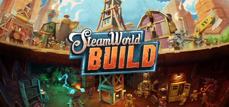
  • Genre Clarity: 8/10 — Strong steampunk city-builder signals. The capsule immediately communicates a steampunk city-building game through the clockwork tower, brass machinery, industrial architecture, and split-screen showing above-ground town and underground dungeon elements. At tiny size, the tower silhouette and warm industrial color palette remain recognizable as strategy/building gameplay, though the exact sub-genre blend is less apparent at smallest sizes.
  • Title Readability: 9/10 — Excellent legibility across all sizes. The 'SteamWorld BUILD' title uses a bold, clean serif and sans-serif hybrid with strong white outline and blue shadow that maintains crisp readability from full header down to tiny thumbnail. The logo sits on a controlled dark underpass background rather than competing with busy sky texture, and the two-line layout with chunky letters ensures no letterform collapse at small sizes.
  • Contrast & Color: 9/10 — Outstanding value and color separation. The composition leverages bright sky blues, warm golden/brass tones, and cool green glowing accents against the dark underpass, creating excellent silhouette separation and depth even at tiny size. In grayscale, the light sky, mid-tone architecture, and dark underground create clear layering that maintains visual impact during quick scroll, with the glowing green providing a distinctive color hook.
  • Uniqueness & Polish: 8/10 — Polished steampunk aesthetic, minor generic risks. The art direction is cohesive and craft-quality with detailed brass machinery, expressive character silhouettes, and purposeful lighting that communicates the town-building + dungeon-exploration hook effectively. The split-world composition is a smart visual storytelling choice showing both gameplay layers, though steampunk aesthetics are familiar in the strategy space, keeping it from reaching the absolute highest tier of originality.
  • Brand Consistency: 8/10 — Strong SteamWorld identity and palette. The capsule establishes clear brand signals through signature steampunk brass/copper tones, the iconic SteamWorld serif logo lettering, and mechanical character design that aligns with established SteamWorld universe visuals. The consistent warm-gold-and-teal color language would be recognizable across marketing materials, supporting strong franchise identity without relying on a single iconic character.
  • Composition: 9/10 — Balanced hierarchy with smart depth layering. The composition excels with a clear three-part hierarchy: the title as the primary focus in the middle, the clockwork tower as a strong vertical anchor in the upper-center, and foreground/background split showing above and below-ground gameplay zones. Safe margins are respected, the eye naturally follows from sky through tower to underground, and at tiny size the vertical tower and horizontal split remain instantly readable without clutter.

What works

  • Title remains crisp at all sizes. The bold, outlined 'SteamWorld BUILD' logo sits on controlled background and uses thick letterforms that never collapse, ensuring immediate legibility from header to thumbnail.
  • Genre and gameplay clearly communicated visually. The split-world composition showing clockwork tower, town above, and dungeon below instantly signals both city-building and exploration mechanics without ambiguity.
  • Strong color contrast pops on Steam dark background. Bright blue sky, warm brass tones, and cool green accents create excellent value separation that maintains silhouette clarity even at tiny thumbnail size.
  • Consistent steampunk brand identity. The signature brass machinery, character design, and warm-gold palette align with SteamWorld universe expectations and feel intentional, not generic.

What hurts the capsule

  • Steampunk aesthetic is familiar in strategy genre. While well-executed, the visual language does not feel particularly distinctive compared to other steampunk-themed builders in the current market.
  • Character details lose definition at tiny size. The small figure silhouettes and mechanical details in the underground section become compressed and less expressive at thumbnail scale, reducing character impact.

Priority fixes

  1. [uniqueness_polish] Consider adding a more distinctive visual hook or mechanic indicator (e.g., clearer resource icons or unique environmental storytelling element) to differentiate from generic steampunk builders.
  2. [composition] Ensure character figures in the underground section have higher contrast or larger silhouettes to remain visually interesting at tiny thumbnail sizes.

Store copy priority fixes

  1. [hook_strength] Rewrite the opening line to lead with the dual-mechanic hook: 'Build a town and delve into dangerous mines to escape a dying planet—every choice matters' instead of the generic frontier framing.
  2. [feature_communication] Add a paragraph after the feature list explaining the town-to-dungeon progression loop: clarify how mining feeds the city economy, how town upgrades unlock deeper mine access, or what resource loops tie the two halves together.
  3. [uniqueness] Explicitly articulate why the city-building + dungeon hybrid is superior to playing them separately—e.g., 'Mining profits fuel town growth, and your town's tech unlocks new mine depths,' if that's true.
  4. [feature_communication] Expand dungeon exploration description with concrete examples of hazards or puzzle types (e.g., 'Dodge steam traps, solve pressure-lock riddles, harvest ore deposits') so players visualize the gameplay.

Related guides

Steam app ID: 2134770 · Tags: City Builder, Casual, Relaxing, Economy, Singleplayer