Scoring genre clarity...

Sonic Adventure 2 capsule

Sonic Adventure 2

Experience two unique adventures featuring both long-time heroes and new and returning villains as they battle for the fate of the world!

$9.99Very Positive(176)
Great SoundtrackAction3D Platformer
SEGANov 19, 2012

Sonic Adventure 2 scores 88/100 — better than 83% of Great Soundtrack capsules (n=393).

Very Positive (176 reviews) · $9.99 · Released Nov 19, 2012 · By SEGA

Quick text summary

Sonic Adventure 2 scored 88/100 on Steam Analyzer — Excellent for a Great Soundtrack capsule. Top priority fix: [genre_clarity] Consider subtle environmental or mechanical elements (e.g., speed lines, chaos emerald hints, or world-specific imagery) to deepen gameplay context beyond character recognition.

Capsule scores by dimension

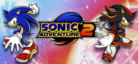
  • Genre Clarity: 9/10 — Iconic character identity instantly clear. Sonic and Shadow are unmistakable at all sizes, with their distinctive silhouettes, color schemes (blue vs black/red), and characteristic poses immediately signaling a high-speed action game. The dual-character composition and energetic stance communicate fast-paced action gameplay even at tiny thumbnail size, making the genre unmistakable.
  • Title Readability: 9/10 — Bold logo reads flawlessly at all sizes. The 'SONIC ADVENTURE 2' logo uses strong yellow-gold lettering with dark blue and black outlines that create excellent contrast against the colorful background. At tiny size, the large numeric '2' and distinctive Sonic branding remain clearly legible, and the logo placement is strategically centered without competing with character elements.
  • Contrast & Color: 9/10 — Vibrant palette with strong value separation. The gradient background (blue to pink to red) provides excellent saturation and movement without overwhelming the characters, who stand out with crisp white gloves, distinct blue and black silhouettes, and bright yellow accents. Even in grayscale, the characters maintain clear separation from background through strong value contrast and well-defined edges.
  • Uniqueness & Polish: 8/10 — Recognizable franchise presentation with polish. The capsule leverages the iconic Sonic and Shadow characters with clean vector-style rendering and professional layout that feels premium and cohesive. The dual-protagonist composition and energetic action poses communicate the game's core hook effectively, though the approach is somewhat expected for a Sonic title rather than introducing a fresh visual concept.
  • Brand Consistency: 9/10 — Signature Sonic identity unmistakably present. The character designs, color palette (primary blues, signature reds and golds), and iconic branding align perfectly with established Sonic franchise identity. These elements are so recognizable that the capsule functions as immediate brand reinforcement, and the visual style matches the game's official promotional materials.
  • Composition: 9/10 — Balanced dual-focus with clear hierarchy. Sonic on the left and Shadow on the right create natural visual balance and symmetry, with the logo anchoring the center as the primary focal point. The foreground characters are cleanly separated from the gradient background, and there are no awkward empty spaces or edge-hugging elements that could be cropped poorly on Steam.

What works

  • Instantly recognizable characters. Sonic and Shadow are iconic gaming figures whose distinctive silhouettes, colors, and poses communicate identity within milliseconds at any size.
  • Strong central logo hierarchy. The yellow 'SONIC ADVENTURE 2' text is boldly outlined and positioned to dominate attention while supporting the character focus.
  • Vibrant, energetic color treatment. The gradient background (blue-pink-red) conveys action and excitement while maintaining clear character legibility through value contrast.
  • Professional asset quality. Vector-style rendering is clean and polished with no cheap or muddy elements, fitting premium AAA presentation standards.

What hurts the capsule

  • Gradient background lacks specificity. The abstract color fade communicates mood but doesn't hint at gameplay setting or world context beyond 'colorful action.'
  • No unique visual hook beyond characters. The capsule relies entirely on character recognition rather than introducing a distinctive art direction or gameplay mechanic visual cue.

Priority fixes

  1. [genre_clarity] Consider subtle environmental or mechanical elements (e.g., speed lines, chaos emerald hints, or world-specific imagery) to deepen gameplay context beyond character recognition.
  2. [uniqueness_polish] Introduce a signature visual element (emblem, mechanic visualization, or setting detail) that differentiates this adventure iteration and communicates what makes SA2 uniquely engaging.

Store copy priority fixes

  1. [hook_strength] Lead the short description with the core gameplay appeal: 'Speed through 30 adrenaline-fueled stages as iconic heroes or villains, each with unique abilities. The hunt for the Chaos Emeralds is on—will you save the world or conquer it?'
  2. [feature_communication] Replace 'unique skills and abilities' with one concrete example per character type: 'Sonic and Shadow race at breakneck speed, Tails and Eggman hover to reach new heights, Knuckles and Rouge glide and climb.'
  3. [uniqueness] Reposition Chao raising as a differentiator: 'Train and battle your own Chao creature in exclusive mini-games, a feature unique to this entry that adds long-term progression beyond the main campaign.'
  4. [genre_clarity] Add 'fast-paced 3D platformer' or 'speed-platformer' to the short or opening of detailed description to immediately signal genre to unfamiliar players.

Related guides

Steam app ID: 213610 · Tags: Great Soundtrack, Action, 3D Platformer, Platformer, Fast-Paced