Quick text summary
Sifu scored 87/100 on Steam Analyzer — Excellent for a Action capsule. Top priority fix: [uniqueness_polish] Add a subtle UI element or game mechanic visual cue (such as an aging mechanic indicator or combat feedback element) to communicate Sifu's core narrative or gameplay hook beyond standard martial arts action.
Capsule scores by dimension
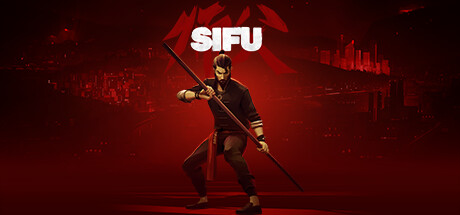
- Genre Clarity: 9/10 — Strong martial arts action identity. The central character in a kung fu stance with staff weapon, combined with the Asian architectural silhouettes and red aesthetic, immediately communicates martial arts action game at all sizes. Even at tiny thumbnail size, the posed fighter with weapon is unmistakable as a brawler or action combat title, and the Asian-inspired setting reinforces the kung fu subgenre perfectly.
- Title Readability: 9/10 — Bold, clean, highly legible. The SIFU title uses a strong sans-serif font in white with excellent contrast against the red background, placed in the upper-center region on a clear background area. At tiny size, the letterforms remain crisp and fully readable with no collapse; the font weight and spacing ensure clarity at all viewing scales.
- Contrast & Color: 9/10 — Vibrant red with strong silhouette. The rich red color palette creates excellent value separation against the dark Steam background (#1b2838), with the white title popping distinctly and the character's golden/bronze armor providing warm mid-tone highlights against the red backdrop. The silhouette of the fighter remains clean and readable even when squinting, with clear edges between the character, weapon, and environment.
- Uniqueness & Polish: 8/10 — Premium martial arts presentation. The capsule demonstrates clean craft with cinematic lighting on the character model, intentional color grading that reinforces the kung fu revenge narrative, and a distinctive red color treatment that sets it apart from generic action games. The composition avoids template design, instead using a signature visual style that communicates premium production quality and specific genre identity aligned with the game's actual mechanics and tone.
- Brand Consistency: 8/10 — Cohesive Asian martial arts identity. The internal palette (red, gold, dark tones), Asian-inspired architecture, and martial arts iconography create a recognizable visual identity that feels consistent with Sifu's narrative and setting. The character model, lighting approach, and color treatment establish memorable brand cues that would be recognizable across multiple marketing materials, though without extremely iconic character-specific details that reach the highest tier.
- Composition: 9/10 — Excellent hierarchy and focal point. The character is positioned as the clear primary subject in the center-lower frame, with the white title anchoring above, and Asian city silhouettes providing layered background context without competing for attention. The foreground-midground-background depth structure is clean and purposeful, the character placement leaves safe margins from edges, and the composition remains readable and balanced at small and tiny sizes without element drift or awkward cropping.
What works
- Crystal-clear title contrast. White sans-serif text with bold weight ensures the SIFU logo remains fully legible from full size down to tiny thumbnail, maintaining visual hierarchy throughout all viewing scales.
- Signature red color palette. The saturated red background creates immediate visual recognition and stands out distinctly against Steam's dark interface while reinforcing the Asian martial arts aesthetic and revenge narrative.
- Strong character pose and silhouette. The centered martial artist in an active fighting stance with staff is unmistakably a kung fu action game, communicating genre and gameplay intent instantly even at thumbnail size.
- Clean depth layering. Foreground character, midground lighting effects, and background city silhouettes create a cohesive cinematic composition that guides the eye without clutter or equal-emphasis confusion.
What hurts the capsule
- Limited character detail visibility. At tiny size, some of the character's armor details and facial features blur together, reducing the individual character memorability that could strengthen brand identity across multiple exposures.
- Minimal supporting visual elements. Beyond the character and title, there are few additional UI cues or gameplay hints (no UI elements, mechanics, or secondary characters) that might further reinforce the game's unique selling points beyond genre.
Priority fixes
- [uniqueness_polish] Add a subtle UI element or game mechanic visual cue (such as an aging mechanic indicator or combat feedback element) to communicate Sifu's core narrative or gameplay hook beyond standard martial arts action.
- [brand_consistency] Ensure this specific character model and pose appear consistently across other promotional materials to build stronger character-specific brand recognition over time.
Store copy priority fixes
- [feature_communication] Explicitly define the aging mechanic: 'Each time the amulet revives you, you age—your health pool shrinks and your reflexes slow.' This clarifies the core strategic trade-off.
- [audience_targeting] Add a direct difficulty signal in the short description or first paragraph, such as: 'Master the perfect parry and timing, or expect defeat'—to set expectations for challenge-seeking players upfront.
- [uniqueness] Strengthen differentiation by comparing to a comp title: 'Like a martial arts Souls-like, but with a ticking clock: every death ages you, forcing brutal decisiveness in combat.'
Related guides
Steam app ID: 2138710 · Tags: Action, Martial Arts, Beat 'em up, Difficult, Third Person