Scoring genre clarity...

Backrooms: Escape Together capsule

Backrooms: Escape Together

A visually lifelike co-op horror game for 1-6 people. Journey through 11 procedurally generated levels, using what's available to survive and progress deeper into the Backrooms.

$6.89Very Positive(5,358)
MultiplayerHorrorOnline Co-Op
Triiodide StudiosOct 18, 2022

Backrooms: Escape Together scores 75/100 — better than 60% of Multiplayer capsules (n=3,009).

Very Positive (5,358 reviews) · $6.89 · Released Oct 18, 2022 · By Triiodide Studios

Quick text summary

Backrooms: Escape Together scored 75/100 on Steam Analyzer — Good for a Multiplayer capsule. Top priority fix: [title_readability] Increase letter spacing or reduce font size slightly to ensure 'ESCAPE TOGETHER' remains clearly readable at 45px height and below.

Capsule scores by dimension

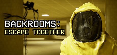
  • Genre Clarity: 8/10 — Strong horror survival signals. The yellow hazmat suit, dark institutional corridor, and unsettling masked figure immediately communicate horror and survival tension. The eerie atmosphere and industrial setting read clearly as survival-horror even at tiny size, though the co-op multiplayer aspect is not visually obvious. Genre expectations are met with recognizable visual language.
  • Title Readability: 7/10 — Readable but dense at tiny. The white sans-serif title text has strong contrast against the yellowish-warm background and reads well at full and small sizes. At tiny size the two-line layout remains legible, though the second line 'ESCAPE TOGETHER' becomes slightly compressed. The outline stroke helps separation, but character spacing is tight and could lose clarity below 45px height.
  • Contrast & Color: 8/10 — Excellent value separation. The bright yellow hazmat suit creates a striking silhouette against the warm-toned institutional corridor and dark mask interior. Strong value contrast between the figure and background holds clarity at small and tiny sizes with good edge definition. The cool-toned dark corridor walls and warm yellow lighting create effective depth separation that survives squinting and grayscale conversion.
  • Uniqueness & Polish: 7/10 — Distinctive visual hook. The iconic yellow hazmat suit with the dark mask provides a memorable and specific aesthetic that differentiates from generic horror capsules. The composition and lighting feel intentional and polished rather than templated. However, the concept is not entirely novel within horror-survival indie spaces, and the execution, while solid, does not reach the standout premium polish of top-tier AAA comparisons.
  • Brand Consistency: 7/10 — Cohesive visual identity. The yellow hazmat suit and institutional aesthetic appear consistent with the Backrooms concept and likely echoed across marketing materials and store screenshots. The warm institutional lighting palette and isolated figure composition support a recognizable brand identity that could be remembered. Internal consistency between text style, color grading, and subject matter is strong, though the identity could be more visually distinctive or iconic.
  • Composition: 8/10 — Clear hierarchy and balance. The right-side placed yellow figure serves as a strong focal point with the unsettling dark mask drawing immediate attention, while the left-side corridor and creature silhouette provide supporting context without competing for focus. Title placement on upper-left avoids the subject and maintains safe margins. The layered depth (background corridor, foreground figure, supporting creature) creates good visual storytelling and survives cropping well across sizes.

What works

  • Strong visual contrast. The bright yellow hazmat suit reads distinctly against warm institutional tones and holds silhouette clarity even at tiny thumbnail size.
  • Clear atmospheric horror communication. The dark corridor, eerie lighting, and masked figure immediately convey survival-horror genre without ambiguity at any viewing size.
  • Focused composition and hierarchy. The right-side placement of the main figure creates a strong focal point while title and secondary elements guide the eye naturally without clutter.
  • Readable title with clean outlines. White text with stroke separation maintains legibility at full, small, and small-medium sizes with sufficient contrast against background.

What hurts the capsule

  • Title compression at extreme tiny size. The two-line text layout becomes increasingly cramped below 45px height and may lose individual character clarity in Steam's smallest carousel thumbnails.
  • Multiplayer co-op aspect not communicated visually. The capsule shows an isolated figure, missing an opportunity to visually convey the 1-6 player co-op selling point that differentiates from single-player survival horror.
  • Generic institutional setting. While the hazmat suit is distinctive, the corridor itself is a common survival-horror trope that does not immediately signal the procedural Backrooms concept specifically.

Priority fixes

  1. [title_readability] Increase letter spacing or reduce font size slightly to ensure 'ESCAPE TOGETHER' remains clearly readable at 45px height and below.
  2. [genre_clarity] Add a subtle second figure or visual cue indicating multiplayer co-op gameplay to strengthen the unique 1-6 player selling point.
  3. [uniqueness_polish] Refine lighting or add a signature detail that makes the institutional setting feel distinctly Backrooms rather than generic horror facility.

Store copy priority fixes

  1. [hook_strength] Rewrite the short description opening to lead with a gameplay verb: 'Survive and escape the Backrooms with up to 5 friends—10 procedurally generated levels, voice chat, and entities await' or similar to front-load action and agency.
  2. [uniqueness] Add one concrete mechanical or design differentiator—e.g., 'our procedural algorithm ensures no two playthroughs share the same room layout or entity spawns' or 'every level dynamically adjusts difficulty based on team performance,' to move beyond generic lore acknowledgment.
  3. [tone_match] Remove or reframe the 'hilarious tension relieving moments' line to match the psychological horror tone; replace with something like 'tense moments of cooperation under pressure' or lean fully into social comedy if that is the actual intended tone.
  4. [audience_targeting] Clarify difficulty expectations and survival mechanics in a bullet point—e.g., 'permadeath mode,' 'resource scarcity,' 'adaptive entity AI'—to help hardcore vs. casual survival players self-select.

Related guides

Steam app ID: 2141730 · Tags: Multiplayer, Horror, Online Co-Op, Psychological Horror, Survival Horror