Scoring genre clarity...
Scoring genre clarity...
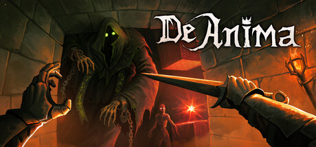
DeAnima scores 73/100 — better than 52% of Action Roguelike capsules (n=1,881).
Positive (22 reviews) · $9.99 · Released Dec 1, 2025 · By Steelgaze Studio
DeAnima scored 73/100 on Steam Analyzer — Good for a Action Roguelike capsule. Top priority fix: [brand_consistency] Introduce a distinctive character or symbol motif visible at small size that becomes recognizable across future marketing materials
Steam app ID: 2143790 · Tags: Action Roguelike, Roguelike, Dungeon Crawler, First-Person, Perma Death