Scoring genre clarity...
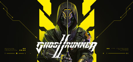
Ghostrunner 2 capsule

Ghostrunner 2

Blood will run in Ghostrunner 2, a hardcore FPP slasher set in a post-apocalyptic cyberpunk future. Become the ultimate cyber ninja and prepare for epic boss fights, improved skills, an interactive story, new game modes, and captivating synthwave soundtrack.

$7.99Very Positive(131)
CyberpunkActionFast-Paced
One More LevelOct 26, 2023

Ghostrunner 2 scores 85/100 — better than 97% of Cyberpunk capsules (n=539).

Very Positive (131 reviews) · $7.99 · Released Oct 26, 2023 · By One More Level

Quick text summary

Ghostrunner 2 scored 85/100 on Steam Analyzer — Excellent for a Cyberpunk capsule. Top priority fix: [title_readability] Slightly increase the font weight or outline thickness of the title to maintain serif letterform legibility at 120x45 pixel thumbnail sizes.

Capsule scores by dimension

  • Genre Clarity: 9/10 — Cyberpunk action ninja immediately clear. The central character is an armored cyber ninja with a sleek masked helmet, holding a glowing blade in a combat-ready pose against a dark cyberpunk backdrop with neon yellow geometric elements. Even at tiny size, the masked warrior silhouette, blade, and neon color scheme unmistakably communicate a hardcore sci-fi action game with obvious melee combat focus. The vertical yellow X framing reinforces the aggressive, slasher-focused gameplay implied by the character stance.
  • Title Readability: 8/10 — Metallic logo readable, minor size loss. The 'Ghostrunner 2' title uses a sharp, metallic silver serif font positioned in the lower center with strong contrast against the dark background. At full size and small size the text reads clearly, but at tiny thumbnail size the letterforms lose some definition due to the serif details and the horizontal line beneath the text compresses slightly. The logo placement is safe from Steam cropping and benefits from a controlled negative space region below the character.
  • Contrast & Color: 9/10 — Excellent neon-to-dark separation. Bright yellow geometric shapes and neon accents create strong value separation against the deep black background, with the central character rendered in dark armor with glowing purple and yellow highlights that read distinctly. The grayscale silhouette of the ninja figure pops clearly even at tiny size due to the high-contrast neon framing and the clean edge definition of the armor. The color palette is highly saturated and strategic, avoiding muddy mid-tones that would blur identity at small sizes.
  • Uniqueness & Polish: 8/10 — Distinctive cyberpunk ninja aesthetic. The capsule presents a confident, premium sci-fi aesthetic with intentional neon framing geometry and a uniquely designed protagonist that reads as a memorable character rather than a generic soldier. The glowing blade, metallic armor detailing, and symmetric yellow X-shape framing create visual storytelling that communicates the core 'cyber ninja' hook without feeling template-like. The craft is clean and cohesive, though the design sits within established cyberpunk conventions rather than breaking new visual ground.
  • Brand Consistency: 8/10 — Strong neon cyberpunk identity. The signature neon yellow and dark purple color palette, geometric framing, and masked protagonist create a recognizable and consistent visual identity that would be identifiable across marketing materials. The metallic typography and sci-fi rendering style align well with a premium action title and suggest a deliberate brand direction focused on sleek, tactical cyberpunk aesthetics. The consistent use of the X-shape motif and neon accent color throughout the composition reinforces brand recall potential.
  • Composition: 9/10 — Centered hero with perfect hierarchy. The character is positioned as the clear focal point in the center of the frame, with the neon yellow geometric shapes creating a symmetric V-shape that guides the eye inward and emphasizes the protagonist's blade. The title sits safely in the lower center region with adequate breathing room, and the composition avoids clutter by using negative dark space effectively around the edges. At tiny size, the primary subject (armored ninja) and secondary accent (neon geometry) maintain clear separation and hierarchy without visual noise or competing elements.

What works

  • Unmistakable genre and character. The masked cyber ninja with glowing blade against neon framing instantly communicates hardcore sci-fi action slasher gameplay and a distinctive protagonist identity.
  • Strong contrast hierarchy at all sizes. The bright neon yellow geometric framing and dark armor create excellent value separation that reads clearly even at tiny thumbnail scale without muddy transitions.
  • Safe composition and title placement. The centered character and lower-center title avoid edge cropping risks and negative space is used strategically to separate the subject from the background.
  • Premium craft and intentional design. Metallic typography, coherent neon palette, and detailed armor rendering communicate a high-polish AAA title identity without generic template feel.

What hurts the capsule

  • Serif letterforms compress at tiny size. The metallic 'Ghostrunner 2' font loses some fine detail definition at thumbnail scale due to thin serifs and the horizontal underline becoming less distinct.
  • Minimal context for story hooks. While the aesthetic is clear, the capsule does not visually hint at the 'improved skills', 'interactive story', or 'boss fights' mentioned in the game description beyond the blade.

Priority fixes

  1. [title_readability] Slightly increase the font weight or outline thickness of the title to maintain serif letterform legibility at 120x45 pixel thumbnail sizes.
  2. [genre_clarity] Consider adding a subtle UI element, skill indicator, or secondary character detail that hints at progression systems or story depth beyond the baseline ninja silhouette.

Store copy priority fixes

  1. [feature_communication] Move the 'About the Game' section to immediately follow the short description, before the edition tables, to prioritize gameplay information over cosmetic bundles.
  2. [uniqueness] Add a sentence explicitly differentiating Ghostrunner 2 from the original or competitors, e.g., 'Motorbikes blend vehicular combat into traversal for the first time' or 'Interactive boss fights let you improvise rather than follow patterns.'
  3. [feature_communication] Expand the motorbike section with one concrete example of how motorcycle gameplay integrates with the slasher mechanics and level design.
  4. [tone_match] Replace 'Immersive, Mind-Bending Features' header and generic descriptors with more specific, cyberpunk-native language that matches the gritty 'Blood will run' opening.

Related guides

Steam app ID: 2144740 · Tags: Cyberpunk, Action, Hack and Slash, Fast-Paced, Runner