Scoring genre clarity...

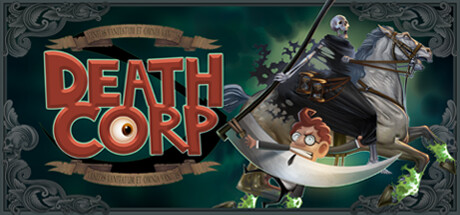
Death Corp capsule

Death Corp

Death Corp is a classic 2D Point and Click Adventure game where you play as the young new intern for Death's own company.

AdventurePoint & Click2D
Alberto CostaComing soon

Death Corp scores 85/100 — better than 98% of Adventure capsules (n=8,231).

Released Coming soon · By Alberto Costa

Quick text summary

Death Corp scored 85/100 on Steam Analyzer — Excellent for a Adventure capsule. Top priority fix: [genre_clarity] Ensure the scythe and reaper silhouette remain pixel-perfect at 120px width; consider slight contrast boost if ornate frame edges blur.

Capsule scores by dimension

  • Genre Clarity: 8/10 — Clear point-and-click adventure vibe. The stylized 2D character design, whimsical protagonist pose on a giant scythe, and gothic ornamental framing immediately signal adventure-comedy tone. At TINY size, the character silhouette and scythe weapon remain readable and reinforce the quirky adventure genre without ambiguity.
  • Title Readability: 9/10 — Bold, readable title dominates. DEATH CORP uses a thick, high-contrast red serif font with orange gradient fill that pops strongly against the dark teal background and ornate frame. The title remains legible even at TINY size due to bold letterforms and strategic left placement on a clear background region, not competing with central character elements.
  • Contrast & Color: 9/10 — Excellent value separation and pop. Warm orange-red title and bright character highlights create strong visual contrast against the cool dark teal background. The green glow accents and white scythe blade further separate foreground elements; in grayscale, the silhouettes remain crisp and distinct even at TINY size.
  • Uniqueness & Polish: 8/10 — Distinctive character design and theme. The art direction blends gothic ornamental borders with cartoony character proportions and a humorous premise (intern at Death's company), creating a memorable visual identity distinct from generic adventure games. Clean illustration craft and intentional color harmony elevate it beyond template work, though the core hook is character-driven rather than mechanically novel.
  • Brand Consistency: 8/10 — Cohesive gothic-comedy aesthetic. The ornate frame, serif typography, teal-and-gold palette, and whimsical character design establish a recognizable internal identity that signals 'stylized narrative adventure.' The visual language feels intentional and tied to the tone; without reference to other store materials, the capsule suggests a confident, themed game with strong art direction.
  • Composition: 9/10 — Clear hierarchy and balanced focal point. The protagonist-on-scythe anchors the composition center-right with the reaper looming in the background, creating strong depth layering and a clear primary subject. The title sits safely in the upper-left framing zone, ornamental borders contain all elements without edge-hugging risk, and the layout remains coherent at SMALL and TINY sizes with no dead zones or competing focal points.

What works

  • Strong title contrast and readability. Bold red-orange serif font with outline creates excellent legibility against dark background even at thumbnail size.
  • Distinctive art style and character charm. Whimsical 2D illustrations and gothic framing establish clear visual identity and memorable personality that stands out in the adventure genre.
  • Excellent composition depth and balance. Layered foreground (protagonist), midground (scythe), and background (reaper) create visual hierarchy that guides attention without clutter.
  • Thematic color palette reinforces mood. Teal, gold, and orange tones with green glow accents create cohesive gothic-comedy atmosphere while maintaining strong silhouette separation.

What hurts the capsule

  • Ornate frame adds visual noise. While stylistically appropriate, the decorative borders introduce complexity that slightly competes with core subject at very small sizes.
  • Genre relies on visual tone over clarity. Adventure game genre is inferred from character and setting cues rather than explicit UI or gameplay iconography, risking minor ambiguity for unfamiliar players.

Priority fixes

  1. [genre_clarity] Ensure the scythe and reaper silhouette remain pixel-perfect at 120px width; consider slight contrast boost if ornate frame edges blur.

Store copy priority fixes

  1. [hook_strength] Remove or downplay the Kickstarter line and rewrite the opening of the detailed description to lead with the core appeal: 'You are Death's newest intern at Death Corp—a supernatural comedy where you harvest souls, solve bizarre puzzles, and navigate the absurd bureaucracy of the afterlife.'
  2. [feature_communication] Add a sentence or bullet describing puzzle types and progression: e.g., 'Solve context-sensitive puzzles tied to harvesting souls, unlock new departments at Death Corp, and uncover story chapters that parody film and literary genres.'
  3. [audience_targeting] Include a statement about playtime, difficulty level, or intended mood to clarify whether this is casual/relaxing or challenging, and what player type it best suits.

Related guides

Steam app ID: 2146280 · Tags: Adventure, Point & Click, 2D, Cartoon, Hand-drawn