Scoring genre clarity...

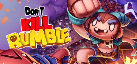
Don't Kill Rumble capsule

Don't Kill Rumble

A chaotic physics-based King of the Hill party brawler for up to 6 players. Punch, dash, and sabotage your rivals using powerful artifacts in deadly arenas full of traps and total mayhem.

Spectacle fighterRunner3D Platformer
Scubalight StudiosComing soon

Don't Kill Rumble scores 70/100 — better than 30% of Spectacle fighter capsules (n=165).

Released Coming soon · By Scubalight Studios

Quick text summary

Don't Kill Rumble scored 70/100 on Steam Analyzer — Good for a Spectacle fighter capsule. Top priority fix: [genre_clarity] Add a visible character or player silhouette in a combat pose or mid-action state to clearly signal the brawler mechanic and differentiate from generic beach party games.

Capsule scores by dimension

  • Genre Clarity: 7/10 — Clear party brawler energy. The bold, playful typography and tropical beach arena setting immediately signal a casual, fun multiplayer experience rather than a serious competitive game. The sandy environment with water and palm trees suggests an accessible party game context. However, at tiny size, the exact mechanic (King of the Hill brawler vs. racing vs. general sports) becomes ambiguous—the visuals lean party game but don't clearly telegraph the combat-focused brawler gameplay or unique punch/dash/sabotage mechanics.
  • Title Readability: 8/10 — Strong bold lettering. The title uses large, high-contrast red and yellow block letters that remain legible at small and tiny sizes due to thick outlines and primary color separation. The white 'DON'T' at top left reads clearly in full size and maintains visibility even when scaled. At tiny size (~120x45), the core 'KILL RUMBLE' words remain distinguishable, though fine serif details on 'DON'T' may soften slightly.
  • Contrast & Color: 8/10 — Warm palette pops well. The red and yellow type create strong warm-cool separation against the tan-beige background and sky, standing out against the Steam dark background (#1b2838) when viewed in context. The saturated primary colors maintain silhouette clarity even in grayscale contrast tests. The beach scene uses value hierarchy effectively—light sky, mid-tone sand, and darker water anchor the composition without muddying the title.
  • Uniqueness & Polish: 6/10 — Competent but generic backdrop. The title treatment feels intentional and polished with clean outline work and playful 3D perspective effects on the letters. However, the background—a generic tropical beach with palm trees, water, and sand—reads as a stock scene rather than a distinctive visual hook that communicates the chaotic brawler premise. The capsule feels like a solid party game aesthetic but lacks a memorable character, signature motif, or visual storytelling that hints at the mayhem and sabotage mechanics.
  • Brand Consistency: 6/10 — Playful tone, generic setting. The bold, colorful typography and lighthearted beach setting suggest a fun, accessible brand identity consistent with a party brawler tone. However, without reference to in-game artifacts, characters, or arena traps visible here, the capsule does not communicate recognizable brand identity cues that would carry across store screenshots or marketing materials. The palette and font choice are coherent but not uniquely memorable or iconic.
  • Composition: 7/10 — Clear focal point, safe layout. The title dominates center-left with strong hierarchy; 'KILL' in red draws the eye first, followed by 'RUMBLE' in yellow, creating a natural reading flow. The beach scene recedes into background layers (sky, palm trees, water, sand), supporting the type without competing for attention. At small and tiny sizes, the composition holds—the title remains the clear primary subject and the background simplifies gracefully without creating dead space or edge-hugging issues.

What works

  • Bold, legible title typography. Red and yellow block letters with outlines remain readable at tiny size and create strong focal hierarchy across all viewing scales.
  • Warm color pop against dark background. Primary color palette achieves high contrast and silhouette clarity that translates well to Steam's dark UI and grayscale contexts.
  • Balanced composition with layered depth. Background, midground, and foreground elements guide the eye without scattered attention or clutter.

What hurts the capsule

  • Generic tropical beach setting. Stock arena backdrop does not visually communicate the chaotic brawler premise, punch/dash/sabotage mechanics, or deadly traps mentioned in description.
  • No character or artifact presence. Absence of a player character, opposing rivals, weapons, or in-game artifacts weakens brand identity and fails to hint at core gameplay loops.
  • Mechanic ambiguity at small sizes. At tiny size, the setting could imply casual beach game, racing, or party experience without clearly signaling King of the Hill brawler combat focus.

Priority fixes

  1. [genre_clarity] Add a visible character or player silhouette in a combat pose or mid-action state to clearly signal the brawler mechanic and differentiate from generic beach party games.
  2. [uniqueness_polish] Integrate one signature arena trap, artifact, or environmental hazard into the scene to visually communicate the 'deadly arenas full of mayhem' and sabotage core mechanics.
  3. [brand_consistency] Include a recognizable character or motif that can anchor brand identity across store screenshots and marketing materials, making the capsule instantly memorable and distinct.

Store copy priority fixes

  1. [uniqueness] Add a sentence explaining what makes the physics engine or artifact combination system mechanically distinct from other party brawlers (e.g., 'Momentum-based knockback means every hit feels reactive' or 'Synergy pairs unlock unpredictable power combos').
  2. [feature_communication] Expand the 'Don't Fall' or climbing section with 1–2 concrete trap examples (spiked platforms, moving obstacles, lava) to show environmental hazards are active threats, not just scenery.
  3. [audience_targeting] Add one sentence clarifying the competitive level (casual party game, competitive ranking, skill-based matchmaking) so players understand the progression philosophy.
  4. [uniqueness] After 'Choose your artifact,' add a line about specific artifact synergies or build variety to hint at depth beyond the four listed examples.

Related guides

Steam app ID: 2146310 · Tags: Spectacle fighter, Combat Racing, Runner, 3D Platformer, Sports