Scoring genre clarity...
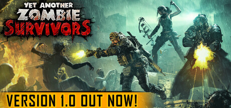
Yet Another Zombie Survivors capsule

Yet Another Zombie Survivors

The Horde is coming but you're ready to fight it! Assemble your team and decide upon their enhancements to find the most efficient synergies against thousands of the undead. Survive. Then evolve. Then break all the limits in this deceivingly simple but addictive bullet heaven game.

$7.49Very Positive(159)
Early AccessBullet HeavenAction Roguelike
Awesome Games StudioJul 13, 2023

Yet Another Zombie Survivors scores 67/100 — better than 12% of Early Access capsules (n=3,143).

Very Positive (159 reviews) · $7.49 · Released Jul 13, 2023 · By Awesome Games Studio

Quick text summary

Yet Another Zombie Survivors scored 67/100 on Steam Analyzer — Solid for a Early Access capsule. Top priority fix: [contrast_color] Increase red 'SURVIVORS' text contrast by using a darker red outline or repositioning text on a lighter background strip to maintain legibility at tiny size.

Capsule scores by dimension

  • Genre Clarity: 8/10 — Action horde shooter gameplay clear. Multiple characters wielding weapons against glowing zombie enemies with explosive effects immediately establish this as an action combat game. At tiny size, the silhouettes of armed figures, muzzle flashes, and undead horde are recognizable enough to convey 'zombie action shooter,' though the specific 'bullet heaven' subgenre mechanic is not visually apparent. The yellow explosions and green/teal enemy glow reinforce a combat-focused action title.
  • Title Readability: 7/10 — Title readable with minor size loss. The white 'YET ANOTHER ZOMBIE' text is bold and legible at full and small sizes, with good contrast against the darker background. The red 'SURVIVORS' text maintains clarity at small size but loses some pop due to red-on-dark-teal saturation competition. At tiny size, the text remains identifiable but the red subtitle becomes less distinct; the white primary title holds up better.
  • Contrast & Color: 7/10 — Good light-dark separation overall. Bright yellow explosions and character highlights contrast well against the dark teal-green background, creating clear silhouettes for the player characters. The white title text pops strongly against the background, and warm golden lighting on the left side provides additional separation. However, the red 'SURVIVORS' text competes with the teal-green midtones and loses some punch at small sizes; some fine detail in the character armor blends into shadow.
  • Uniqueness & Polish: 6/10 — Competent action scene, generic execution. The composition features multiple armed characters in a zombie-apocalypse setting with energetic combat effects, which is a familiar template for action indie games. While the execution is clean and the explosions are polished, the scene lacks a distinctive hook or memorable visual signature that sets it apart from dozens of similar horde-shooter or bullet-heaven titles. The art style and lighting are professional but not notably unique.
  • Brand Consistency: 5/10 — Generic apocalypse aesthetic, no icon. The capsule presents a standard zombie-apocalypse visual language—armed survivors, undead horde, explosions—with no distinctive character, color motif, or symbol that would make 'Yet Another Zombie Survivors' instantly recognizable on repeat viewing. The teal-green-yellow palette is functional but not signature; without access to the 12 screenshots, internal consistency cannot be fully assessed, but the capsule itself lacks a memorable identity marker. The self-aware title 'YET ANOTHER' ironically underscores the generic presentation.
  • Composition: 7/10 — Clear focal point, good layering. The composition uses layered depth effectively: background buildings, midground zombies and explosions, and foreground characters create visual hierarchy. The title text is positioned in safe margins at the top-right, avoiding crop danger and not competing with the action. At tiny size, the central mass of characters and explosions still reads as the clear focal point; however, the scattered placement of enemies across the frame creates slight competing focal points that dilute emphasis slightly.

What works

  • White title text contrast. Bold white 'YET ANOTHER ZOMBIE' text maintains excellent legibility at all sizes and stands out cleanly against the background.
  • Explosive energy clarity. Yellow and orange muzzle flashes and explosions create bright, eye-catching focal points that communicate intense action clearly even at tiny size.
  • Depth and layering. Clear foreground-midground-background structure with character silhouettes distinct from environment prevents flat composition and guides the eye naturally.
  • Genre intent recognizable. Armed figures, zombie enemies, and combat effects immediately signal 'action horde game' despite not revealing the specific bullet-heaven mechanic.

What hurts the capsule

  • Red subtitle legibility loss. The red 'SURVIVORS' text struggles against teal-green background at small and tiny sizes due to reduced saturation separation and loses visual pop.
  • Generic visual identity. No distinctive character, logo, or color signature differentiates this from dozens of zombie-action indie titles; the aesthetic is competent but forgettable.
  • Competing focal points. Multiple enemies and explosions scattered across the frame create slight visual confusion; the scattered zombie placement divides attention rather than anchoring to one hero or team.
  • No unique hook visible. The capsule does not visually communicate the 'bullet heaven' or team-synergy mechanics that differentiate the gameplay; it appears as a generic horde shooter.

Priority fixes

  1. [contrast_color] Increase red 'SURVIVORS' text contrast by using a darker red outline or repositioning text on a lighter background strip to maintain legibility at tiny size.
  2. [uniqueness_polish] Add a distinctive visual element such as a signature character silhouette, iconic ability effect, or memorable color accent to create brand recognition and differentiate from generic zombie titles.
  3. [genre_clarity] Incorporate a subtle visual cue of the synergy or team-assembly mechanic—such as character icons linked together or color-coded squad formation—to hint at the game's unique 'bullet heaven' system.
  4. [composition] Anchor the focal point to one prominent hero character or central team cluster to reduce scattered attention and create a clearer hierarchy at small sizes.

Store copy priority fixes

  1. [uniqueness] Replace 'unique prestige system' with a specific example: 'Unlock permanent stat boosts and new squad roles by completing prestige runs, letting you tackle harder enemy waves and unlock new synergies each ascension.' This would prove rather than claim uniqueness.
  2. [feature_communication] Add a bullet-point list of 2–3 specific synergy examples in the detailed description (e.g., 'Pair flamethrower splash with cold perks to slow masses' or 'stack crit-chance perks with high-attack-speed characters'), so players understand what 'synergy' concretely means.
  3. [hook_strength] Strengthen the short description opening: replace 'The Horde is coming but you're ready' with a stronger verb-forward phrase like 'Command your squad against endless zombie waves, crafting powerful perk synergies to dominate the battlefield.' This makes the action and agency more visceral.
  4. [uniqueness] Add 1–2 sentences explaining what sets YAZS apart from similar bullet-heaven games (e.g., team composition depth, prestige mechanics, or specific weapon/perk combinations) to justify the 'Yet Another' ironic title.

Related guides

Steam app ID: 2163330 · Tags: Early Access, Bullet Heaven, Action Roguelike, Zombies, Top-Down Shooter