Scoring genre clarity...

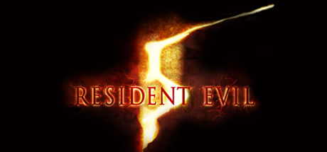
Resident Evil 5 capsule

Resident Evil 5

This game is a port of the Games for Windows - Live version that was released in 2009. If you buy the Untold Stories Bundle here on Steam, it will be the same as upgrading to Resident Evil 5 Gold Edition.

$4.99Very Positive(1,302)
Co-opActionZombies
CapcomSep 15, 2009

Resident Evil 5 scores 82/100 — better than 90% of Co-op capsules (n=1,669).

Very Positive (1,302 reviews) · $4.99 · Released Sep 15, 2009 · By Capcom

Quick text summary

Resident Evil 5 scored 82/100 on Steam Analyzer — Good for a Co-op capsule. Top priority fix: [uniqueness_polish] Introduce a distinctive visual element (cinematic lighting effect, iconic weapon design, or signature explosion/muzzle flash) that differentiates this capsule from generic action-adventure templates and makes it memorable at small size

Capsule scores by dimension

  • Genre Clarity: 9/10 — Action horror immediately clear. Two armed protagonists in tactical gear with visible weapons (handgun, rifle with muzzle flash) against a warm golden horror atmosphere clearly signal action-adventure horror. At tiny size, the gun silhouettes, poses, and warm apocalyptic tone are instantly readable and genre-defining without ambiguity.
  • Title Readability: 8/10 — Title legible with minor size loss. RESIDENT EVIL appears in bold red text centered in the lower third with strong contrast against the golden background. At full size it reads perfectly; at small size (231×87) the text remains readable though slightly compressed; at tiny (120×45) the letterforms compress but remain distinguishable due to high contrast and bold weight.
  • Contrast & Color: 9/10 — Excellent warm-cool separation. The dominant warm golden-yellow gradient provides strong value separation from the dark Steam background (#1b2838), while the red title text creates additional focal contrast. Character silhouettes remain clearly defined even in grayscale due to lighting separation, and the orange-to-red color progression creates visual pop without muddy mid-tones.
  • Uniqueness & Polish: 7/10 — Professional execution, recognizable property. The capsule demonstrates polished production values with clean character compositing, intentional lighting, and a cohesive warm palette that communicates premium franchise identity. However, the dual-character pose and golden gradient treatment is a familiar formula for action-adventure games of this era, preventing it from standing out as distinctly innovative compared to peers like Black Myth: Wukong or Armored Core VI.
  • Brand Consistency: 8/10 — Strong RE franchise identity maintained. The red RESIDENT EVIL logo, warm apocalyptic color palette, tactical character presentation, and horror-action visual language are consistent with established Resident Evil branding across the series. The signature bold serif typography and golden-to-red gradient treatment reinforce franchise recognition without feeling derivative of competing horror titles.
  • Composition: 8/10 — Clear hierarchy, balanced focal points. The two-character composition creates a natural visual triangle with strong depth layering: characters in foreground, textured gradient background providing context without clutter. The centered red title anchors the lower third without obstructing character silhouettes; at small and tiny sizes the composition remains legible with the characters as clear primary subjects.

What works

  • Strong color contrast against dark background. The warm golden-yellow palette creates immediate visual separation from Steam's dark theme, making the capsule pop in scrolling contexts.
  • Clear genre communication through visual language. Tactical gear, visible weapons, and character poses immediately signal action-horror gameplay without requiring text interpretation.
  • Readable title with high-contrast red text. Bold RESIDENT EVIL typography maintains legibility from full size down to tiny thumbnail due to weight and color choice.
  • Recognizable franchise identity. The signature red logo and warm color palette reinforce Resident Evil brand recognition for returning players.

What hurts the capsule

  • Generic dual-character action pose formula. The side-by-side character composition and golden-gradient treatment follow familiar industry patterns that lack distinctive visual hooks compared to top-tier peers.
  • Limited character detail visibility at tiny size. At 120×45 pixels, facial features and gear details compress significantly, reducing the character silhouettes to simplified forms that lose performance-level polish.
  • Textured background adds visual noise. The grainy golden texture, while atmospheric, introduces subtle detail that can feel muddy when squinting or viewing at smallest sizes.

Priority fixes

  1. [uniqueness_polish] Introduce a distinctive visual element (cinematic lighting effect, iconic weapon design, or signature explosion/muzzle flash) that differentiates this capsule from generic action-adventure templates and makes it memorable at small size
  2. [composition] Simplify or reduce background texture graininess to improve clarity at tiny sizes and create cleaner edge definition for character silhouettes when squinting
  3. [title_readability] Consider adding a subtle dark outline or background bar behind the red RESIDENT EVIL text to guarantee legibility at 120×45 pixel thumbnail size

Store copy priority fixes

  1. [hook_strength] Replace the short description entirely. Lead with a specific, action-forward hook: 'Experience intense third-person action as Chris Redfield investigates a biological outbreak in Africa. Team up with a partner in visceral co-op combat against mutated horrors.' This immediately communicates genre and core gameplay.
  2. [feature_communication] Add a bulleted Features or Gameplay section after the story that covers: campaign co-op mechanics (online/local), combat loop, weapon variety, campaign length, and difficulty modes. Players need to know what they will do, not just what the story is about.
  3. [genre_clarity] Explicitly name the genre early in the detailed description. Insert a sentence like 'Fight your way through a bio-organic infected world in this third-person action shooter' before or after the story section to anchor genre without ambiguity.

Related guides

Steam app ID: 21690 · Tags: Co-op, Action, Zombies, Co-op Campaign, Online Co-Op