Scoring genre clarity...

Retrace the Light capsule

Retrace the Light

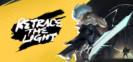
Dive into the immersive world of Retrace the Light, a captivating 2.5D action-adventure game centered around the "Spatial Retracing" feature. Assume the role of an Enforcer working for a super AI in a futuristic world, exploring the depths of human consciousness and healing their emotional wounds.

$17.99Very Positive(166)
ExplorationTop-DownMetroidvania
Xiaming GameNov 20, 2025

Retrace the Light scores 72/100 — better than 48% of Exploration capsules (n=4,872).

Very Positive (166 reviews) · $17.99 · Released Nov 20, 2025 · By Xiaming Game

Quick text summary

Retrace the Light scored 72/100 on Steam Analyzer — Good for a Exploration capsule. Top priority fix: [uniqueness_polish] Integrate a subtle visual metaphor of 'retracing' or consciousness—such as trailing light paths, temporal echoes, or fractured reflections behind the character—to communicate the core Spatial Retracing mechanic and differentiate from generic action titles.

Capsule scores by dimension

  • Genre Clarity: 7/10 — Action RPG with sci-fi setting clear. The armored character wielding a glowing blade against a dark futuristic backdrop reads immediately as sci-fi action combat. At TINY size, the silhouette of the protagonist with sword is recognizable as an action game, though the specific 2.5D puzzle mechanic (Spatial Retracing) is not visually implied. The metallic armor and energy weapon effectively signal the genre intent.
  • Title Readability: 8/10 — Bold title with strong contrast readable. The white 'RETRACE THE LIGHT' text with black brush stroke outline is positioned in the upper left on the yellow gradient zone, maintaining excellent legibility at all sizes. At TINY size, the title remains distinguishable despite the brushstroke effect, and the outline strategy prevents color crush against the dark Steam background. Letter forms are clean and spacing is well-controlled.
  • Contrast & Color: 8/10 — Strong value separation with warm highlight. The bright yellow-gold gradient background creates powerful separation from both the dark character and the black space elements. The protagonist's light armor and glowing cyan blade pop clearly against the navy-black midground, and the overall warm-to-cool color split maintains clarity at SMALL size. In grayscale, the value ladder (light yellow, mid-tone armor, deep black) remains distinct and readable.
  • Uniqueness & Polish: 7/10 — Polished execution, slight generic feel. The render quality is professional with clean lighting on the character model and intentional brush-stroke typography that avoids generic fonts. However, the composition of 'armored protagonist with sword in sci-fi setting' is a familiar trope across top-tier action titles (Black Myth: Wukong, Star Wars Jedi, Armored Core VI). The brushstroke title treatment adds some personality but the visual hook does not yet communicate the unique Spatial Retracing mechanic that differentiates this game.
  • Brand Consistency: 6/10 — Consistent palette, minimal iconic identity. The yellow-black-cyan color scheme appears cohesive and the character design with the oversized armored helmet suggests a recognizable protagonist archetype. Without reference to the 12 store screenshots, the internal rendering style (3D character, gradient background, brush effect text) is polished and consistent, but no distinctive brand symbol, motif, or palette signature emerges that would make this capsule uniquely recognizable as 'Retrace the Light' if the title were removed.
  • Composition: 7/10 — Clear focal point, good balance overall. The armored character is positioned right-of-center as the primary focal point, with the title anchored safely in the upper left on a controlled background zone. The composition uses foreground character, mid-tone background space, and background light rays to create depth; at SMALL size, the character silhouette remains the clear hero element. The only minor weakness is that the lower right area feels slightly sparse, but safe margins are respected and no critical elements are at risk of Steam crop.

What works

  • Title legibility at all sizes. White text with black outline positioned on yellow gradient maintains readability down to TINY size without collapse.
  • Strong color separation. Warm yellow background, cool cyan blade accent, and deep black create a clear visual hierarchy that reads in quick scroll.
  • Professional character rendering. The protagonist 3D model is cleanly lit with clear form definition that holds silhouette at reduced sizes.

What hurts the capsule

  • Generic action-RPG visual archetype. Armored swordsman in sci-fi setting is a well-worn formula that does not immediately communicate the game's unique Spatial Retracing mechanic.
  • Limited brand identity signal. Without the title, few distinctive visual cues remain that would allow recognition as 'Retrace the Light' versus similar sci-fi action titles.
  • Lower right composition void. The bottom right quadrant contains minimal visual interest and could leverage space more effectively for secondary storytelling.

Priority fixes

  1. [uniqueness_polish] Integrate a subtle visual metaphor of 'retracing' or consciousness—such as trailing light paths, temporal echoes, or fractured reflections behind the character—to communicate the core Spatial Retracing mechanic and differentiate from generic action titles.
  2. [brand_consistency] Refine or introduce a signature visual motif (emblem, palette accent, or UI element) that ties to the Enforcer role and the super AI setting, making the capsule recognizable across marketing materials.
  3. [composition] Populate the lower right area with complementary background elements (additional light rays, distant landscape detail, or UI fragments) that enhance depth without cluttering the character focal point.

Store copy priority fixes

  1. [hook_strength] Rewrite the short description opening to lead with the Retrace ability and its gameplay impact: 'Master the Spatial Retrace ability to teleport through Mirrormazes, solving puzzles and outmaneuvering bosses in this 2.5D action-adventure.' This moves from adjectives to concrete verbs.
  2. [tone_match] Remove or relocate the Discord and QQ group links to the end of the detailed description or to a separate community section; keep the narrative synopsis uninterrupted and cohesive.
  3. [uniqueness] Add 1-2 sentences explaining what makes Spatial Retrace strategically different: e.g., 'Unlike traditional teleportation, Retrace anchors you to visited spaces, enabling mid-combat repositioning and multi-stage puzzle solutions that reward exploration.'
  4. [audience_targeting] Add a brief sentence signaling difficulty and playstyle: e.g., 'Craft your own combat approach with adjustable difficulty, appealing to both story-driven explorers and challenge-seeking action fans.'

Related guides

Steam app ID: 2179370 · Tags: Exploration, Top-Down, Metroidvania, Indie, 3D Platformer