Scoring genre clarity...

Warhammer 40,000: Space Marine 2 capsule

Warhammer 40,000: Space Marine 2

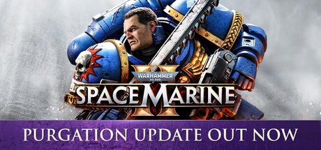
Embody the superhuman skill and brutality of a Space Marine. Unleash deadly abilities and devastating weaponry to obliterate the relentless Tyranid swarms. Defend the Imperium in spectacular third-person action in solo or multiplayer modes.

$17.99Very Positive(3,686)
Co-opActionMultiplayer
Saber InteractiveSep 9, 2024

Warhammer 40,000: Space Marine 2 scores 83/100 — better than 93% of Co-op capsules (n=1,620).

Very Positive (3,686 reviews) · $17.99 · Released Sep 9, 2024 · By Saber Interactive

Quick text summary

Warhammer 40,000: Space Marine 2 scored 83/100 on Steam Analyzer — Good for a Co-op capsule. Top priority fix: [title_readability] Increase the size or weight of the Warhammer 40,000 franchise text above the main logo so it remains legible at small capsule sizes rather than disappearing into the medallion.

Capsule scores by dimension

  • Genre Clarity: 9/10 — Sci-fi third-person action clear. The heavily armored Space Marine in iconic blue power armor dominates the frame, holding a massive bolter and chainsword, instantly communicating sci-fi military action. The Warhammer 40K aesthetic is immediately recognizable to fans and genre-adjacent players. Even at tiny size, the hulking armored silhouette and oversized weapons clearly signal third-person action combat.
  • Title Readability: 8/10 — Strong title with small franchise text. SPACE MARINE 2 reads clearly in large bold serif-style lettering with strong contrast against the lower background, and the metallic treatment adds premium feel without sacrificing legibility. The Warhammer 40,000 franchise text above it is noticeably smaller and while readable at full size, it becomes difficult to parse at tiny 120x45 size. At small capsule size the main title still holds well but the franchise prefix blurs into the logo medallion.
  • Contrast & Color: 8/10 — Strong subject separation from background. The bright ultramarine blue armor pops clearly against the desaturated grey-smoke background, providing strong hue and value contrast. The warm mist and subtle red-orange tones in the background add depth without competing with the figure. In grayscale the character silhouette remains clearly separated from the background, though the lower portion of the image merges somewhat with the dark Steam background near the bottom edge.
  • Uniqueness & Polish: 8/10 — Premium AAA execution, familiar formula. The capsule communicates AAA production values through high-quality character rendering, dramatic lighting on the armor, and a clean professional layout that matches top-tier genre competitors like God of War and Helldivers 2. The composition is confident and well-crafted with intentional typography treatment that feels authentic to the IP. However it follows the standard hero-shot formula common to the genre without a distinctive visual hook that separates it beyond brand recognition.
  • Brand Consistency: 9/10 — Iconic IP identity strongly executed. The Ultramarines blue, the distinctive power armor silhouette, the Warhammer 40K logo medallion, and the grimdark aesthetic are all unmistakable and consistent with the franchise identity. The color palette, typography style, and tonal atmosphere align tightly with the broader Warhammer 40K visual language. This capsule would be immediately recognized by anyone familiar with the IP, and even newcomers would associate it with a serious grimdark military sci-fi brand.
  • Composition: 8/10 — Hero-dominant with clear hierarchy. The Space Marine is placed slightly right of center with his gaze and body turned toward the viewer, creating strong visual weight and confident hierarchy. The title text anchors the lower third cleanly, and the background smoke provides depth without cluttering the focal point. At small and tiny sizes the character fills the frame well and the title sits in a controlled low-contrast zone, though the top portion of the helmet is cropped slightly tight which could be a concern at some crop ratios.

What works

  • Iconic silhouette at all sizes. The hulking power armor silhouette is immediately recognizable and reads cleanly even at 120x45 thumbnail size.
  • Strong color contrast. Ultramarine blue against a desaturated grey-smoke background creates clear value and hue separation that pops on Steam's dark background.
  • Confident title placement. SPACE MARINE 2 occupies a clean region in the lower third with controlled background contrast ensuring consistent readability.
  • AAA production quality. Character rendering, lighting, and typography treatment all communicate premium production values consistent with top genre competitors.

What hurts the capsule

  • Franchise text too small at tiny size. The Warhammer 40,000 text above the main title becomes illegible at 120x45 and blends into the logo medallion, losing the franchise branding signal.
  • Generic hero-shot formula. Despite high polish the composition follows a standard single-character centered pose that does not visually differentiate it from many other action game capsules.
  • Tight head crop risks edge loss. The top of the helmet sits close to the upper edge and may be cropped awkwardly in some Steam display contexts.
  • Bottom edge merges with Steam background. The lower portion of the image fades to dark and can blend with Steam's #1b2838 background, reducing overall silhouette clarity at the base.

Priority fixes

  1. [title_readability] Increase the size or weight of the Warhammer 40,000 franchise text above the main logo so it remains legible at small capsule sizes rather than disappearing into the medallion.
  2. [composition] Add a subtle bottom vignette or thin gradient barrier with slightly warmer tone to prevent the lower image edge from merging invisibly into Steam's dark background.
  3. [composition] Pull the framing down slightly to give the helmet more breathing room above and reduce the risk of top-edge cropping in various Steam display ratios.
  4. [uniqueness_polish] Consider incorporating a secondary visual element such as a Tyranid silhouette or swarm in the background to hint at the game's core combat loop and differentiate from generic single-hero action capsules.

Store copy priority fixes

  1. [feature_communication] Replace the duplicate opening paragraph in the detailed description with a single sentence summarizing the main campaign scope (length, story stakes, or mission variety) to orient players immediately.
  2. [uniqueness] Expand the Swarm Engine mention with a concrete comparison or gameplay consequence, e.g., 'Saber's Swarm Engine delivers 300+ simultaneous enemies—engage hordes that would stall lesser engines.'
  3. [feature_communication] Add a subsection briefly describing campaign missions or story structure (e.g., '8-hour campaign across 5 planets + endless multiplayer modes') so players understand content value immediately.
  4. [audience_targeting] Include a line explicitly naming the player types served, e.g., 'Perfect for co-op veterans, Warhammer fans, and PvP competitors seeking fast-paced gunplay.'

Related guides

Steam app ID: 2183900 · Tags: Co-op, Action, Multiplayer, Third-Person Shooter, PvE