Scoring genre clarity...

Hotline Miami capsule

Hotline Miami

Hotline Miami is a high-octane action game overflowing with raw brutality, hard-boiled gunplay and skull crushing close combat.

$0.99Overwhelmingly Positive(2,816)
Great SoundtrackViolentAction
Dennaton GamesOct 23, 2012

Hotline Miami scores 90/100 — better than 91% of Great Soundtrack capsules (n=141).

Overwhelmingly Positive (2,816 reviews) · $0.99 · Released Oct 23, 2012 · By Dennaton Games

Quick text summary

Hotline Miami scored 90/100 on Steam Analyzer — Excellent for a Great Soundtrack capsule. Top priority fix: No fixes required. This capsule is near-exemplary for the action indie genre and serves as a strong benchmark.

Capsule scores by dimension

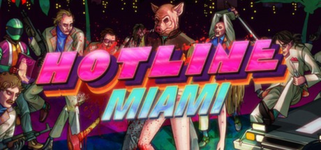
  • Genre Clarity: 9/10 — Instantly recognizable action violence. The neon-soaked synthwave aesthetic, gun-wielding cast of characters, and visceral close-combat poses immediately signal brutal action gameplay. Even at TINY size, the stylized violence, colorful weapon accessories, and nightclub setting read clearly as high-octane indie action, not any other genre.
  • Title Readability: 9/10 — Bold neon text perfectly legible. The magenta and cyan split lettering of 'HOTLINE MIAMI' uses strong value contrast and thick, blocky strokes that remain crisp at SMALL and TINY sizes. The two-line stacking places the title prominently in the upper-middle zone, avoiding background noise and ensuring immediate recognition even in quick scroll.
  • Contrast & Color: 9/10 — Vivid neon pops against dark field. The hot magenta and cyan title and character glow effects create extreme value separation from the deep purple-black background, and the warm skin tones and colorful jackets add saturated midtones that prevent muddiness. At TINY size, the silhouette of the central female figure and the neon text remain perfectly distinct and readable against the dark field.
  • Uniqueness & Polish: 9/10 — Iconic synthwave style, premium craft. The 1980s synthwave art direction, detailed character designs with expressive poses, and the carefully balanced neon color palette feel distinctly polished and intentional rather than generic. The composition communicates the game's core identity—stylish violence and cool counterculture—through visual storytelling, not template reuse, and stands well above mid-tier indie action capsules.
  • Brand Consistency: 9/10 — Unmistakable Hotline Miami identity. The magenta-cyan neon aesthetic, synthwave character roster with recognizable silhouettes, and ultraviolent pose language are signature to Hotline Miami's visual brand and would be identifiable across other marketing materials. The palette, art style, and character styling create a cohesive and memorable identity that aligns strongly with the game's established visual language.
  • Composition: 9/10 — Clear hierarchy, perfect focal flow. The central female figure with the red-soaked legs anchors the composition, while the surrounding cast of characters creates depth and frames the eye naturally inward, with the neon title positioned prominently without obscuring key elements. The layering—background characters, midground action figures, and foreground title—maintains balance and visual interest at all sizes, and critical elements stay well within safe margins.

What works

  • Neon title pop and legibility. The magenta-cyan split lettering remains perfectly readable at TINY size due to thick strokes, strong value contrast, and strategic placement on a dark background region.
  • Genre communicated through visual language. Gun accessories, violent poses, colorful character silhouettes, and the synthwave color palette immediately signal brutal action gameplay without ambiguity.
  • Premium polished art direction. Detailed character designs, intentional lighting, coherent 1980s aesthetic, and expressive poses communicate high craft and distinctive identity, not generic template reuse.
  • Strong depth and composition balance. Layered character arrangement creates natural focal flow toward the center, with title placement avoiding obscurity and maintaining margins well within safe zones.

What hurts the capsule

  • No significant weaknesses identified. The capsule executes all critical dimensions at a high level with consistent visual language, readable hierarchy, and strong genre/brand communication.
  • Minor: Slight mid-tone saturation density. Character clothing and skin tones cluster slightly in warmth, though contrast against the cool neon and dark background remains strong enough that clarity is unaffected.

Priority fixes

  1. No fixes required. This capsule is near-exemplary for the action indie genre and serves as a strong benchmark.

Store copy priority fixes

  1. [feature_communication] Add one sentence describing core gameplay loop mechanics: how levels reset, respawn systems, or progression structure that creates the "brutally unforgiving" challenge mentioned.
  2. [uniqueness] Explicitly mention the soundtrack or visual style as differentiation: replace generic "unmistakable visual style" with specific descriptor like "neon-soaked pixel art" or "synth-driven soundtrack" to reinforce what sets this apart.

Related guides

Steam app ID: 219150 · Tags: Great Soundtrack, Violent, Action, Indie, Pixel Graphics