Scoring genre clarity...

B.I.R.D. capsule

B.I.R.D.

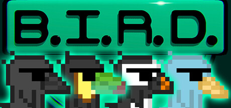
B.I.R.D. is 2.5D platformer with a big emphasis on music. You play as 4 different birds, each having to dodge various obstacles; some move, some rotate, some are timed to the song. Will you be able to make it in time and stop the world from (potentially) being destroyed?

$9.999 user reviews
Rhythm2D PlatformerPlatformer
Tim KashaniJan 12, 2026

B.I.R.D. scores 83/100 — better than 93% of Rhythm capsules (n=312).

9 user reviews · $9.99 · Released Jan 12, 2026 · By Tim Kashani

Quick text summary

B.I.R.D. scored 83/100 on Steam Analyzer — Good for a Rhythm capsule. Top priority fix: [genre_clarity] Consider adding a subtle music note icon or beat-synced visual indicator (e.g., pulsing aura on one bird) to communicate the rhythm-platformer core mechanic without cluttering the layout.

Capsule scores by dimension

  • Genre Clarity: 8/10 — Pixel platformer with music cue. The four distinct pixel-art bird characters in platformer poses with hazard obstacles clearly communicate a rhythm/music platformer game at full size. At SMALL size, the bird silhouettes and pixelated obstacle blocks remain legible, confirming the platformer genre. At TINY size, the characters and obstacles compress but the cyan-and-black color scheme maintains enough clarity to suggest an indie platformer, though music synchronization is no longer obvious.
  • Title Readability: 9/10 — Bold, legible title in all sizes. The B.I.R.D. title uses thick, high-contrast black letterforms on a bright cyan background with consistent spacing and clear sans-serif geometry. The title remains fully readable and distinctive even at TINY size due to the high value contrast and deliberate letter-spacing with periods. The strategic placement in the top region avoids the busy character field below.
  • Contrast & Color: 9/10 — Vibrant cyan with strong dark separation. The bright cyan background (#00D9A3 range) creates exceptional contrast against the Steam dark background (#1b2838), while black character outlines and dark gray obstacles provide sharp silhouette separation. At SMALL and TINY sizes, the cyan ground and character forms maintain crisp edges and silhouette clarity; the warm orange accents on the birds' beaks add subtle depth without compromising readability. In grayscale, the value hierarchy remains strong with clear separation between the bright mid-ground and dark elements.
  • Uniqueness & Polish: 8/10 — Distinctive pixel aesthetic with clear appeal. The capsule demonstrates intentional art direction through cohesive pixel-art style, thoughtful character variety (four different bird designs), and deliberate color choice that signals a modern indie game rather than retro pastiche. The composition of four characters side-by-side creates a team/selection visual metaphor that hints at core mechanics without generic tropes. The cyan-and-black palette is distinctive and memorable, though the chunky pixel style is common in the genre, the execution here is polished and purposeful.
  • Brand Consistency: 8/10 — Cohesive pixel palette recognizable. The cyan background, black outlines, and four distinct bird characters appear to form a core visual identity that would be recognizable across store screenshots and marketing materials. The pixel-art rendering style is applied consistently to all characters and UI elements (title, geometric obstacles). The color palette is distinctive enough to serve as a brand marker in a crowded indie space, though without access to the nine screenshots mentioned, this assumes internal visual consistency based on the unified rendering here.
  • Composition: 8/10 — Clear hierarchy with balanced focal layout. The title anchors the top third in a high-visibility zone, while the four bird characters create a strong focal line in the center-lower region, naturally guiding the eye across the capsule. The geometric obstacles frame the characters without overwhelming the composition, and the bright cyan field provides a clean staging ground that prevents clutter. The design shows good resilience at SMALL size with maintained focal clarity, though at TINY size the individual character details compress slightly, the primary silhouettes remain distinct and the title retains its prominence.

What works

  • Exceptional title contrast and legibility. The black B.I.R.D. text with period spacing on cyan background remains sharp and readable even at tiny thumbnail size, ensuring immediate game identification during quick scrolling.
  • Strong color separation against Steam background. The bright cyan platform reads as vivid against the dark Steam interface (#1b2838), creating instant visual pop and high discoverability in a browsing context.
  • Clear character-driven visual hook. Four distinct bird silhouettes in varied poses immediately communicate that the player selects or plays as different characters, implying gameplay variety and visual progression.
  • Polished pixel-art execution. The rendering style is intentional and consistent across all elements, avoiding the cheap-asset trap and signaling a well-crafted indie title with care in visual presentation.

What hurts the capsule

  • Music mechanic not visually obvious. While the platformer genre is clear, the core music synchronization mechanic is not communicated through visual cues alone; a player unfamiliar with B.I.R.D. would not infer the rhythm-based gameplay from this capsule alone.
  • Obstacle clarity diminishes at tiny size. The geometric hazard blocks and rotating elements become harder to parse at TINY thumbnail size, potentially reading as abstract noise rather than specific platforming challenges.
  • Limited environmental storytelling. The capsule shows gameplay elements but lacks visual narrative hooks about the 'world destruction' story element mentioned in the description, which could deepen emotional engagement.

Priority fixes

  1. [genre_clarity] Consider adding a subtle music note icon or beat-synced visual indicator (e.g., pulsing aura on one bird) to communicate the rhythm-platformer core mechanic without cluttering the layout.
  2. [composition] Ensure the geometric obstacles maintain distinction at TINY size by increasing their outline weight or adding subtle glow separation from the background.
  3. [uniqueness_polish] Test the capsule alongside top competitors (Balatro, DAVE THE DIVER, Hades II) at SMALL and TINY sizes to verify it stands out; consider if a signature visual flourish (particle effect, character expression, or foreground element) would increase memorability.

Store copy priority fixes

  1. [hook_strength] Strengthen the opening line by replacing 'Will you be able to make it in time' with a music-rhythm verb that emphasizes the core tension—e.g., 'Master rhythm-timed platforming as four birds race to stop a world-ending machine' or 'Time your jumps and dodges to the beat as you race against a countdown.'
  2. [feature_communication] Reorder the detailed description to lead with gameplay loop (obstacles, movement mechanics, music sync) before narrative setup, and reduce narrative exposition by 30-40% to prioritize why the game feels good to play.
  3. [audience_targeting] Add a single sentence that explicitly targets difficulty expectation, e.g., 'Perfect for players who love precision platformers with rhythm-based challenges—rewarding to master, but accessible to practice.' or 'Challenging but fair; designed for completionists seeking pixel-perfect levels and optional perfection runs.'
  4. [uniqueness] Insert a comparison phrase that anchors what makes B.I.R.D. special, e.g., 'Combines the tight controls of classic platformers with Crypt of the NecroDancer-style music synchronization' or 'The only platformer where every obstacle is locked to the beat—one song, one perfect run.'

Related guides

Steam app ID: 2196750 · Tags: Rhythm, 2D Platformer, Platformer, Bullet Hell, 2.5D