Scoring genre clarity...

No Name Village capsule

No Name Village

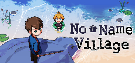
No Name Village is a top-down adventure rpg game, set in a peaceful village on the brink of being swallowed by the Black Sea. Play as a young boy, explore the world, battle monsters, and uncover the secrets behind the looming disaster.

$9.99Very Positive(51)
Pixel GraphicsStory RichExploration
PieMastahSep 13, 2025

No Name Village scores 60/100 — better than 0% of Pixel Graphics capsules (n=4,749).

Very Positive (51 reviews) · $9.99 · Released Sep 13, 2025 · By PieMastah

Quick text summary

No Name Village scored 60/100 on Steam Analyzer — Solid for a Pixel Graphics capsule. Top priority fix: [title_readability] Redesign title with a bolder sans-serif font or apply a solid dark background panel behind text to ensure legibility at 120px width and below.

Capsule scores by dimension

  • Genre Clarity: 7/10 — Top-down adventure RPG readable. The pixel art style, top-down perspective, and young protagonist in an outdoor village setting clearly signal a retro-styled adventure RPG. At TINY size, the silhouette of the boy character and floating enemies remain recognizable, though the peaceful village atmosphere is less apparent. The overall composition suggests exploration and adventure rather than action intensity, which aligns with the game's core identity.
  • Title Readability: 5/10 — Title present but loses clarity tiny. The title 'No Name Village' is rendered in a bold, pixelated serif font positioned on the right side against the sky background. At FULL size it reads cleanly, but at TINY size the letterforms become muddy and harder to parse, particularly the serif details that collapse at small scale. The placement avoids major character overlap, but the font weight and style do not optimize for sub-120px viewing.
  • Contrast & Color: 6/10 — Pleasant palette, moderate steam contrast. The bright blue sky, green vegetation, and warm brown character create a cohesive, inviting color scheme with reasonable separation. Against Steam's dark background #1b2838, the blue and browns provide decent value lift, though the mid-tone sky does not create aggressive visual pop. In grayscale test, the character silhouette remains distinct, but the overall image reads as soft rather than high-impact at quick-scroll speeds.
  • Uniqueness & Polish: 6/10 — Competent pixel art, generic scene. The pixel art is clean and well-executed with consistent sprite work and a cohesive color palette typical of indie adventure games. However, the composition is a fairly standard 'character in village with sky' scene without a distinctive hook, mechanic highlight, or unique visual storytelling element that separates it from dozens of similar indie RPGs. The craft is solid but the concept feels familiar rather than premium or memorable.
  • Brand Consistency: 6/10 — Consistent pixel style, no icon hook. The art direction is internally coherent with matching pixel density, color harmony, and a unified retro aesthetic across the visible elements. There is no distinctive character or symbol that immediately signals 'No Name Village' across future marketing—the boy is generic enough that it could belong to many games in the genre. The peaceful village mood is consistent but does not create strong, immediately recognizable brand identity cues.
  • Composition: 6/10 — Balanced layout, soft focal point. The young protagonist occupies the left-center area with the floating companion character above-right, creating a loose triangular balance. The title sits right-aligned on the upper portion, and the scene is layered with foreground character, midground plants, and sky background. At TINY size, the protagonist remains the primary focus, but the overall composition lacks a strong dramatic anchor or visual tension that would make it memorable at 120x45 pixels.

What works

  • Clean pixel art execution. The sprite work is well-crafted with consistent proportions, clear line work, and a cohesive retro aesthetic that feels polished rather than amateurish.
  • Genre intent is clear. The top-down perspective, village setting, and young protagonist immediately communicate adventure RPG intent without ambiguity.
  • Balanced color palette. Blues, greens, and warm browns create visual harmony and a peaceful, inviting mood that matches the game's peaceful village premise.

What hurts the capsule

  • Title illegible at tiny size. The pixelated serif font loses definition below 100px width, making the game name unreadable during quick Steam browsing at small capsule scale.
  • No distinctive visual hook. The scene is a generic village moment without a unique mechanic callout, character quirk, or visual element that makes this game stand out from similar pixel art RPGs.
  • Soft contrast against dark Steam bg. The bright but unsaturated sky and muted brown tones create pleasant visuals but don't punch with high value separation needed for fast discovery scrolling.
  • Weak brand identity signal. The protagonist and scene are competent but generic enough that they do not create lasting brand recall or immediately signal this game on sight.

Priority fixes

  1. [title_readability] Redesign title with a bolder sans-serif font or apply a solid dark background panel behind text to ensure legibility at 120px width and below.
  2. [contrast_color] Increase saturation and value contrast of the sky or add a darker accent element in the upper portion to create stronger visual punch on Steam's dark background.
  3. [uniqueness_polish] Add a distinctive visual element—such as a unique enemy design, glowing artifact, or environmental anomaly hint (e.g., encroaching black sea edge)—to communicate core gameplay and differentiate from generic adventure games.
  4. [composition] Strengthen focal hierarchy by enlarging the protagonist slightly or adding a visual direction cue that guides the eye to the title and reinforces game identity at small scales.

Store copy priority fixes

  1. [uniqueness] Add a sentence after the short description clarifying what makes this game's story, combat system, or exploration mechanically distinct (e.g., 'Season cycles change enemy types and pathways' or 'Choices in NPC interactions reshape the village's fate').
  2. [feature_communication] Expand the 'Expand your map' and 'Upgrade your equipment' bullets to 1–2 sentences each, explaining mechanical depth (e.g., 'Upgrade your equipment with rare drops to unlock new combat abilities and areas').
  3. [hook_strength] Rewrite the opening of the detailed description to lead with an emotional hook rather than pure setting—e.g., 'A village slowly consumed by darkness. Your choices and discoveries may be its only salvation.'

Related guides

Steam app ID: 2201500 · Tags: Pixel Graphics, Story Rich, Exploration, Hack and Slash, Action-Adventure