Scoring genre clarity...
Kerbal Space Program capsule

Kerbal Space Program

In Kerbal Space Program, take charge of the space program for the alien race known as the Kerbals. You have access to an array of parts to assemble fully-functional spacecraft that flies (or doesn’t) based on realistic aerodynamic and orbital physics.

HK$ 249.00Overwhelmingly Positive(1,017)
SpaceSimulationSandbox
Squad27 Apr, 2015

Kerbal Space Program scores 90/100 — better than 100% of Space capsules (n=1,490).

Overwhelmingly Positive (1,017 reviews) · HK$ 249.00 · Released 27 Apr, 2015 · By Squad

Quick text summary

Kerbal Space Program scored 90/100 on Steam Analyzer — Excellent for a Space capsule. Top priority fix: No priority fixes identified—this capsule is exceptionally well-executed across all dimensions and serves as a strong reference for the genre.

Capsule scores by dimension

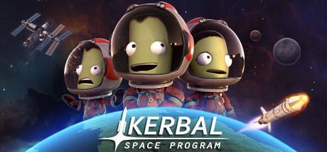
  • Genre Clarity: 9/10 — Space simulation instantly recognizable. Three Kerbals in spacesuits with distinctive wide-eyed expressions, a curved planet with atmosphere glow, orbital mechanics iconography (satellite upper left), and a rocket exhaust trail immediately communicate space exploration simulation. At tiny size, the alien character silhouettes and planet curve remain unmistakable genre signals that distinguish this from other games.
  • Title Readability: 9/10 — Bold title with excellent legibility. KERBAL appears in large, high-contrast white serif lettering positioned directly above the planet, with SPACE PROGRAM in smaller scale below. The title sits on a controlled gradient background that isolates it from character clutter, and the letterforms remain fully readable even at tiny thumbnail size with no collapse in clarity.
  • Contrast & Color: 9/10 — Vibrant contrast against dark space. The Kerbals' lime-yellow skin pops strongly against the deep space background, the glowing blue planet and orange rocket exhaust create warm-cool separation, and the white title text has maximum value separation from the dark cosmos. In grayscale, silhouettes remain crystal clear with distinct edges, and at tiny size the character trio and planet glow maintain full visual punch.
  • Uniqueness & Polish: 9/10 — Premium craft with distinctive character. The three Kerbals with their iconic goofy expressions, expressive eyes, and spacesuit detail work create strong visual personality that feels intentional and polished, not generic. The composition layers multiple environmental storytelling elements—satellite, planet, rocket exhaust—that communicate the game's core loop while maintaining a cohesive stylized art direction that feels distinctly Kerbal Space Program.
  • Brand Consistency: 9/10 — Signature Kerbal aesthetic throughout. The lime-green Kerbal character is iconic and immediately recognizable across the game's brand, the spacesuit design with red and gray accents is consistent and specific, and the playful expression tone matches the game's humorous approach to space physics. The palette and character rendering style are unmistakably tied to Kerbal Space Program's established visual identity.
  • Composition: 9/10 — Excellent focal hierarchy and balance. Three Kerbals form the primary focal point at center, with the glowing planet creating a strong secondary anchor below and the satellite and rocket providing directional guides that frame the scene without competing. Title placement above the characters uses safe margins and won't be cropped, the depth layering (space background, planet, characters, foreground glow) creates clear visual hierarchy, and the asymmetrical balance with rocket exhaust on the right guides the eye naturally through the composition.

What works

  • Iconic character personality. The three Kerbals with expressive wide-eyed faces and goofy grins instantly communicate the game's humorous tone and become memorable visual anchors that persist at all sizes.
  • Strong environmental storytelling. Satellite, planet, rocket exhaust, and space elements work together to immediately communicate space exploration gameplay without requiring text interpretation.
  • Excellent color and contrast strategy. Lime-yellow characters against deep space, glowing blue planet, and orange rocket exhaust create multiple layers of visual separation that remain distinct even at tiny thumbnail size.
  • Professional typography placement. Title sits on controlled gradient background isolated from character clutter, ensuring maximum readability at all scales without competing for attention.

What hurts the capsule

  • No meaningful weaknesses at scale. The capsule maintains clarity and impact across full, small, and tiny viewing sizes with no significant legibility or contrast collapse.
  • Composition remains resilient to cropping. All critical elements—characters, planet, title—sit safely within core composition margins and won't be compromised by Steam's typical image cropping behavior.

Priority fixes

  1. No priority fixes identified—this capsule is exceptionally well-executed across all dimensions and serves as a strong reference for the genre.

Store copy priority fixes

  1. [feature_communication] Replace 'and much more!' with a specific example of late-game progression, such as 'develop advanced propulsion systems and establish inter-planetary supply chains' to maintain feature specificity.
  2. [uniqueness] Expand the modding mention into the main feature list with a sentence like 'Customize and extend your game with thousands of community-created mods, from new spacecraft to gameplay overhauls' to highlight KSP's ecosystem strength.
  3. [audience_targeting] Add a brief line in the opening or after the three-mode description explicitly naming the educational and STEM-learning value, e.g., 'Learn real orbital mechanics and aerospace engineering principles while building and testing your designs.'

Related guides

Steam app ID: 220200 · Tags: Space, Simulation, Sandbox, Physics, Science