Scoring genre clarity...
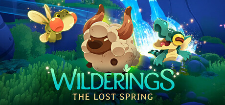
Wilderings: The Lost Spring capsule

Wilderings: The Lost Spring

Master the wilds. Restore a broken world. In this creature-collecting roguelite, dynamic action meets open-world style exploration. Befriend mystical Hântu to heal a corrupted land! From Herobeat, the BAFTA-winning creators of Endling. Official selection for London Games Festival 2026.

Early AccessCreature CollectorAction
Herobeat StudiosComing soon

Wilderings: The Lost Spring scores 75/100 — better than 68% of Early Access capsules (n=3,143).

Released Coming soon · By Herobeat Studios

Quick text summary

Wilderings: The Lost Spring scored 75/100 on Steam Analyzer — Good for a Early Access capsule. Top priority fix: [composition] Ensure character silhouette has at least 10-15px safe margin from right edge to prevent Steam crop issues across all display contexts

Capsule scores by dimension

  • Genre Clarity: 7/10 — Clear creature-collecting adventure vibe. The character on the right with distinctive features (white fluffy hair, brown skin, orange/golden armor) and the mystical aesthetic immediately signal a fantasy adventure or creature-collecting game. At TINY size, the character silhouette and whimsical design remain readable enough to convey the genre, though specific mechanics like roguelite elements are not visually apparent. The blue atmospheric background and character pose suggest exploration and adventure rather than pure action combat.
  • Title Readability: 8/10 — Strong cyan logo with readable subtitle. The title 'WILDERINGS' in bright cyan-green stands out excellently against the dark blue background with strong luminosity contrast. The subtitle 'THE LOST SPRING' in warm orange gold below provides secondary hierarchy and remains readable at small size. At TINY size, the main logo maintains clarity due to its luminous color and letter spacing, though the subtitle becomes challenging but still partially legible.
  • Contrast & Color: 8/10 — High-value cyan against dark blue field. The cyan-green 'WILDERINGS' text and the character's light-colored hair and gold armor create strong value separation against the dark blue background. The warm orange subtitle and character gold accents add secondary contrast and visual warmth. In grayscale, the title and character maintain clear silhouette separation from background, and the composition avoids muddy mid-tones that would collapse readability at small sizes.
  • Uniqueness & Polish: 7/10 — Charming character design with polish. The character design is distinctive and well-rendered with thoughtful details like the white fluffy hair, expressive eyes, and coordinated color palette (brown, orange, gold, cream). The visual style feels intentional and premium rather than generic, with clear personality and craft evident in the illustration. However, the overall composition and layout follow relatively common capsule patterns, placing it as solid but not groundbreaking compared to standout indie titles like DAVE THE DIVER or Hades II.
  • Brand Consistency: 7/10 — Cohesive art style with signature palette. The warm-cool color balance (cool cyan title, warm character tones, cool blue background) creates internal consistency. The character design establishes a memorable visual identity with the distinctive silhouette, creature-companion aesthetic, and whimsical tone that should be recognizable across marketing materials. The illustration style and color palette appear cohesive and branded, though without access to other store assets, full verification of cross-asset consistency is limited.
  • Composition: 8/10 — Clear focal point with balanced layout. The character is positioned right of center as the primary focal point, while the title anchors the left side, creating balanced asymmetrical composition. The character's gaze and pose guide attention naturally without creating dead center voids. At TINY size, the layout remains clear with the title on the left and character on the right maintaining readable separation; safe margins appear adequate and unlikely to suffer from Steam edge cropping.

What works

  • Luminous title contrast. The bright cyan-green 'WILDERINGS' creates exceptional value separation against the dark blue background and remains readable even at tiny thumbnail size.
  • Distinctive character presence. The well-illustrated character with unique silhouette, personality, and color harmony (white hair, brown skin, gold armor) immediately communicates the game's charm and creature-focused theme.
  • Balanced asymmetrical layout. Title and character placement create a natural visual flow with clear focal hierarchy and no wasted negative space, maintaining composition integrity at all size reductions.
  • Warm-cool color sophistication. The interplay of cool cyan title, cool blue background, and warm orange/gold character accents creates visual richness and intentional color direction.

What hurts the capsule

  • Subtitle legibility at tiny size. The orange 'THE LOST SPRING' subtitle becomes hard to parse at TINY thumbnail size due to smaller point size, though not critical since the main title carries the branding.
  • Limited gameplay mechanic visualization. While the character is charming, the capsule does not visually communicate the roguelite or creature-collecting mechanics beyond general fantasy aesthetic, making it less distinctive than top-tier genre entries.
  • Character right-side edge proximity. The character extends close to the right edge, which could result in cropping or composition tightness on certain Steam display contexts, particularly narrower capsule presentations.

Priority fixes

  1. [composition] Ensure character silhouette has at least 10-15px safe margin from right edge to prevent Steam crop issues across all display contexts
  2. [uniqueness_polish] Add subtle visual elements (creature companion, environmental detail, or UI mockup) that hint at roguelite or creature-collecting mechanics to increase genre specificity
  3. [title_readability] Increase subtitle 'THE LOST SPRING' point size or letter spacing slightly to improve legibility at TINY size without disrupting layout

Store copy priority fixes

  1. [hook_strength] Rewrite the short description to lead with the core gameplay hook—'Befriend mystical Hântu and master dynamic action to heal a corrupted world'—before mentioning developer pedigree or festival selection.
  2. [feature_communication] Add a concrete example of Hântu ability synergy in the 'Synergetic Combat' section, such as 'a Hântu that soaks fire damage pairs with Abi's ranged attacks to unleash a fiery counter-strike' to clarify how combos function.
  3. [audience_targeting] Insert a brief difficulty or tone descriptor early in the detailed description, e.g., 'Challenging action for players who enjoy puzzle-like boss patterns and build experimentation' to signal intended skill level.
  4. [uniqueness] Strengthen the differentiation by explicitly contrasting this game's eco-restoration gameplay loop with other creature-collecting roguelites, e.g., 'Unlike traditional collectors, your caught Hântu actively restore the world, unlocking traversal shortcuts and biome rewards that reshape your journey.'

Related guides

Steam app ID: 2217470 · Tags: Early Access, Action, Roguelite, Adventure, Creature Collector