Scoring genre clarity...
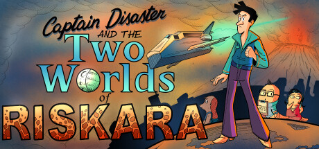
Captain Disaster and The Two Worlds of Riskara capsule

Captain Disaster and The Two Worlds of Riskara

A new Captain Disaster adventure; this time he is more of a hero than a disaster! ... Or is he? A point and click adventure game with cartoony graphics, epic storyline and more bad jokes than you can possibly imagine. Wishlist this game. It is your destiny...

AdventurePoint & Click2D
Dave Seaman, Lorenzo Boni2026

Captain Disaster and The Two Worlds of Riskara scores 77/100 — better than 83% of Adventure capsules (n=8,231).

Released 2026 · By Dave Seaman

Quick text summary

Captain Disaster and The Two Worlds of Riskara scored 77/100 on Steam Analyzer — Good for a Adventure capsule. Top priority fix: [title_readability] Consolidate title into two lines max (Captain Disaster | Two Worlds: Riskara) to strengthen brand messaging unity and ensure RISKARA reads as subtitle rather than separate element at TINY size.

Capsule scores by dimension

  • Genre Clarity: 8/10 — Clear adventure comedy game. The cartoonish character design, vintage point-and-click UI elements (magnifying glass, binoculars visible in the scene), and adventure-themed setting with aircraft and volcano immediately signal adventure game genre. At TINY size, the character silhouette and comic art style remain readable and distinctly communicate a comedic adventure, though specific subgenre nuances blur.
  • Title Readability: 7/10 — Legible but multi-line split. The title 'Captain Disaster in Two Worlds' uses a clear cyan handwritten font that reads well at full size, though the three-line layout (Captain Disaster / TWO Worlds / RISKARA) spreads information across vertical space. At SMALL size the text remains distinguishable with good contrast against the background, but at TINY size RISKARA as a separate line becomes challenging to parse as connected to the main title.
  • Contrast & Color: 8/10 — Strong warm-cool separation. The design uses a vibrant warm-to-cool gradient from orange-red in the right background through cyan-green in the sky, creating excellent value separation against the dark Steam background. The character in teal jacket pops clearly, and the silhouetted volcano and terrain provide dark anchors that enhance midground contrast. Even at TINY size, the color palette maintains clear edge definition and doesn't muddy into the background.
  • Uniqueness & Polish: 8/10 — Distinctive cartoony art style. The capsule showcases a cohesive, hand-drawn cartoon aesthetic with expressive character design and environmental storytelling through the volcano, aircraft, and adventure props that feel intentional and premium. The art direction clearly differentiates it from generic adventure fare—this is unmistakably a comedic retro-style adventure with personality. The craft level is solid throughout with consistent line weight and color theory application.
  • Brand Consistency: 7/10 — Recognizable character identity. Captain Disaster as the central character anchor provides strong brand recognition potential, and his distinctive silhouette (tall frame, colorful outfit, confident pose) creates a memorable identity marker. The retro cartoon rendering style is internally consistent across all visible elements, though without reference to the 34 screenshots, the broader visual ecosystem cannot be fully assessed for long-term recognition cues.
  • Composition: 8/10 — Balanced focal hierarchy layered. The composition uses clear depth layering: dark silhouetted terrain foreground, mid-ground characters and volcano, and bright gradient sky background creating strong visual hierarchy. Captain Disaster stands prominently in the right third with good space around him, while secondary characters and objects support without competing. Title placement in the upper left-center on controlled background avoids clutter, and at SMALL and TINY sizes the primary subject (Captain) remains the clear focal point.

What works

  • Vibrant color gradient contrast. The warm orange-to-cool cyan color transition creates strong visual pop against the Steam dark background with excellent value separation throughout the composition.
  • Clear character focal point. Captain Disaster's prominent right-side placement with confident pose and distinctive silhouette commands attention immediately and reads clearly even at TINY size.
  • Coherent cartoon art direction. The hand-drawn aesthetic is consistently applied across all elements, creating a premium, intentional visual identity that differentiates from generic adventure game templates.
  • Readable title with handwritten personality. The cyan cursive font for 'Captain Disaster' provides good contrast and personality while maintaining legibility at small scales.

What hurts the capsule

  • Multi-line title fragmentation. Splitting the title across three lines (Captain Disaster / TWO Worlds / RISKARA) creates visual separation that weakens brand message cohesion, especially problematic at TINY size where RISKARA reads as a separate element.
  • Secondary character visual weight. The group of characters in the center-left competes slightly with Captain Disaster as focal point, creating momentary attention split during quick scroll even though hierarchy ultimately favors the main character.
  • Tagline missing context. No visible descriptive tagline or catch phrase that communicates the game's core hook or selling proposition beyond the character presence, relying solely on visual genre inference.

Priority fixes

  1. [title_readability] Consolidate title into two lines max (Captain Disaster | Two Worlds: Riskara) to strengthen brand messaging unity and ensure RISKARA reads as subtitle rather than separate element at TINY size.
  2. [composition] Rebalance center-left character group visual weight by reducing saturation or contrast slightly so Captain Disaster remains unambiguous primary focal point across all viewing sizes.
  3. [genre_clarity] Consider adding a small UI affordance or icon (quest marker, dialogue bubble) to reinforce point-and-click adventure mechanics more explicitly for players unfamiliar with the franchise.

Store copy priority fixes

  1. [feature_communication] Add 1-2 sentences describing the core gameplay loop: e.g., 'Explore two contrasting alien worlds, solve environment-based puzzles, and unlock the planet's mysteries through conversations with quirky inhabitants.' This clarifies what players do for hours, not just the story premise.
  2. [uniqueness] Specify what makes the 'Two Worlds' mechanic distinct—do players switch between parallel realities, experience different physics, or access unique character perspectives? Replace generic 'complex themes' with a concrete differentiator.
  3. [hook_strength] Rewrite the opening line to lead with intrigue rather than franchise recognition: e.g., 'A hapless space captain answers a distress call and uncovers a forgotten empire's secrets on an alien world...' This hooks newcomers before mentioning the character name.
  4. [audience_targeting] Add a single, clear sentence positioning the game for your primary audience—either 'Perfect for retro adventure fans who crave hardcore puzzles' or 'A charming all-ages adventure that respects player intelligence'—rather than trying to appeal equally to both.

Related guides

Steam app ID: 2242270 · Tags: Adventure, Point & Click, 2D, Cartoon, Cartoony