Scoring genre clarity...

VideoHole: Episode II capsule

VideoHole: Episode II

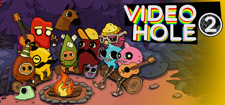
Fall down further. Find them where they have always been. Help them remember. Explore multiple worlds, solve mysteries, and set your retail-hardened will against a mysterious cosmic force in the second installment of the beloved videohole series.

$9.99Positive(12)
AdventureInteractive FictionStory Rich
JofiSoftOct 23, 2025

VideoHole: Episode II scores 73/100 — better than 61% of Adventure capsules (n=7,922).

Positive (12 reviews) · $9.99 · Released Oct 23, 2025 · By JofiSoft

Quick text summary

VideoHole: Episode II scored 73/100 on Steam Analyzer — Good for a Adventure capsule. Top priority fix: [genre_clarity] Add a subtle environmental or mechanical cue (e.g., a world-hopping portal, mystery symbol, or layered world stack) to reinforce the adventure-mystery core without cluttering the character focus.

Capsule scores by dimension

  • Genre Clarity: 7/10 — Colorful indie adventure with puzzle hints. The capsule communicates indie game through vibrant character design and whimsical creature collection, but the genre messaging is somewhat ambiguous. At tiny size, the colorful cast and mysterious cosmic elements read as adventure-adjacent, though the puzzle and mystery elements are not immediately obvious from silhouettes alone. The aesthetic clearly signals indie rather than mainstream AAA.
  • Title Readability: 8/10 — Bold rainbow title, clear at all sizes. The title 'VIDEO HOLE 2' uses bright rainbow letterforms with a strong yellow-gold backing strip that ensures excellent contrast against the dark Steam background. The text remains clearly readable at small and tiny sizes due to bold weight and high saturation. The sequential number '2' is clearly visible, confirming this is Episode II.
  • Contrast & Color: 8/10 — Strong value separation, vibrant palette pops. The capsule uses high-saturation reds, oranges, yellows, and blues against a muted purple-gray background, creating excellent silhouette clarity even when squinting. The gradient from purple-blue at top to warm orange-brown at bottom provides clear depth layering. Characters read distinctly even at tiny size due to bold outline strokes and color saturation.
  • Uniqueness & Polish: 7/10 — Distinctive character art, competent execution. The hand-drawn character design and quirky creature aesthetic feel distinctive and intentional, avoiding generic indie template looks. The craft is clean with consistent line weight and color control, though the composition reads more as a character showcase than a specific narrative hook or gameplay mechanic reveal. This polish exceeds baseline competency without reaching exceptional standout status.
  • Brand Consistency: 7/10 — Recognizable character style, consistent approach. The vibrant character lineup with consistent outline style and emotional expression creates a memorable visual identity that would be recognizable across marketing materials. The warm color palette and whimsical tone suggest a cohesive series aesthetic, though without direct reference to the first episode's capsule, internal consistency alone reads as solid rather than exceptional. The numbered sequel treatment reinforces brand continuity.
  • Composition: 7/10 — Busy but balanced, clear focal hierarchy. The composition arranges multiple characters across the frame with the title occupying the top-right, creating a clear upper anchor point while characters fill the mid and lower sections. At small and tiny sizes, the group reads as a unified mass rather than scattered elements, with the brightest characters and the title strip naturally drawing attention. The layout has adequate margin safety, though the character cluster at bottom-center occupies significant space that could feel slightly crowded at very small sizes.

What works

  • High-impact rainbow title treatment. The 'VIDEO HOLE 2' text with rainbow gradient and gold backing strip commands attention and remains perfectly legible at tiny sizes due to bold weight and stark contrast.
  • Cohesive character-driven aesthetic. The consistent hand-drawn style, outline weight, and expressive character design create a memorable and distinctly indie visual identity that differentiates from generic templates.
  • Excellent background-subject separation. The muted purple-gray background and strategic color saturation in character design ensure silhouettes remain clear even in grayscale, maintaining strong visual hierarchy at all viewing sizes.

What hurts the capsule

  • Genre messaging remains ambiguous. While the art style is distinctive, the capsule does not clearly communicate that this is a mystery-puzzle adventure; the character showcase approach could imply several different game types.
  • Character cluster feels slightly dense at tiny sizes. The bottom-center character concentration creates a visual bottleneck that may read as slightly cluttered when viewed as a 120×45 thumbnail in quick scroll.
  • Limited narrative or mechanical context. The capsule prioritizes character appeal over storytelling or gameplay hints; viewers unfamiliar with the series gain little understanding of what 'fall down further' or 'set your will against a cosmic force' actually means.

Priority fixes

  1. [genre_clarity] Add a subtle environmental or mechanical cue (e.g., a world-hopping portal, mystery symbol, or layered world stack) to reinforce the adventure-mystery core without cluttering the character focus.
  2. [composition] Consider tightening the bottom character cluster slightly or adjusting vertical spacing to reduce perceived density at tiny size while maintaining the current joyful energy.
  3. [uniqueness_polish] Emphasize a signature visual motif or symbolic element (consistent with the cosmic/mysterious theme) that differentiates this from a general character roster and hints at the game's core hook.

Store copy priority fixes

  1. [audience_targeting] Add a sentence early in the short or detailed description clarifying this is a sequel and briefly stating what new players need to know (e.g., 'Whether you're returning or jumping in, help your friends escape a cosmic nightmare').
  2. [feature_communication] Replace or supplement the narrative paragraph with a bullet-point list of concrete mechanics: 'Explore surreal, interconnected worlds. Solve puzzles tied to each friend's memories. Unlock secrets to uncover the truth about the VideoHole.'
  3. [uniqueness] Add one sentence explaining what makes Episode II mechanically or narratively distinct from Episode I (e.g., new worlds, expanded mechanics, new characters, or a different tone).

Related guides

Steam app ID: 2269060 · Tags: Adventure, Interactive Fiction, Story Rich, Singleplayer, Walking Simulator