Scoring genre clarity...
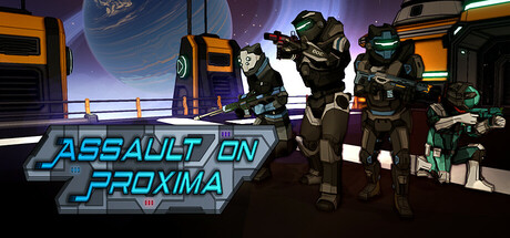
Lock and load with Strike Force Delta in this action-packed sci-fi FPS! Play solo or team up to blast through hordes of Gacrux alien invaders, save humanity’s colonies, and dominate intense PvP showdowns. Gear up, soldier, and get ready to lead the Assault on Proxima!
$3.99Positive(32)
FPSSci-fiShooter
Delta Video GamesMar 10, 2025