Scoring genre clarity...
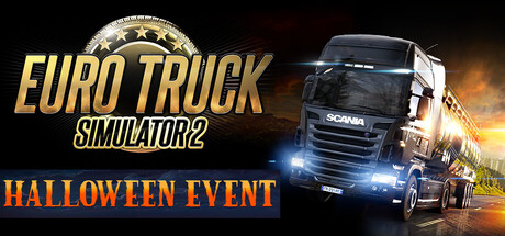
Euro Truck Simulator 2 capsule

Euro Truck Simulator 2

Travel across Europe as king of the road, a trucker who delivers important cargo across impressive distances! With dozens of cities to explore, your endurance, skill and speed will all be pushed to their limits.

19,99€Overwhelmingly Positive(6,121)
DrivingTransportationSimulation
SCS Software12 Oct, 2012

Euro Truck Simulator 2 scores 87/100 — better than 96% of Driving capsules (n=635).

Overwhelmingly Positive (6,121 reviews) · 19,99€ · Released 12 Oct, 2012 · By SCS Software

Quick text summary

Euro Truck Simulator 2 scored 87/100 on Steam Analyzer — Excellent for a Driving capsule. Top priority fix: [composition] Increase vertical spacing between SIMULATOR2 text and truck cabin to ensure safe margin compliance across all Steam crop variations

Capsule scores by dimension

  • Genre Clarity: 9/10 — Truck simulation instantly recognizable. The large Scania truck positioned centrally with cargo trailer, headlights on, and motion blur immediately signals a driving/trucking simulation. The golden steering wheel emblem in the top left reinforces vehicular control theme. Even at TINY size, the truck silhouette and headlights remain unmistakably clear, leaving no ambiguity about genre.
  • Title Readability: 9/10 — Bold gold text reads perfectly. EURO TRUCK SIMULATOR2 is rendered in large, high-contrast golden italic text positioned on the left side against a dark background with minimal texture interference. The title maintains full legibility at SMALL and TINY sizes due to strong value separation and generous letter spacing. No tagline clutter or small text interferes with recognition.
  • Contrast & Color: 9/10 — Warm gold and cool truck pop. The golden title text and steering wheel emblem create strong warm-to-cool contrast against the dark #1b2838 background, while the truck's white cabin and blue headlights provide additional value separation. In grayscale, the light truck and bright title remain clearly distinct from dark surroundings, with sharp silhouette edges that survive at TINY size.
  • Uniqueness & Polish: 8/10 — Professional execution with strong branding. The capsule demonstrates premium production quality with motion blur effects, dramatic lighting (golden sunset glow), and a recognizable iconic truck model that feels authentic to the sim genre. The golden emblem and sunset ambiance elevate it beyond generic—this is cohesive branded work rather than a template application, though the core concept remains within expected sim trailer visual language.
  • Brand Consistency: 8/10 — Cohesive Euro Truck identity established. The golden color palette, European truck imagery, and steering wheel emblem create a memorable identity tied to the franchise. The warm sunset lighting and cargo trailer are signature visual cues that appear consistent with franchise marketing. The style feels distinctly Euro Truck Simulator, not a generic truck sim.
  • Composition: 9/10 — Balanced hierarchy with clear focal point. The truck occupies the right two-thirds as primary subject while the title anchors the left third, creating natural visual flow without competition. The golden steering wheel emblem acts as a secondary accent in the upper left. Safe margins protect all key elements, and the composition remains legible and balanced when cropped to SMALL or TINY sizes.

What works

  • Instant genre recognition. Truck silhouette with headlights and cargo trailer immediately communicates the simulation premise without ambiguity.
  • Strong title contrast and placement. Golden text positioned cleanly on dark background with excellent legibility maintained at all viewing scales.
  • Professional motion and lighting effects. Sunset glow, headlight bloom, and motion blur create premium production value without overwhelming the subject.
  • Recognizable franchise branding. Golden emblem and warm palette establish a memorable identity consistent with Euro Truck Simulator visual language.

What hurts the capsule

  • Minor emblem visibility at tiny size. The steering wheel emblem in the top left becomes very small and less impactful at TINY thumbnail size, though it does not obstruct readability.
  • Slight text-subject overlap potential. At FULL size, the subtitle SIMULATOR2 sits close to the truck edge and could benefit from slightly more clearance in certain crops.

Priority fixes

  1. [composition] Increase vertical spacing between SIMULATOR2 text and truck cabin to ensure safe margin compliance across all Steam crop variations
  2. [title_readability] Consider slightly larger emblem or stronger outline to improve prominence at TINY thumbnail size without disrupting composition

Store copy priority fixes

  1. [hook_strength] Rewrite the opening to lead with the meditative, long-haul experience ('Master the open roads of Europe on epic journeys') rather than 'king of the road,' and add 'relax and unwind' language that matches the game's primary audience appeal.
  2. [uniqueness] Add a sentence explicitly positioning the European setting and real geography as a core differentiator, e.g., 'Haul authentic European routes through dozens of real cities, not generic highways.'
  3. [tone_match] Reframe World of Trucks section to emphasize community and shared experience rather than feature mechanics, e.g., 'Share your best moments with thousands of truckers worldwide' instead of listing registration and upload functions.
  4. [audience_targeting] Explicitly call out the relaxing, long-haul gameplay loop for chill-game players in the short description or opening paragraph, not just the challenge and skill elements.

Related guides

Steam app ID: 227300 · Tags: Driving, Transportation, Simulation, Open World, Automobile Sim