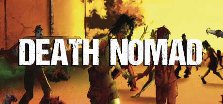
Death Nomad scores 68/100 — better than 17% of Action capsules (n=8,534).

Quick text summary

Death Nomad scored 68/100 on Steam Analyzer — Solid for a Action capsule. Top priority fix: [uniqueness_polish] Introduce a distinctive visual motif—such as an iconic nomadic symbol, unique equipment silhouette, or signature color accent that reflects the procedural/nomadic core mechanic and differentiates Death Nomad from generic post-apocalyptic action games

Capsule scores by dimension

  • Genre Clarity: 7/10 — Action survival gameplay evident. The capsule clearly communicates action through dynamic character poses, weapon silhouettes, and environmental hazard cues like fire and destruction. Multiple armed figures in combat stance against a hostile apocalyptic setting read as survival-action at full size. At tiny size, the warm color palette and aggressive posturing still convey danger and action, though survival-specific mechanics become less distinct.
  • Title Readability: 8/10 — Bold white text reads cleanly. DEATH NOMAD uses a strong sans-serif white font positioned in the upper-middle portion of the image with excellent contrast against the warm orange-yellow background. The letterforms remain legible at small size due to weight and outline clarity. At tiny size the title remains readable as a cohesive block, though fine serifs would be lost—the chosen style preserves clarity at all scales.
  • Contrast & Color: 8/10 — Warm palette pops against dark Steam background. The orange-yellow-red gradient background creates strong value separation from the #1b2838 Steam dark theme, making the capsule immediately noticeable in a feed. Character silhouettes read clearly with dark clothing against bright environmental light, and the white title sits in high contrast. At tiny size, the warm color field remains dominant and distinguishable from Steam's cold dark interface.
  • Uniqueness & Polish: 6/10 — Competent but generic apocalyptic aesthetic. The image presents a functional post-apocalyptic scene with armed survivors, destroyed buildings, and environmental chaos—a familiar survival-game visual language that does not strongly differentiate Death Nomad from competitors like Lethal Company or HELLDIVERS 2. The execution is clean and the orange color temperature is consistent, but the composition lacks a distinctive hook or memorable visual identity unique to this title's procedural-generation or nomadic survival mechanics.
  • Brand Consistency: 5/10 — Generic survival aesthetic lacks identity. The capsule uses a standard post-apocalyptic visual language (fire, destruction, armed figures, warm color grade) that could apply to many survival titles without establishing a distinctive brand identity for Death Nomad specifically. No iconic character, signature symbol, or unique color motif emerges that would be recognizable across store screenshots or future marketing. The style is internally coherent but does not signal what makes Death Nomad's procedural and nomadic design philosophy visually distinct.
  • Composition: 7/10 — Clear focal depth, title placement strong. The composition layers foreground characters, midground buildings, and background explosion/sky, creating visual depth that holds attention at full size. The title is positioned in safe upper-middle space without critical edge cropping risk. At small size the depth layering still reads and the title remains prominent, though at tiny size individual character details blur into the ensemble.

What works

  • High contrast warm palette. The orange-yellow-red gradient creates immediate visual pop against Steam's dark background and remains readable at all sizes in quick scroll.
  • Strong title legibility. White sans-serif DEATH NOMAD maintains clarity and visual hierarchy across full, small, and tiny viewing scales with strategic placement.
  • Layered environmental composition. Foreground-to-background depth with characters, structures, and sky creates a sense of scale and action that reads well even when compressed.

What hurts the capsule

  • Generic survival game aesthetic. Post-apocalyptic ruins, armed survivors, and fire are visual tropes shared across many action-survival titles, offering no distinctive brand hook for Death Nomad.
  • No unique visual identity signal. The capsule does not communicate or emphasize the procedural generation or nomadic movement mechanics that differentiate the game from traditional survival shooters.
  • Character silhouettes blend at tiny scale. Multiple armed figures create a busy ensemble that loses individual definition and strategic pose clarity when compressed to thumbnail size.

Priority fixes

  1. [uniqueness_polish] Introduce a distinctive visual motif—such as an iconic nomadic symbol, unique equipment silhouette, or signature color accent that reflects the procedural/nomadic core mechanic and differentiates Death Nomad from generic post-apocalyptic action games
  2. [genre_clarity] Add a clear survival-specific UI element (e.g., equipment/durability bar, procedural map fragment, resource counter) in a corner to signal the survival-progression loop and nomadic movement focus at small sizes
  3. [brand_consistency] Establish a consistent color or character signature across the 13 screenshots that can anchor brand identity and make this capsule recognizable as part of the Death Nomad family

Store copy priority fixes

  1. [hook_strength] Rewrite the short description to lead with a specific, action-forward hook: replace 'survival game with procedurally generated environments' with something like 'Survive the wasteland: scavenge, craft, fight, and drive your way through endless hordes in a world that never stops trying to kill you.'
  2. [uniqueness] Add a 1-2 sentence section explicitly differentiating Death Nomad—e.g., highlight the crafting penalty system, vehicle customization depth, or the specific progression/contamination mechanic that makes hordes escalate, positioning what is actually unique.
  3. [feature_communication] Restructure the detailed description to show gameplay flow: describe a typical 10-minute play session (e.g., 'Start at an outpost, scavenge nearby for materials, craft an upgrade, fortify a position, survive an approaching horde, then drive to the next safe zone') rather than isolated bullet points.
  4. [tone_match] Inject voice and urgency into the copy—replace clinical descriptions ('Fortify your position with walls and traps') with sensory or dramatic language that matches the post-apocalyptic tone and makes the game feel alive.

Related guides

Steam app ID: 2279180 · Tags: Action, Shooter, Roguelike, Exploration, Collectathon