Scoring genre clarity...
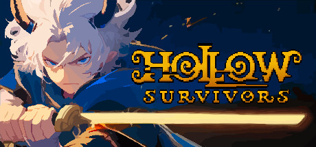
Battle through hordes of horrific creatures as you hack and slash your way to the top of the Tower in this rogue-like dungeon crawler game. Choose from a variety of upgrades and weapons, and save the Tower.
$9.99Very Positive(170)
Bullet HellRogueliteAction Roguelike
Danny DeerApr 10, 2025