Scoring genre clarity...
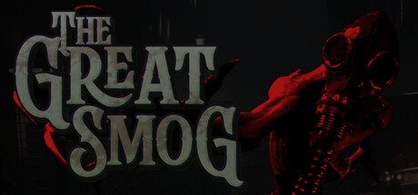
A Steampunk Co-Op Horror for 1-4 players. Descend from your fully customizable airship into the streets of Post-Apocalyptic Victorian London to scavenge resources, craft gear and take on terrifying mutants inspired by British myths.
$12.992 user reviews
Early AccessOnline Co-OpSteampunk
JFi GamesOct 31, 2025