Scoring genre clarity...
Quake II capsule

Quake II

You are humanity’s last hope to stop the Strogg, a hostile alien race waging war against Earth. Play this military sci-fi FPS, now upgraded for modern platforms with improved visuals, new campaign content, online multiplayer/co-op, and more.

$9.99Very Positive(112)
FPSClassicAction
id Software, Nightdive Studios, MachineGamesAug 3, 2007

Quake II scores 88/100 — better than 99% of FPS capsules (n=1,477).

Very Positive (112 reviews) · $9.99 · Released Aug 3, 2007 · By id Software

Quick text summary

Quake II scored 88/100 on Steam Analyzer — Excellent for a FPS capsule. Top priority fix: [genre_clarity] Consider adding subtle background environmental cues (alien tech, military setting detail) while maintaining minimalist balance to strengthen sci-fi FPS communication without cluttering the composition

Capsule scores by dimension

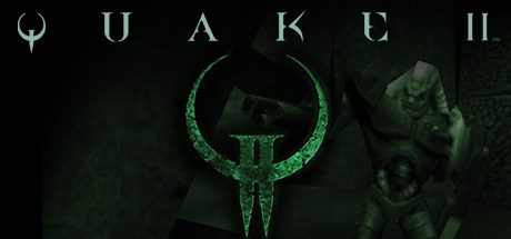
  • Genre Clarity: 8/10 — Strong sci-fi FPS identity established. The Quake II logo paired with the iconic triple-spiked rune symbol instantly communicates a sci-fi shooter, specifically the recognizable Strogg aesthetic. At tiny size, the glowing cyan rune remains legible and distinctive, clearly signaling futuristic military action over fantasy or other genres. The sparse, technical presentation reinforces hard sci-fi rather than fantasy or horror.
  • Title Readability: 9/10 — Excellent legibility across all sizes. The title text 'QUAKE II' uses an elegant, widely-spaced serif font in pale cyan-green that contrasts sharply against the dark textured background. Letter spacing and font weight maintain clarity even at tiny thumbnail size, and the title sits in a clean upper region with no competing visual noise. The minimalist presentation ensures the title never collapses or becomes ambiguous regardless of viewing scale.
  • Contrast & Color: 9/10 — Premium contrast with striking silhouettes. The pale cyan-green rune and title text create excellent value separation against the nearly black, heavily textured background. The glowing effect on the symbol gives it dimensional pop without relying on saturation alone, and the grayscale squint test shows clear edge definition and subject separation. At tiny size, the bright rune remains instantly recognizable and cuts through the dark field with authority.
  • Uniqueness & Polish: 9/10 — Iconic brand symbol with premium craft. The Strogg rune is an instantly recognizable franchise symbol that carries decades of brand equity, paired with restrained, high-end minimalist design that avoids cheap asset vibes. The weathered texture overlay and glowing effect feel intentional and polished rather than template-based. The visual story—a lone alien symbol emerging from darkness—communicates alien threat and military sci-fi positioning without relying on generic explosions or action poses.
  • Brand Consistency: 9/10 — Unmistakable brand identity reinforced. The Strogg triple-spiked rune is the core visual identity of Quake II and appears consistently across all franchise materials; this capsule leads with that iconic motif. The cyan-green palette and aged texture treatment align with the series' technological-gothic aesthetic established in the original 1997 release. The minimal approach creates a signature look that would be immediately recognizable to fans while remaining distinctive in a storefront browsing context.
  • Composition: 9/10 — Balanced focal hierarchy with safe margins. The Strogg rune sits as the dominant central focal point, with the title anchored above it in the upper-third safe zone, leaving breathing room on all edges for Steam cropping. The vertical alignment creates natural hierarchy and visual flow without clutter or dead space. At small and tiny sizes, both the rune and title remain clearly visible and centered, with no important elements risking crop or obscuration.

What works

  • Iconic franchise symbol usage. The Strogg rune instantly communicates the Quake II brand and alien sci-fi threat without requiring rendered characters or complex imagery.
  • Exceptional minimalist design discipline. Restrained color palette, sparse composition, and negative space convey premium positioning and avoid generic action-game template clichés.
  • Flawless readability across all viewing scales. Both title and primary symbol remain sharp, legible, and impactful from full header size down to tiny 120×45 thumbnail dimensions.
  • Strategic technical aesthetic. Aged texture, glowing cyan accents, and stark contrast reinforce hard sci-fi military positioning without requiring complex visual effects.

What hurts the capsule

  • Static presentation lacks action energy. Unlike top-performing competitors (HELLDIVERS 2, Space Marine 2), the capsule is purely symbolic with no implied movement, combat, or dynamic gameplay hint.
  • No human or character presence. The composition relies entirely on abstract symbolism, missing an opportunity to show humanity, soldiers, or scale through character representation.

Priority fixes

  1. [genre_clarity] Consider adding subtle background environmental cues (alien tech, military setting detail) while maintaining minimalist balance to strengthen sci-fi FPS communication without cluttering the composition
  2. [uniqueness_polish] Introduce a subtle hint of human presence or military context (silhouette, weapon edge, or tactical element) in the background to differentiate from generic sci-fi symbol usage and communicate player agency

Store copy priority fixes

  1. [feature_communication] Consolidate and re-order the feature sections to eliminate duplicate headers and create a single, scannable list: Campaign (with level counts), Mission Packs, New Expansion, Multiplayer (with platform-specific player counts), Visual Enhancements, and Bonus Content.
  2. [uniqueness] Add a 1-2 sentence statement highlighting why this remaster stands out—e.g., 'MachineGames' new 28-level expansion extends the story 25 years later' or 'The only Quake II package that bundles both the original, moddable version and a modern enhanced build.'
  3. [hook_strength] Strengthen the short description's second sentence by replacing 'now upgraded for modern platforms' with a more specific, benefit-driven phrase like 'featuring a brand-new 28-level expansion and seamless crossplay across PC, console, and Switch.'
  4. [feature_communication] Integrate asterisk information into the main body—e.g., 'Up to 16-player online multiplayer and 8-player local split-screen on PC' instead of burying the platform limit in a footnote.

Related guides

Steam app ID: 2320 · Tags: FPS, Classic, Action, Boomer Shooter, Shooter