Scoring genre clarity...
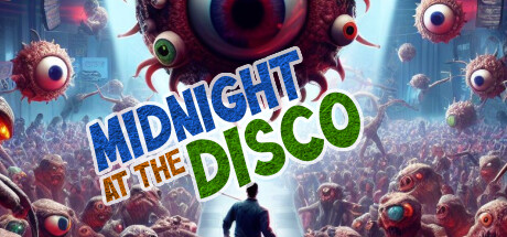
Annihilate grotesque eyeball monsters in this top-down, roguelike, bullet purgatory, twin-stick shooter. Survive a full day raging on the dance floor by blasting baddies using unique builds combos on each frantic run to nab a spot on the online leaderboards.
Free to PlayPositive(27)
SurvivalAction RoguelikeBullet Hell
Taphouse GamesMar 22, 2025